
Security News
Oracle Drags Its Feet in the JavaScript Trademark Dispute
Oracle seeks to dismiss fraud claims in the JavaScript trademark dispute, delaying the case and avoiding questions about its right to the name.
By Sarah Gooding - Feb 07, 2025
@hedviginsurance/react-native-floating-action
Advanced tools
floating action component for react-native - fork by hedviginsurance
Floating action button for React Native
Open the following click on your phone: Expo link
or user your phone and scan the following QR:

npm i react-native-floating-action --save
or
yarn add react-native-floating-action
Take a look into example/ReactNativeFloatingAction-Expo
To execute the example using Expo run the following command:
yarn run run:example
or open Expo link from your mobile
First step: import the component:
import { FloatingAction } from 'react-native-floating-action';
Second step: define the buttons
  const actions = [{
    text: 'Accessibility',
    icon: require('./images/ic_accessibility_white.png'),
    name: 'bt_accessibility',
    position: 2
  }, {
    text: 'Language',
    icon: require('./images/ic_language_white.png'),
    name: 'bt_language',
    position: 1
  }, {
    text: 'Location',
    icon: require('./images/ic_room_white.png'),
    name: 'bt_room',
    position: 3
  }, {
    text: 'Video',
    icon: require('./images/ic_videocam_white.png'),
    name: 'bt_videocam',
    position: 4
  }];
Third step: use it
    <View style={styles.container}>
      <Text style={styles.example}>
        Floating Action example
      </Text>
      <FloatingAction
        actions={actions}
        onPressItem={
          (name) => {
            console.log(`selected button: ${name}`);
          }
        }
      />
    </View>
There are some cases where you want to show or hide the component without pressing the main button:
<FloatingAction
  ref={(ref) => { this.floatingAction = ref; }}
  actions={[...]}
  ...
/>
and then:
this.floatingAction.animateButton();
FloatingAction
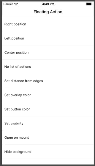
| Property | Type | Default | Description |
|---|---|---|---|
| actions | array | [] | Actions to be show once user press the main button |
| color | string | #1253bc | Color of the main button |
| distanceToEdge | number | 30 | Distance from button to edge |
| visible | boolean | true | Hide or Show the component using an animation |
| overlayColor | string | rgba(68, 68, 68, 0.6) | Color of the background overlay |
| position | string | right | Position to render the main button and actions, options: (left, right, center) |
| overrideWithAction | string | false | Override the main action with the first action inside list actions, will not show other action |
| floatingIcon | node | ReactElement | |
| showBackground | boolean | true | Show or Hide background after open it |
| openOnMount | boolean | false | Open component after mounting it, useful on some weird cases like tutorials |
| actionsPaddingTopBottom | number | 8 | Change distance between actions |
| iconWidth | number | 15 | Icon width of the main button |
| iconHeight | number | 15 | Icon height of the main button |
| listenKeyboard | boolean | false | Change position when the keyboard will appear |
| dismissKeyboardOnPress | boolean | false | Dismiss keyboard when user press on the main button |
| onPressItem | function | Function to be call as soon as the user select an option from actions. Will return the name of the action. | |
| onPressMain | function | Function to be call as soon as use click main button and will return true or false depeneding of the state. | |
| onPressMain | function | Function to be call as soon as use click main button and will return true or false depeneding of the state. | |
| onPressBackdrop | function | Function to be call as soon as the backdrop is clicked. |
Actions
| Property | Type | Default | Description |
|---|---|---|---|
| color | string | #1253bc | Color of the action button |
| icon | any | Icon to be rendered inside the action, will accept an URL or React.Image. If we want to send an URL we need to send it in this way: icon: { uri: 'https://imageurl.com' } if we want to send a React.Image we will use it in this way: icon: require('path/image') | |
| name | string | Name of the icon, this name is used as parameter for onPressItem action | |
| text | string | Text to show near to the button. (Only apply for position = ['left', 'right']) | |
| textBackground | string | #ffffff | Background color for Text container |
| textColor | string | #444444 | Text color for every action |
| textElevation | number | 5 | Elevation property (only android) |
| render | function | Custom render function for Action. If provided, other properties are not applicable. The provided function should return a React Node | |
| margin | number | 8 | Additional margin for action. This property is useful when we want to override the current margin for example using custom render |
| size | number | 40 | size of of the icon rendered inside the action |
FAQs
floating action component for react-native - fork by hedviginsurance
The npm package @hedviginsurance/react-native-floating-action receives a total of 7 weekly downloads. As such, @hedviginsurance/react-native-floating-action popularity was classified as not popular.
We found that @hedviginsurance/react-native-floating-action demonstrated a not healthy version release cadence and project activity because the last version was released a year ago. It has 5 open source maintainers collaborating on the project.
Did you know?

Socket for GitHub automatically highlights issues in each pull request and monitors the health of all your open source dependencies. Discover the contents of your packages and block harmful activity before you install or update your dependencies.
Security News
Oracle seeks to dismiss fraud claims in the JavaScript trademark dispute, delaying the case and avoiding questions about its right to the name.

Security News
The Linux Foundation is warning open source developers that compliance with global sanctions is mandatory, highlighting legal risks and restrictions on contributions.

Security News
Maven Central now validates Sigstore signatures, making it easier for developers to verify the provenance of Java packages.