@hypertheme-editor/chakra-ui-colors
Change all Chakra UI theme colors, create custom custom colors and generate color palettes with HyperTheme Editor.
This module is part of HyperTheme Editor, check it out before installing and using it.
Import
import { ThemeEditorFontSizes } from '@hypertheme-editor/chakra-ui-font-sizes'
Usage
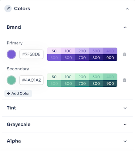
ThemeEditorColors works with the ThemeEditorDrawer component.
Put the ThemeEditColors component as a children of ThemeEditorDrawer and set icon and title props like in this example:
function MyThemeEditor(props) {
  return (
    <ThemeEditor>
      <ThemeEditorButton {...props} />
      <ThemeEditorDrawer>
        <ThemeEditorFontSizes icon={ImFontSize} title="Font Sizes" />
      </ThemeEditorDrawer>
    </ThemeEditor>
  )
}
HyperTheme Editor

Powerful visual theme editor for your next Chakra UI project.
Learn more about it on the website: hyperthe.me.
Documentation
Read the HyperTheme Editor documentation here.
License
HyperTheme Editor is licensed under the MIT License by Hyperting S.r.l..


