Security News
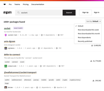
npm Updates Search Experience with New Objective Sorting Options
npm has a revamped search experience with new, more transparent sorting options—Relevance, Downloads, Dependents, and Publish Date.
@justeattakeaway/pie-card
Advanced tools

pie-card is a Web Component built using the Lit library.
This component can be easily integrated into various frontend frameworks and customized through a set of properties.
To install pie-card in your application, run the following on your command line:
# npm
$ npm i @justeattakeaway/pie-card

# yarn
$ yarn add @justeattakeaway/pie-card
For full information on using PIE components as part of an application, check out the Getting Started Guide.
// Default – for Native JS Applications, Vue, Angular, Svelte, etc.
import { PieCard } from '@justeattakeaway/pie-card';

// If you don't need to reference the imported object, you can simply
// import the module which registers the component as a custom element.
import '@justeattakeaway/pie-card';
// React
// For React, you will need to import our React-specific component build
// which wraps the web component using @lit/react
import { PieCard } from '@justeattakeaway/pie-card/dist/react';
[!NOTE] When using the React version of the component, please make sure to also include React as a peer dependency in your project.
[!IMPORTANT] When using
pie-card, you will also need to include a couple of dependencies to ensure the component renders as expected. See the PIE Wiki for more information and how to include these in your application.
| Property | Type | Default | Description |
|---|---|---|---|
| tag | String | button | What HTML element the card should be such as a or button |
| variant | string | default | What style variant the card should be such as default, outline, inverse or outline-inverse |
| disabled | boolean | false | When true, the card is disabled. |
| href | string | undefined | The URL that the card should point to (this will not take effect unless the card is a link). |
| target | string | undefined | Where to display the linked URL such as _self, _blank, _parent or _top (this will not take effect unless the card is a link). |
| rel | string | undefined | What the relationship of the linked URL is (this will not take effect unless the card is a link). |
| aria | object | undefined | The ARIA labels used for various parts of the card. |
| isDraggable | boolean | false | Sets a grab/grabbing cursor when set to true. Note: the actual dragging capabilities should be implemented by the consuming application. |
| padding | String | undefined | Sets the padding of the card. Can be either a single value or two values separated by commas. Setting a single value adds padding to all sides of the card, whereas setting two values will set the "topBottom, leftRight" padding. e.g 'a' or 'a, b' |
In your markup or JSX, you can then use these to set the properties for the pie-card component:
<!-- Native HTML -->
<pie-card disabled href="/foo/bar" rel="noopener" target="_blank"></pie-card>

<!-- JSX -->
<PieCard disabled href="/foo/bar" rel="noopener" target="_blank"></PieCard>
Check out our contributing guide for more information on local development and how to run specific component tests.
FAQs
PIE Design System Card built using Web Components
The npm package @justeattakeaway/pie-card receives a total of 196 weekly downloads. As such, @justeattakeaway/pie-card popularity was classified as not popular.
We found that @justeattakeaway/pie-card demonstrated a healthy version release cadence and project activity because the last version was released less than a year ago. It has 0 open source maintainers collaborating on the project.
Did you know?

Socket for GitHub automatically highlights issues in each pull request and monitors the health of all your open source dependencies. Discover the contents of your packages and block harmful activity before you install or update your dependencies.

Security News
npm has a revamped search experience with new, more transparent sorting options—Relevance, Downloads, Dependents, and Publish Date.

Security News
A supply chain attack has been detected in versions 1.95.6 and 1.95.7 of the popular @solana/web3.js library.

Research
Security News
A malicious npm package targets Solana developers, rerouting funds in 2% of transactions to a hardcoded address.