React Scatter Graph


A fully customizable, ready to use scatter graph UI package for React.
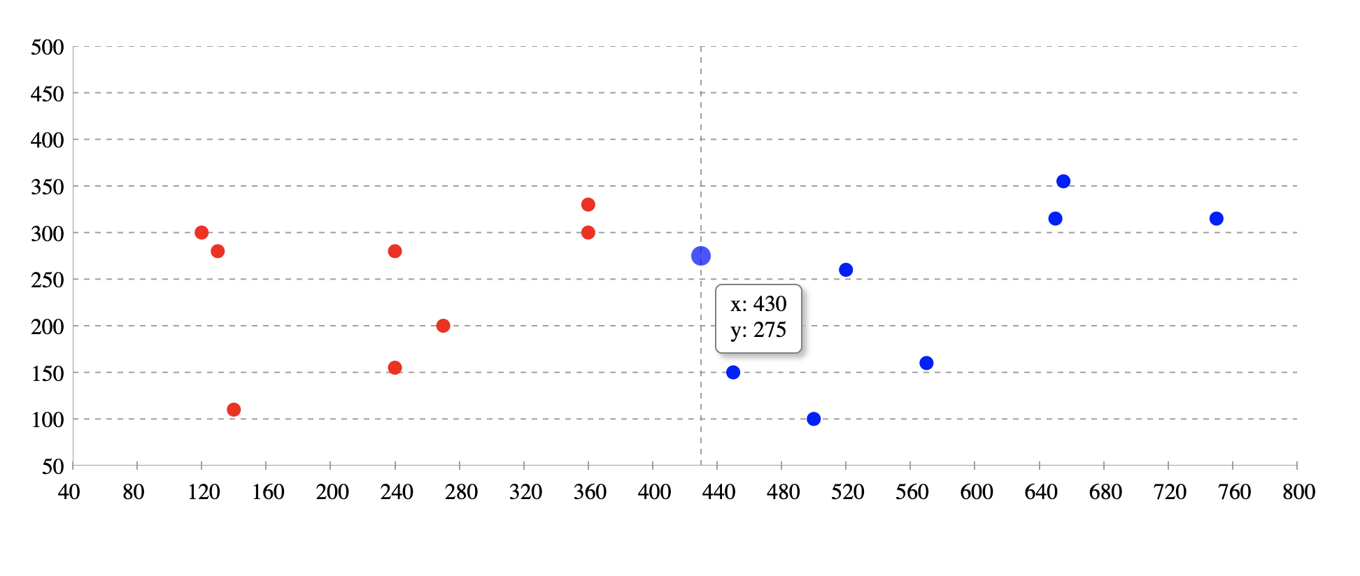
Try tweaking React Scatter Graph using this codesandbox link here
Installation
npm install @keyvaluesystems/react-scatter-graph
You’ll need to install React separately since it isn't included in the package.
Note for Next.js users, if you are using Next.js version 13 or later, you will have to use the use client feature to ensure proper compatibility.
Usage
React Scatter Graph can run in a very basic mode like this:
import React, { useState } from 'react';
import ReactScatterGraph from '@keyvaluesystems/react-scatter-graph';

function App() {
  data = [
    { x: 450, y: 150 },
    { x: 360, y: 330 },
    { x: 650, y: 315 },
    { x: 270, y: 200 }
  ];

  return <ScatterGraph data={data} graphHeight={500} />;
}

export default App;
The data array is an array of objects with { x, y } coordinates.
Note: The graph width is responsive. So it can be adjusted by a parent wrapper. You need to provide the height.
React Scatter Graph for date inputs:
Scatter graph is a useful tool for plotting date values. In order to do so, timestamps must be provided for the x-axis values.
import React, { useState } from 'react';
import ReactScatterGraph from '@keyvaluesystems/react-scatter-graph';
function App() {
data = [
{ x: 1672876800000, y: 150 },
{ x: 1673568000000, y: 330 },
{ x: 1674086400000, y: 315 },
{ x: 1673222400000, y: 200 }
];
return <ScatterGraph data={data} graphHeight={500} />;
}
export default App;
v2.0.0 (Major Version Change)
This release includes a breaking change. Please read this document carefully before upgrading
Breaking Changes
- The
axisColor prop has been renamed to gridLineColor.
Migration Steps
- Update Prop: Replace the prop
axisColor with the name gridLineColor.
Before
<ScatterGraph data={data} graphHeight={500} axisColor='#00FF00' />
After
<ScatterGraph data={data} graphHeight={500} gridLineColor='#00FF00' />
Props
Props that can be passed to the component are listed below:
data: object[] | An array of x-y coordinates to render. | undefined |
graphHeight: number | Height of graph in pixel | undefined |
gridLineColor: string | Color for the grid lines on the x and y axes. It helps user to see the exact value of a point on the graph | #9E9E9E |
originAxisColor: string | Color for the origin axis | #9E9E9E |
renderYLabel?: (arg: number | string): string |
Render function for customizing Y axis label
| undefined |
renderXLabel?: (arg: number | string): string |
Render function for customizing X axis label
| undefined |
scatterPointColor?: (arg: { x: number, y: number }): string |
Function for customizing scatter point color. Based on the args, we can customise the color. Return value should be the color hash / string.
| undefined |
renderValuebox?: (x: number, y: number): ReactElement |
Render function for customizing the value box shown on hover.
| undefined |
styles?: object | Provides you with a bunch of style objects and callback functions to override the default styles.(refer
Style Customizations)
| undefined |
Style Customizations
Style customizations can be done by overriding default styles using the styles prop.
The below code shows all the overridable styles using styles prop.
<ScatterGraph
  data={data}
  graphHeight={500}
  styles={{
    Root?: {...styles},
    XLabel?: (xLabel) => ({...styles}),
    YLabel?: (yLabel) => ({...styles}),
  }}
/>;
For a more specific example, please refer the following:
<ScatterGraph
  data={data}
  graphHeight={500}
  styles={{
    Root: {
      marginTop: 50
    },
    XLabel: () => ({
      color: 'blue'
    }),
    YLabel: () => ({
      color: 'green'
    })
  }}
/>
Within the styles prop, following keys accept a style object:
Root - overrides the style of outermost container.
Within the styles prop, following keys accept a function that returns the desired style for each element:
XLabel - overrides the style of x-axis labels.YLabel - overrides the style of y-axis labels.