React Native Rating
An interactive rating component for React Native, which can display ratings using stars, hearts, emojis, or custom symbols of your choice. The component leverages the PanResponder and Animated APIs to create high-performing animations. It is written in TypeScript and has zero dependencies. Whether you’re building a review-based app, a rating system, or any application that requires user feedback, React Native Rating will be an invaluable addition to your toolkit.

Installation
yarn
yarn add @kolking/react-native-rating
npm
npm i @kolking/react-native-rating
Example Usage
import React, { useCallback, useState } from 'react';
import { StyleSheet, Text, View } from 'react-native';
import { Rating } from '@kolking/react-native-rating';

const App = () => {
  const [rating, setRating] = useState(0);

  const handleChange = useCallback(
    (value: number) => setRating(Math.round((rating + value) * 5) / 10),
    [rating],
  );

  return (
    <View style={styles.root}>
      <Rating size={40} rating={rating} onChange={handleChange} />
      <Text style={styles.text}>Rated {rating} out of 5</Text>
    </View>
  );
};

const styles = StyleSheet.create({
  root: {
    flex: 1,
    alignItems: 'center',
    justifyContent: 'center',
  },
  text: {
    fontSize: 17,
    marginTop: 20,
  },
});

export default App;
Props
| Prop | Type | Default | Description |
|---|
variant | Variants | stars | Pre-defined design variant, see variants section below |
rating | number | 0 | Decimal rating value |
size | number | 30 | Width and height of the rating symbol |
scale | number | 1.3 | Scaling factor for the snap animation, set it to 1 to turn animation off |
spacing | number | size * (scale - 1) | Distance between symbols, calculated based on the scale prop if no value is provided |
maxRating | number | 5 | Maximum rating value and the total number of symbols |
disabled | boolean | false | Set true to disable user interaction |
baseColor | string | variant default | Color of the "empty" symbols |
fillColor | string | variant default | Color of the "filled" symbols |
touchColor | string | variant default | Color of the symbols during interaction |
baseSymbol | SymbolSource | variant default | An image (or array of images) for the "empty" rating |
fillSymbol | SymbolSource | variant default | An image (or array of images) for the "filled" rating |
style | ViewStyle | | Style object applied to the wrapping View |
onMove | (rating: number) => void | | A function called during pan gesture |
onChange | (rating: number) => void | | A function called when touch released |
Performance
When rendering a lot of rating components on the same screen, e.g. in a FlatList or SectionList, make sure to set the disabled prop to true. Otherwise you may encounter the "excessive number of pending callbacks" warning.
Symbols
To achieve a customized appearance for the component, you have the flexibility to define your own symbols using the baseSymbol and fillSymbol props. The SymbolSource type is defined as ImageSourcePropType | ImageSourcePropType[], allowing you to pass either a single image source or an array of images. It is important to note that when passing an array, its length must match the maxRating value to ensure proper functionality.
Variants
There are five pre-defined design variants available for selection. All of the variants are designed to support both light and dark color schemes. In addition, you have the flexibility to override any of the variant props with your own custom values.
stars
| Preview | baseSymbol | fillSymbol | baseColor | fillColor | touchColor |
|---|
 |  | | #D1D1D6 light
#3A3A3C dark | #FF9500 light
#FF9F0A dark | #FF3B30 light
#FF453A dark |
stars-outline
| Preview | baseSymbol | fillSymbol | baseColor | fillColor | touchColor |
|---|
 |  | | #C7C7CC light
#48484A dark | #FF9500 light
#FF9F0A dark | #FF3B30 light
#FF453A dark |
hearts
| Preview | baseSymbol | fillSymbol | baseColor | fillColor | touchColor |
|---|
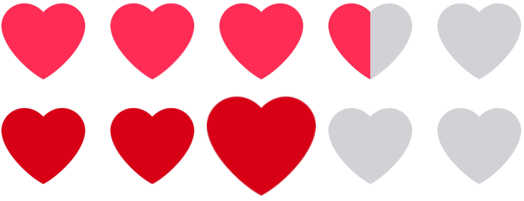 |  | | #D1D1D6 light
#3A3A3C dark | #FF2D55 light
#FF375F dark | #D70015 light
#D70015 dark |
hearts-outline
| Preview | baseSymbol | fillSymbol | baseColor | fillColor | touchColor |
|---|
 |  | | #C7C7CC light
#48484A dark | #FF2D55 light
#FF375F dark | #D70015 light
#D70015 dark |
emoji
| Preview | baseSymbol |
|---|
 |  |
Feedback
I appreciate your feedback, so please star the repository if you like it. This is the best motivation for me to maintain the package and add new features. If you have any feature requests, found a bug, or have ideas for improvement, feel free to open an issue.
Also, please check out my other React Native components that might be a good fit for your project:
License
Licensed under the MIT license.


