Product
Socket Now Supports uv.lock Files
Socket now supports uv.lock files to ensure consistent, secure dependency resolution for Python projects and enhance supply chain security.
@maptiler/ar-control
Advanced tools
AR Control for MapTiler SDK JS


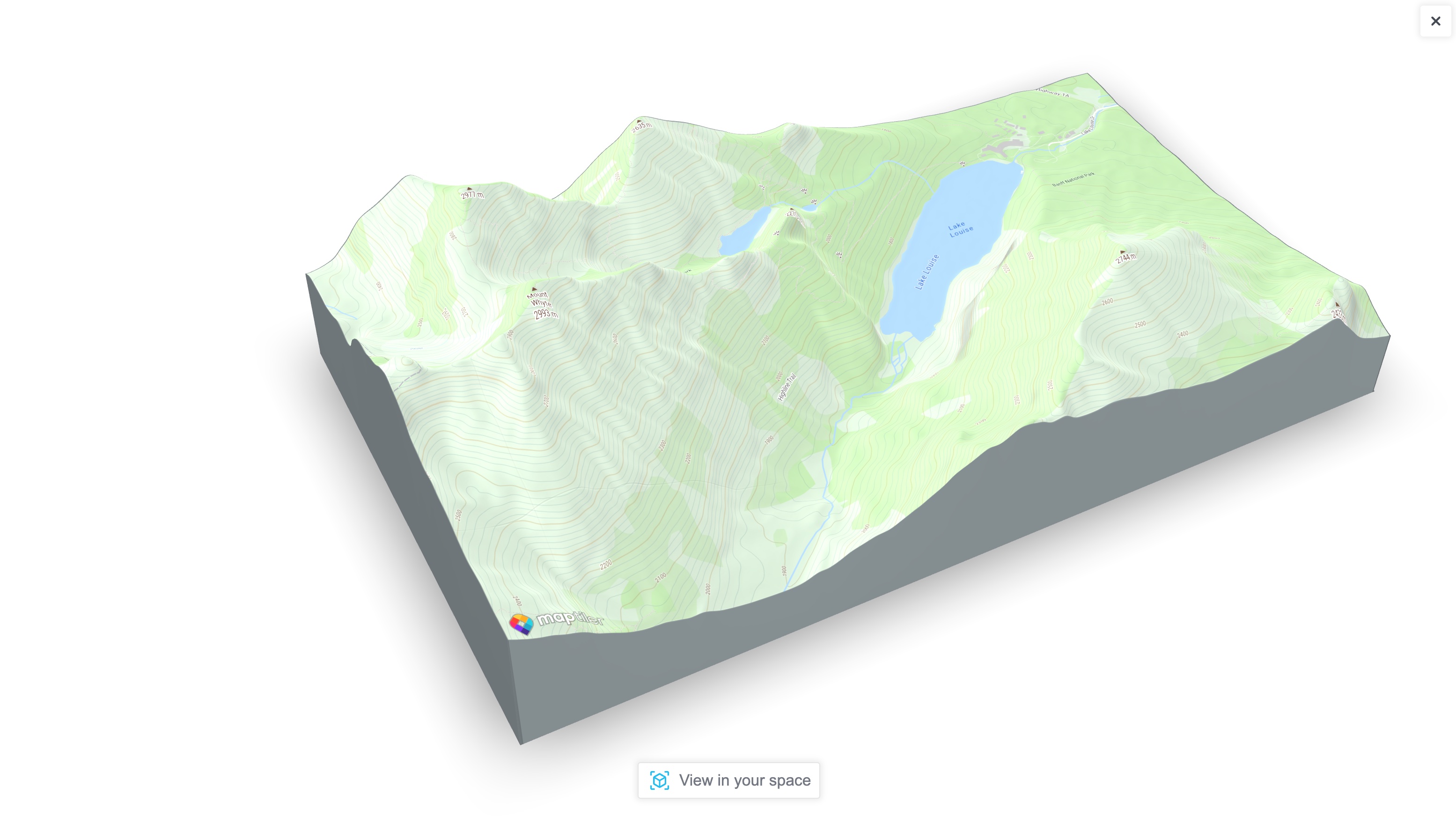
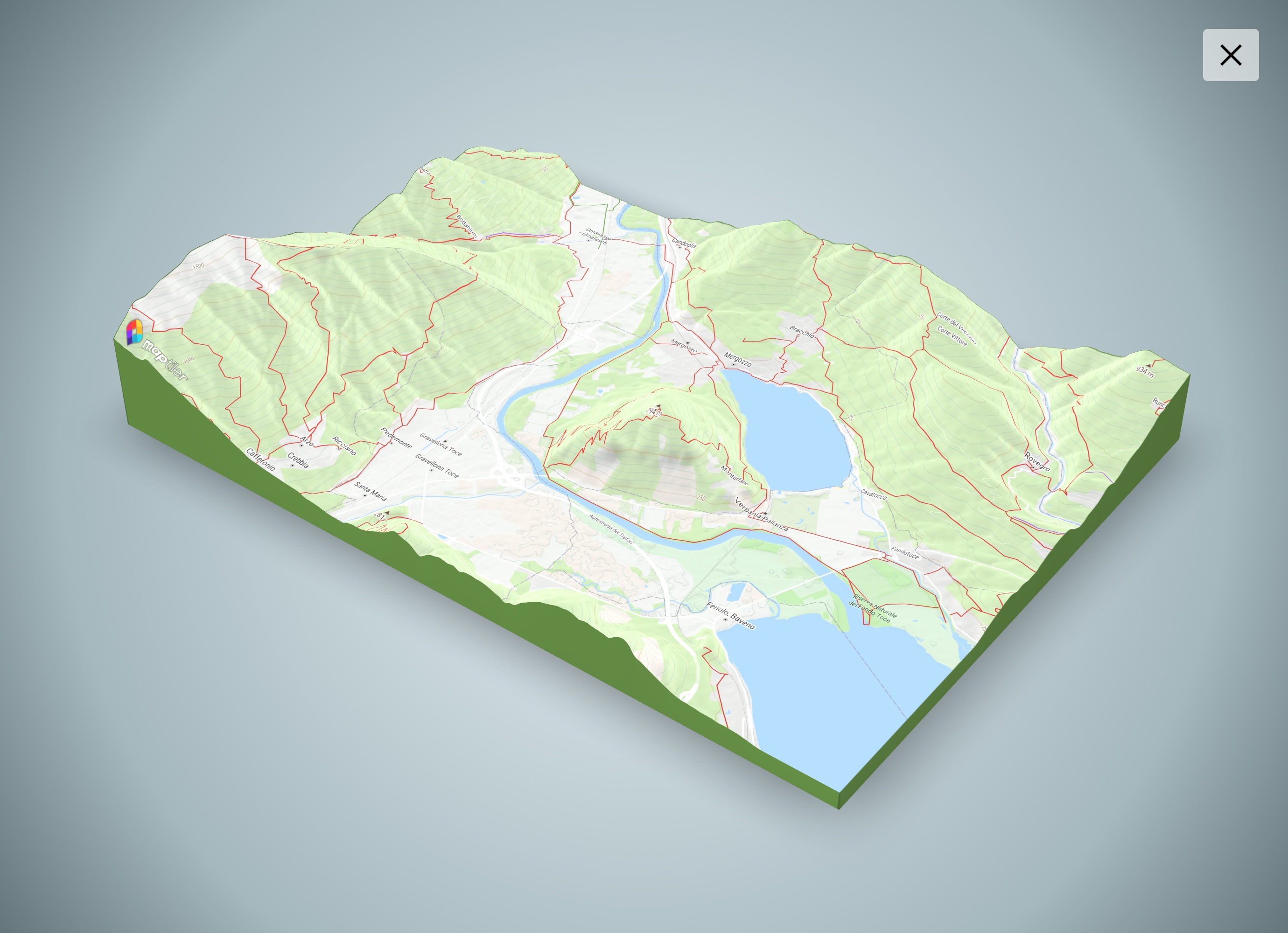
This AR control adds a button on your MapTiler SDK's Map to create a 3D model of the viewport, including 3D terrain and any layer you have put on top.
If your device is compatible with WebXR or Apple Quick Look, the Enable AR button will show up. Then you can position and interact with the 3D model on your own space!

npm install @maptiler/sdk @maptiler/ar-control
Then in your code, import the control:
// Import MapTiler SDK
import * as maptilersdk from "@maptiler/sdk";

// Import the AR Control
import * as maptilerarcontrol from "@maptiler/ar-control";
// Or specifically:
import { MaptilerARControl } from "@maptiler/ar-control";
⚠️ with NextJS, the AR control module must be dynamically imported:
const maptilerarcontrol = await import("@maptiler/ar-control");
This must be done in hook that is only executed client side (or inside componentDidMount, in the case of class components). This is due to the AR Control dependency to ModelViewer that needs to acces the global object window. NextJS will attempt SSR, where window is not defined and this will result in an error.
<!-- Make sure you enable device pixel ratio greater than 1 -->
<meta name="viewport" content="width=device-width, initial-scale=1">

<!-- Import MapTiler SDK -->
<script src="https://cdn.maptiler.com/maptiler-sdk-js/latest/maptiler-sdk.umd.min.js"></script>
<link href="https://cdn.maptiler.com/maptiler-sdk-js/latest/maptiler-sdk.css" rel="stylesheet" />

<!-- Import the AR Control -->
<script src="https://cdn.maptiler.com/maptiler-ar-control/latest/maptiler-ar-control.umd.js"></script>
The AR control requires to be used with our SDK (which is an extension of MapLibre).
// Get a free token at https://cloud.maptiler.com
// with a generous free tier!
maptilersdk.config.apiKey = 'YOUR_MAPTILER_CLOUD_TOKEN';

// Creating a map
const map = new maptilersdk.Map({
  container: 'map',
  style: maptilersdk.MapStyle.OUTDOOR,
  terrain: true,
  hash: true,
  geolocate: true,
});

// Waiting for the map to be ready
map.on("load", (e) => {
  // Creating the control
  const arControl = new maptilerarcontrol.MaptilerARControl();

  // Adding the AR control on the top-left corner of the map
  map.addControl(arControl, "top-left");

  arControl.on("computeStart", (e) => {
    // Do something when the control starts to compute the 3D model
  })

  arControl.on("computeEnd", (e) => {
    // Do something when the control is done computing the 3D model
  })
})
There are two events:
computeStart happens when the AR control starts computing the the 3D model, as soon as the AR button is clicked.computeEnd happens when the AR control is done computing the model and is about to display itThe AR control performs some temporary changes to the map view, so these events are handy to hide those transformations behind a curtain or displaying a message.
In the example, we show a fullscreen overlay with a waiting message at computeStart and hides it at computeEnd, just by dynamically updating the .style.display property of the overlay. Keep in mind that the z-index CSS property of this overlay must be higher than the 3D model view, so greater than 3.
When using React, you may want to replace this logic by a change of state.
The constructor MaptilerARControl accepts an option object to customize the look and feel. Here are the attributes:
showButton (boolean): Shows the AR button if true, hide it otherwise. Default: true.background (string): Background color (or any css-compatible string for gradient or image url). Default: "#FFFFFF" (white).closeButtonClassName (string): CSS class to add to the close button on the AR modal. If none is provided, a default inline style is added Default: none.closeButtonContent (string | HTMLElement): Content to add to the close button. If the content is a string, it is added as .innerHTML. If it's a DOM element, it is added as .appendChild(). Default: "Close".arButtonClassName (string): CSS class to add to the AR button on the AR modal. If none is provided, a default inline style is added. Default: nonearButtonContent (string | HTMLElement): Content to add to the AR button. If the content is a string, it is added as .innerHTML. If it's a DOM element, it is added as .appendChild(). Default: "Close".edgeColor (string): Color of the 3D model edges. Default: "#0eaeff" (grayish teal)logo (string): a URL to a logo placed at the bottom of the 3D view when AR mode is not enabled. By default, the logo will have an height of 60 pixel and be placed at the bottom left corner with a margin of 10 pixels.logoHeight(number): the height of the logo in pixels (if any). Default: 60logoClass (string): CSS class to add to the class list of the <img> element holding the logo (if any). If used, the .logoHeight as well as the default styling will no longer be applied.activateAR (boolean): When the platform allows, setting this to true automatically activates the AR mode as soon as the data is ready. Quick Look on iOS is likely to allow this, while WebXR on Android is not likeley to. Default: falsehighRes (boolean): increases the resolution of the texture. Will most likely have no effect on iOS due to some format limitation. Default: false.
.run(): programmatically run the computation of the 3D model. This can be used in replacement of a click on the control.close(): programmatically closes the overlay containing the 3D model.updateLogo(src: string): updates the src of the logo. This can only be used if the .logo option was set in the constructor. Can be coupled with the computeStart event to refresh the information, for isntance a dynamically generated QR code that would contain info about the place being processed.MapTiler SDK can be used efficiently with CapacitorJS to create beautiful native maps-centric apps. This AR Control has been design to work in such scenario, though a different scenrio is unrolled internaly: there will be no intermediate 3D model and instead Apple Quicklook will directly open.
Your mobile app (or at least the compinent that installed on the mobile device) needs to have these Capacitor dependencies installed:
npm install @capacitor/core @capacitor/filesystem @capacitor-community/file-opener
See LICENSE.md
FAQs
AR Control for MapTiler SDK
The npm package @maptiler/ar-control receives a total of 173 weekly downloads. As such, @maptiler/ar-control popularity was classified as not popular.
We found that @maptiler/ar-control demonstrated a healthy version release cadence and project activity because the last version was released less than a year ago. It has 7 open source maintainers collaborating on the project.
Did you know?

Socket for GitHub automatically highlights issues in each pull request and monitors the health of all your open source dependencies. Discover the contents of your packages and block harmful activity before you install or update your dependencies.

Product
Socket now supports uv.lock files to ensure consistent, secure dependency resolution for Python projects and enhance supply chain security.

Research
Security News
Socket researchers have discovered multiple malicious npm packages targeting Solana private keys, abusing Gmail to exfiltrate the data and drain Solana wallets.

Security News
PEP 770 proposes adding SBOM support to Python packages to improve transparency and catch hidden non-Python dependencies that security tools often miss.