vue-pivot-table
A vue component for pivot table
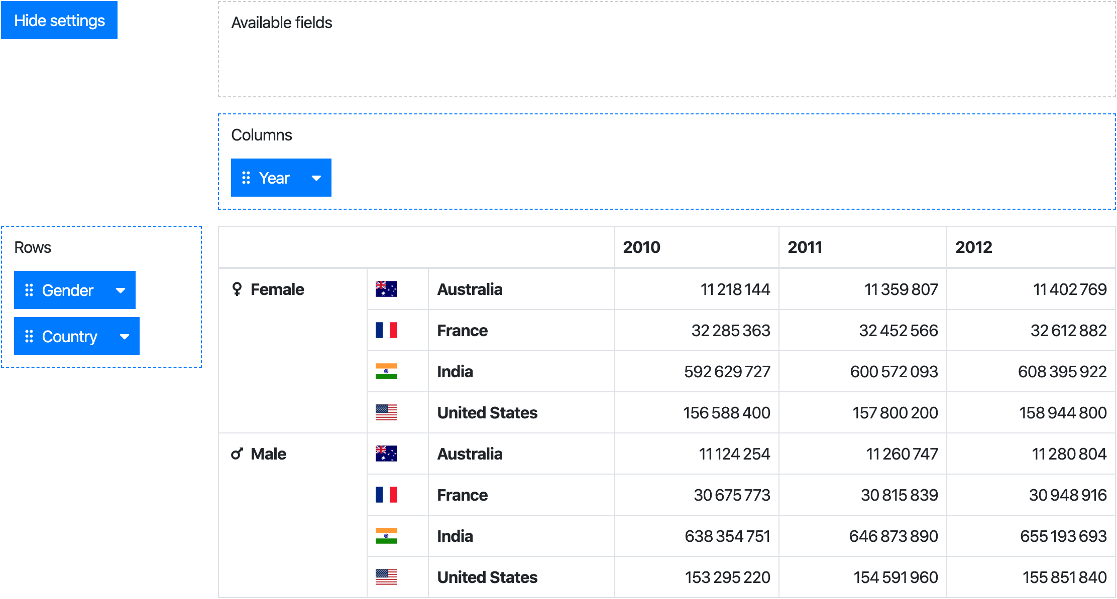
Live demo (jsfiddle)
Install
npm install --save @marketconnect/vue-pivot-table
Components
This project provides 2 components:
Pivot: aggregation table with drag & drop user interface to configure rows/columnsPivotTable: aggregation table only
While the Pivot component provides the full experience, the PivotTable can be used standalone if you need only a table.
Browser
Vue.use(VuePivot)
Webpack
Pivot
Javascript
import Pivot from '@marketconnect/vue-pivot-table'
export default {
components: { Pivot },
data: () => {
return {
data: Object.freeze([{ x: 0, y: 0, z: 0 }, { x: 1, y: 1, z: 1 }]),
fields: [{
key: 'x',
getter: item => item.x,
label: 'X'
}, {
key: 'y',
getter: item => item.y,
label: 'Y'
}, {
key: 'z',
getter: item => item.z,
label: 'Z'
}],
rowFieldKeys: ['y', 'z'],
colFieldKeys: ['x'],
reducer: (sum, item) => sum + 1
}
}
...
}
HTML
<pivot :data="data" :fields="fields" :row-field-keys="rowFieldKeys" :col-field-keys="colFieldKeys" :reducer="reducer">
</pivot>
PivotTable
Javascript
import PivotTable from '@marketconnect/vue-pivot-table'
export default {
components: { PivotTable },
data: () => {
return {
data: Object.freeze([{ x: 0, y: 0, z: 0 }, { x: 1, y: 1, z: 1 }]),
rowFields: [{
getter: item => item.y,
label: 'Y'
}, {
getter: item => item.z,
label: 'Z'
}],
colFields: [{
getter: item => item.x,
label: 'X'
}],
reducer: (sum, item) => sum + 1
}
}
...
}
HTML
<pivot-table :data="data" :row-fields="rowFields" :col-fields="colFields" :reducer="reducer">
</pivot-table>
API
Pivot component
Properties
data | Object Array | [] | Dataset to use in the pivot |
fields | Array | [] | Fields definition (see fields element format) |
available-field-keys | Array | [] | Keys of the fields to show as "available" by default |
row-field-keys | Array | [] | Keys of the fields to use as rows by default |
col-field-keys | Array | [] | Keys of the fields to use as columns by default |
reducer | function | (sum, item) => sum + 1 | Function applied to reduce data in the pivot table |
no-data-warning-text | String | 'No data to display.' | Text to display when data is empty |
is-data-loading | Boolean | false | Display a loading content instead of the table when the value is true (see slots for customization) |
default-show-settings | Boolean | true | Show settings at component creation |
available-fields-label-text | String | 'Available fields' | Text for available fields drag area |
rows-label-text | String | 'Rows' | Text for the rows drag area |
cols-label-text | String | 'Columns' | Text for the columns drag area |
hide-settings-text | String | 'Hide settings' | Text for the "hide settings" button |
show-settings-text | String | 'Show settings' | Text for the "show settings" button |
select-all-text | String | 'Select all' | Text for the "Select all" button in the dropdown value filter |
unselect-all-text | String | 'Unselect all' | Text for the "Unselect all" button in the dropdown value filter |
fields element format
key | String | A unique string value to identify the field |
label | String | Text to display in the draggable element |
labelSlotName | String | Optional - Name of the slot to use to format the label content |
getter | Function | Function to apply on an element of data to get the field value |
sort | Function | Optional - Function to order fields in the pivot table header ; if no value is provided, javascript-natural-sort will be applied |
showHeader | Boolean | Optional (default: true) - Whether the header should be displayed in the pivot table |
showFooter | Boolean | Optional (default: false) - Whether the footer should be displayed in the pivot table |
headerSlotName | String | Optional - Name of the slot to use to format the header in the pivot table ; if no slot name is provided, the value will be displayed as found in data |
headerSlotNames | String Array | Optional - Names of the slots to use to format the headers in the pivot table |
headers | Array | Optional - Definition of the headers (see headers element format) |
footerSlotName | String | Optional - Same as above for the footer |
footerSlotNames | String Array | Optional - Same as above for the footer |
headerAttributeFilter | Boolean | Optional (default: false) - Activate dropdown to filter field header attributes |
valueFilter | Boolean | Optional (default: false) - Activate dropdown to filter field values |
valueFilterSlotName | String | Optional - Name of the slot to use to format the values in the field values selection dropdown |
slotName | String | Name of the slot to use to format the header in the pivot table |
label | String | If headerAttributeFilter is activated, in the field dropdown: label to display next to the checkbox |
checked | Boolean | If headerAttributeFilter is activated, in the field dropdown: default checkbox value |
Slots
<field label slot name> | Content displayed in the field draggable label | |
<field header slot name> | Table header content for a field, referenced from the field headerSlotName property | { value } |
<field value filter slot name> | If field valueFilter prop is set to true: content in the menu next to the checkbox | { value } |
value | Table cell content | { value, row, col } (see value slot scope) |
loading | Content displayed while data-is-loading prop is set to true | |
computing | Content displayed while table values are being loaded | |
value slot scope
value | Number | Value of the cell |
row | Array | Row values of the cell |
col | Array | Column values of the cell |
PivotTable component
Properties
data | Object Array | [] | Dataset to use in the pivot |
row-fields | Array | [] | Fields to use as rows by default (see row-fields/col-fields element format) |
col-fields | Array | [] | Fields to use as columns by default (see row-fields/col-fields element format) |
reducer | function | (sum, item) => sum + 1 | Function applied to reduce data in the pivot table |
no-data-warning-text | String | 'No data to display.' | Text to display when data is empty |
is-data-loading | Boolean | false | Display a loading content instead of the table when the value is true (see slots for customization) |
row-fields/col-fields element format
getter | Function | Function to apply on an element of data to get the field value |
sort | Function | Optional - Function to order fields in the pivot table header ; if no value is provided, javascript-natural-sort will be applied |
valuesFiltered | Set | Optional - A set of values to filter displayed rows/columns |
showHeader | Boolean | Optional (default: true) - Whether the header should be displayed in the pivot table |
showFooter | Boolean | Optional (default: false) - Whether the footer should be displayed in the pivot table |
headerSlotName | String | Optional - Name of the slot to use to format the header in the pivot table ; if no slot name is provided, the value will be displayed as found in data |
headerSlotNames | String Array | Optional - Names of the slots to use to format the headers in the pivot table |
footerSlotName | String | Optional - Same as above for the footer |
footerSlotNames | String Array | Optional - Same as above for the footer |
Slots
<field header slot name> | Table header content for a field, referenced from row-field/col-field headerSlotName property | { value } |
value | Table cell content | { value, row, col } (see value slot scope) |
loading | Content displayed while data-is-loading prop is set to true | |
computing | Content displayed while table values are being loaded | |
value slot scope
value | Number | Value of the cell |
row | Array | Row values of the cell |
col | Array | Column values of the cell |
Large datasets
If this component is used with large datasets, consider applying Object.freeze on your data object to avoid useless change tracking on each data element.
See https://vuejs.org/v2/guide/instance.html#Data-and-Methods.
Build
npm install
npm run dev
npm run build
Thanks


