Security News
Create React App Officially Deprecated Amid React 19 Compatibility Issues
Create React App is officially deprecated due to React 19 issues and lack of maintenance—developers should switch to Vite or other modern alternatives.
@marketconnect/vue-pivot-table
Advanced tools
A vue component for pivot table

npm install --save @marketconnect/vue-pivot-table
This project includes 2 components:
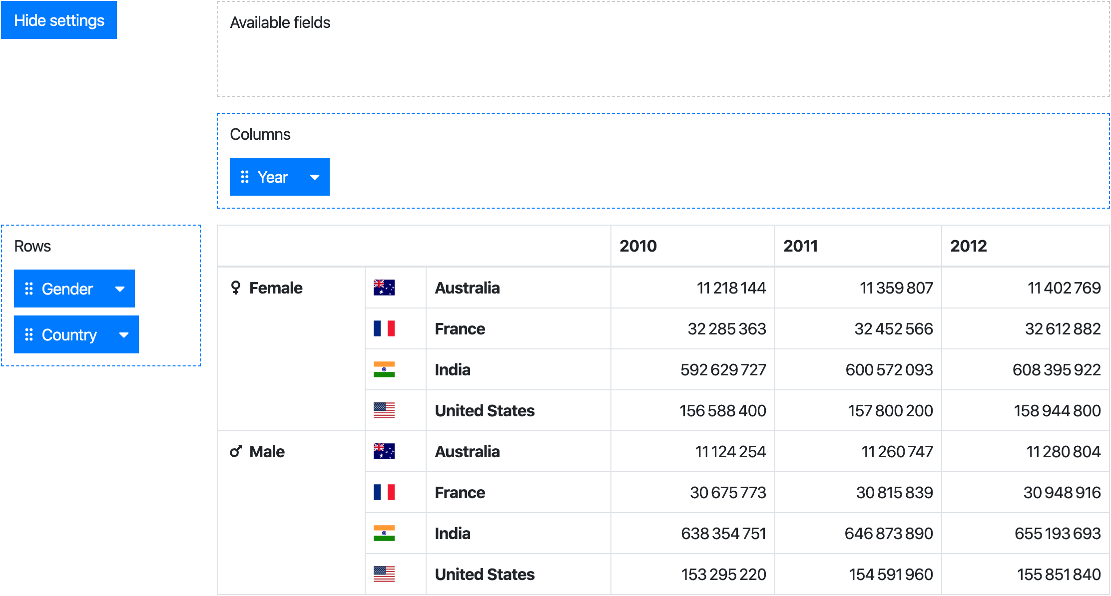
PivotTable: a component creating an aggregation table from data & specific rows/columnsPivot : a drag & drop user interface to configure rows/columns of a PivotTableWhile the Pivot component provides the full experience, the PivotTable can be used standalone.
// Import the needed component(s)
import Pivot from '@marketconnect/vue-pivot-table'
import PivotTable from '@marketconnect/vue-pivot-table'

export default {
  // Register the needed component
  components: { Pivot, PivotTable },

  // Basic data for component props
  data: () => {
    return {
      data: Object.freeze([{ x: 0, y: 0, z: 0 }, { x: 1, y: 1, z: 1 }]),
      fields: [],
      rowFields: [{
        getter: item => item.y,
        label: 'Y'
      }, {
        getter: item => item.z,
        label: 'Z'
      }],
      colFields: [{
        getter: item => item.x,
        label: 'X'
      }],
      reducer: (sum, item) => sum + 1
    }
  }
  ...
}
Vue.use(VuePivot)
<pivot :data="data" :fields="fields" :row-fields="rowFields" :col-fields="colFields" :reducer="reducer">
  <!-- Optional slots can be used for formatting table headers and values, see documentation below -->
</pivot>
Or
<pivot-table :data="data" :fields="fields" :row-fields="rowFields" :col-fields="colFields" :reducer="reducer">
  <!-- Optional slots can be used for formatting table headers and values, see documentation below -->
</pivot-table>
Pivot & PivotTable| Prop | Type | Default | Description |
|---|---|---|---|
data | Array | [] | Dataset to use in the pivot ; each element should be an object |
fields | Array | [] | Fields to display in the "Available fields" zone |
row-fields | Array | [] | Fields to use as rows by default |
col-fields | Array | [] | Fields to use as columns by default |
reducer | function | (sum, item) => sum + 1 | Function applied to reduce data in the pivot table |
no-data-warning-text | String | 'No data to display.' | Text to display when data is empty |
is-data-loading | Boolean | false | Display a loading content instead of the table when the value is true (see slots for customization) |
Pivot only| Prop | Type | Default | Description |
|---|---|---|---|
default-show-settings | boolean | true | Show settings at component creation |
available-fields-label-text | String | 'Available fields' | Text for available fields drag area |
rows-label-text | String | 'Rows' | Text for the rows drag area |
cols-label-text | String | 'Columns' | Text for the columns drag area |
hide-settings-text | String | 'Hide settings' | Text for the "hide settings" button |
show-settings-text | String | 'Show settings' | Text for the "show settings" button |
Each element in the arrays fields, colFields or rowFields should be an Object with this format:
label (String): text to display in the draggable buttongetter (function): Function to apply on an element of data to get the field valuesort (function, optional): Function to order fields in the pivot table header ; if no value is provided, javascript-natural-sort will be appliedheaderSlotName (String, optional): Name of the slot to use to format the header in the pivot table ; if no slot name is provided, the value will be displayed as found in dataPivot table headers can be customized with scoped slots:
<template slot="my-field-header-slot-name" slot-scope="{ value }">{{ value }}</template>
The slot attribute must match the slotName previously set on your field prop.
value scoped slotPivot table values can be customized with the value scoped slot:
<template slot="value" slot-scope="{ value }">{{ value.toLocaleString }}</template>
loading slotIf the data prop is loaded asynchronously, a loading feedback can be displayed by setting the data-is-loading prop to true. The default feedback is the text "Loading...".
It can be customized with the loading slot:
<template slot="loading">Loading data, please wait...</template>
If this component is used with large datasets, consider applying Object.freeze on your data object to avoid useless change tracking on each data element.
See https://vuejs.org/v2/guide/instance.html#Data-and-Methods.
# Install dependencies
npm install

# Serve with hot reload at localhost:8080
npm run dev

# Build js libraries in dist folder
npm run build
[0.0.1] - 2018-09-06
First release
FAQs
A vue component for pivot table
The npm package @marketconnect/vue-pivot-table receives a total of 0 weekly downloads. As such, @marketconnect/vue-pivot-table popularity was classified as not popular.
We found that @marketconnect/vue-pivot-table demonstrated a not healthy version release cadence and project activity because the last version was released a year ago. It has 2 open source maintainers collaborating on the project.
Did you know?

Socket for GitHub automatically highlights issues in each pull request and monitors the health of all your open source dependencies. Discover the contents of your packages and block harmful activity before you install or update your dependencies.

Security News
Create React App is officially deprecated due to React 19 issues and lack of maintenance—developers should switch to Vite or other modern alternatives.

Security News
Oracle seeks to dismiss fraud claims in the JavaScript trademark dispute, delaying the case and avoiding questions about its right to the name.

Security News
The Linux Foundation is warning open source developers that compliance with global sanctions is mandatory, highlighting legal risks and restrictions on contributions.