vue-pivot-table
A vue component for pivot table
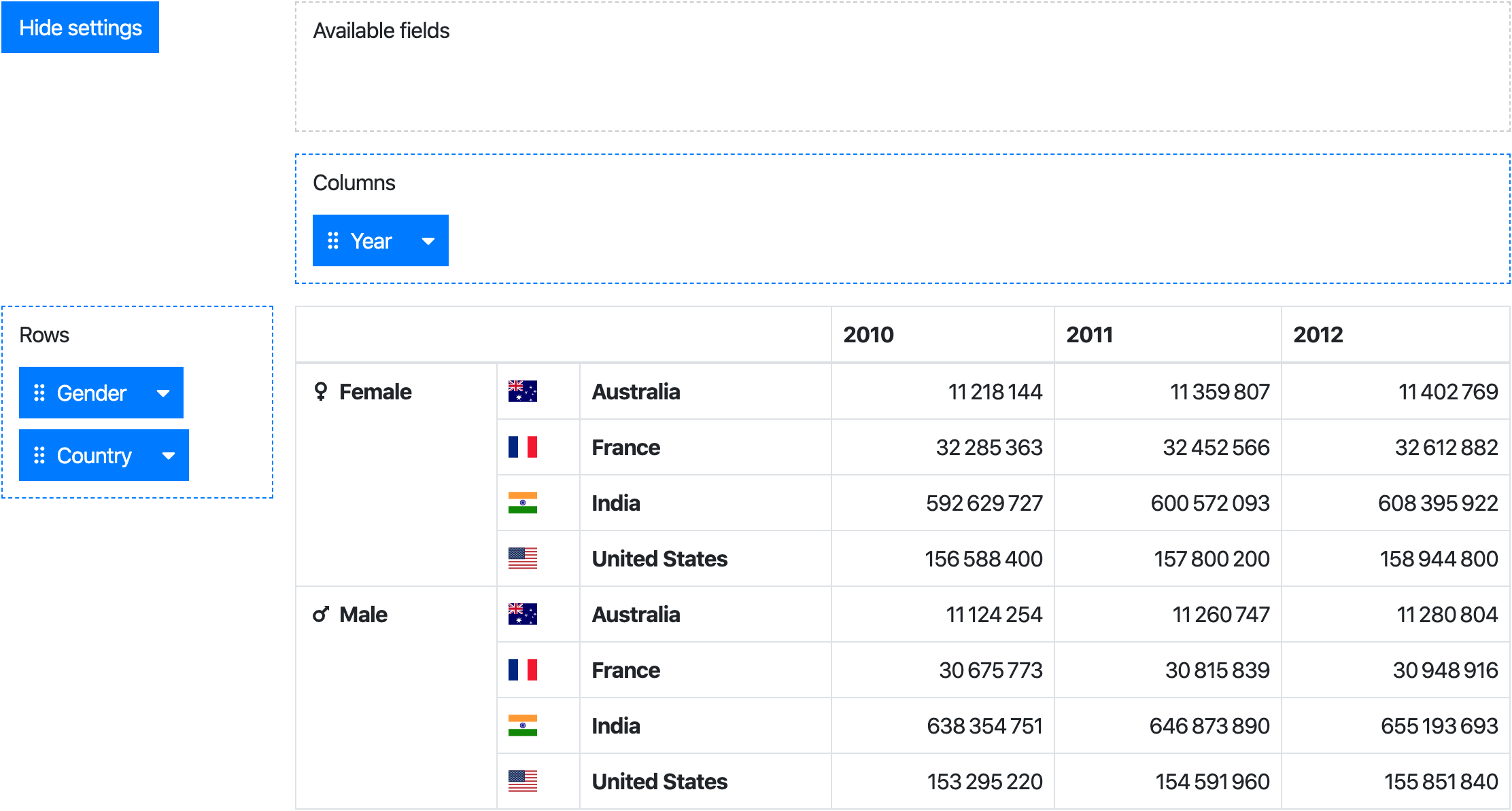
Live demo (jsfiddle)
Install
npm install --save @marketconnect/vue-pivot-table
Usage
This project includes 2 components:
PivotTable: a component to create an aggregation table from data + row/column settingsPivot : a PivotTable wrapper with drag & drop user interface to set rows/columns
While the Pivot component provides the full experience, the PivotTable can be used standalone.
Browser
Vue.use(VuePivot)
Webpack
PivotTable
Javascript
import PivotTable from '@marketconnect/vue-pivot-table'
export default {
components: { PivotTable },
data: () => {
return {
data: Object.freeze([{ x: 0, y: 0, z: 0 }, { x: 1, y: 1, z: 1 }]),
rowFields: [{
getter: item => item.y,
label: 'Y'
}, {
getter: item => item.z,
label: 'Z'
}],
colFields: [{
getter: item => item.x,
label: 'X'
}],
reducer: (sum, item) => sum + 1
}
}
...
}
HTML
<pivot-table :data="data" :row-fields="rowFields" :col-fields="colFields" :reducer="reducer">
</pivot-table>
Pivot
Javascript
import Pivot from '@marketconnect/vue-pivot-table'
export default {
components: { Pivot },
data: () => {
return {
data: Object.freeze([{ x: 0, y: 0, z: 0 }, { x: 1, y: 1, z: 1 }]),
fields: [],
rowFields: [{
getter: item => item.y,
label: 'Y'
}, {
getter: item => item.z,
label: 'Z'
}],
colFields: [{
getter: item => item.x,
label: 'X'
}],
reducer: (sum, item) => sum + 1
}
}
...
}
HTML
<pivot :data="data" :fields="fields" :row-fields="rowFields" :col-fields="colFields" :reducer="reducer">
</pivot>
API
Note: internally, the Pivot component will pass down its props and slots to its PivotTable instance.
Props
PivotTable & Pivot
| Prop | Type | Default | Description |
|---|
data | Array | [] | Dataset to use in the pivot ; each element should be an object |
row-fields | Array | [] | Fields to use as rows by default |
col-fields | Array | [] | Fields to use as columns by default |
reducer | function | (sum, item) => sum + 1 | Function applied to reduce data in the pivot table |
no-data-warning-text | String | 'No data to display.' | Text to display when data is empty |
is-data-loading | Boolean | false | Display a loading content instead of the table when the value is true (see slots for customization) |
Pivot only
| Prop | Type | Default | Description |
|---|
fields | Array | [] | Fields to display in the "Available fields" zone |
default-show-settings | Boolean | true | Show settings at component creation |
available-fields-label-text | String | 'Available fields' | Text for available fields drag area |
rows-label-text | String | 'Rows' | Text for the rows drag area |
cols-label-text | String | 'Columns' | Text for the columns drag area |
hide-settings-text | String | 'Hide settings' | Text for the "hide settings" button |
show-settings-text | String | 'Show settings' | Text for the "show settings" button |
Field format
Each element in the arrays fields, colFields or rowFields should be an Object with this format:
| Prop | Type | Description |
|---|
label | String | Text to display in the draggable button (Pivot only) |
getter | Function | Function to apply on an element of data to get the field value |
sort | Function | Optional - Function to order fields in the pivot table header ; if no value is provided, javascript-natural-sort will be applied |
showHeader | Boolean | Optional (default: true) - Whether the header should be displayed in the pivot table |
showFooter | Boolean | Optional (default: false) - Whether the footer should be displayed in the pivot table |
headerSlotName | String | Optional - Name of the slot to use to format the header in the pivot table ; if no slot name is provided, the value will be displayed as found in data |
footerSlotName | String | Optional - Same as above for the footer |
Slots
To customize table headers/footers, set a slot name on the field using headerSlotName/footerSlotname, then use the dynamically created slot:
<template v-slot:my-field-header-slot-name="{ value }">{{ value }}</template>
Cell values
Pivot table cell values can be customized with the value scoped slot:
<template v-slot:value="{ value }">{{ value.toLocaleString }}</template>
Currently this slot is applied to all value cells and does not allow customization based on current rowField/colField (TODO).
Loading
If the data prop is loaded asynchronously, a loading feedback can be displayed by setting the data-is-loading prop to true. The default feedback is the text "Loading...".
It can be customized with the loading slot:
<template v-slot:loading>Loading data, please wait...</template>
Computing
At the creation of the PivotTable component, and when the data/rowFields/colFields props change, a different loading feedback is displayed to the user. The default feedback is the text "Loading table values...".
It can be customized with the computing slot:
<template v-slot:computing>Loading table values, please wait...</template>
This feedback will be displayed together with the table in its previous state.
Large datasets
If this component is used with large datasets, consider applying Object.freeze on your data object to avoid useless change tracking on each data element.
See https://vuejs.org/v2/guide/instance.html#Data-and-Methods.
Build
npm install
npm run dev
npm run build
Thanks


