<mwc-radio> 
IMPORTANT: The Material Web Components are a work in progress and subject to
major changes until 1.0 release.
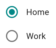
Radio buttons allow the user to select one option from a set. Use radio buttons when the user needs to see all available options.

Material Design Guidelines: Radio buttons
Installation
npm install @material/mwc-radio
NOTE: The Material Web Components are distributed as ES2017 JavaScript
Modules, and use the Custom Elements API. They are compatible with all modern
browsers including Chrome, Firefox, Safari, Edge, and IE11, but an additional
tooling step is required to resolve bare module specifiers, as well as
transpilation and polyfills for IE11. See
here
for detailed instructions.
Example usage
Standard

<mwc-radio name="myGroup" value="value1"></mwc-radio>
<mwc-radio name="myGroup" value="value2" checked></mwc-radio>

<script type="module">
  import '@material/mwc-radio/mwc-radio.js';
</script>
Custom color

<style>
mwc-radio {
  background-color: #363636;

  --mdc-theme-secondary: #ff2929;
  --mdc-radio-unchecked-color: white;
}
</style>

<mwc-radio name="myGroup" checked></mwc-radio>
<mwc-radio name="myGroup"></mwc-radio>
Disabled custom color

<style>
mwc-radio {
  background-color: #363636;

  --mdc-radio-disabled-color: #adadad;
}
</style>

<mwc-radio disabled name="myGroup"></mwc-radio>
<mwc-radio disabled name="myGroup" checked></mwc-radio>
With Form Field
Most applications should use
<mwc-formfield>
to associate an interactive label with the radio.

<style>
  mwc-formfield {
    display: block;
  }
</style>

<mwc-formfield label="Home">
  <mwc-radio name="location"></mwc-radio>
</mwc-formfield>

<mwc-formfield label="Work">
  <mwc-radio name="location"></mwc-radio>
</mwc-formfield>

<script type="module">
  import '@material/mwc-radio/mwc-radio.js';
  import '@material/mwc-formfield/mwc-formfield.js';
</script>
API
Slots
None
Properties/Attributes
| Name | Type | Default | Description |
|---|
checked | boolean | false | Whether this radio button is the currently-selected one in its group. Maps to the native checked attribute. |
disabled | boolean | false | If true, this radio button cannot be selected or de-selected. Maps to the native disabled attribute. |
name | string | '' | Name of the input for form submission, and identifier for the selection group. Only one radio button can be checked for a given selection group. Maps to the native name attribute. |
value | string | '' | Value of the input for form submission. Maps to the native value attribute. |
global | boolean | false | If true, this radio button will use a global, document-level scope for its selection group rather than its local shadow root. |
reducedTouchTarget | boolean | false | When true, the radio removes touch target that extends beyond visual boundary of the component. Set to false by default to meet Material accessibility guidelines. |
Methods
None
Events
| Name | Detail | Description |
|---|
change | {} | Fired when the user modifies the radio checked state from an input device interaction on this radio. Note that, like native <input>, the change event is not fired when the checked property is set from JavaScript, nor is it fired when another radio in the same group becomes checked. |
CSS Custom Properties
| Name | Default | Description |
|---|
--mdc-radio-unchecked-color |  rgba(0, 0, 0, 0.54) | Color of the ring of an unchecked radio. |
--mdc-radio-disabled-color |  rgba(0, 0, 0, 0.38) | Color of the ring and circle of a disabled radio. |
Global Custom Properties
This component exposes the following global theming
custom properties.
| Name | Description |
|---|
--mdc-theme-secondary | Color of the radio button. |
Additional references


