Security News
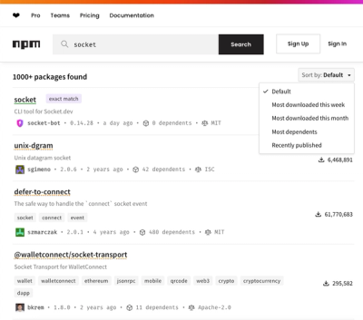
npm Updates Search Experience with New Objective Sorting Options
npm has a revamped search experience with new, more transparent sorting options—Relevance, Downloads, Dependents, and Publish Date.
@momentum-ui/icons
Advanced tools
The Cisco Momentum UI Icons library allows developers to easily incorporate Webex Icons and CSS into any application.
Momentum UI Icons
Momentum UI Icons is a full suite of the pictographic font and svg icons.
Momentum UI Icons is a full suite of the pictographic icons for easy scalable vector graphics on websites and web applications, created and maintained by the Spark UI Design Language team. It contains the Scss, CSS, fonts and SVG files needed for implenting the icons indepented of any other framework. It is also consumed and published as part of the Momentum UI Toolkit.
Install and manage the Spark UI Toolkit's icons using NPM. You may use yarn or npm. By default, yarn/npm installs packages to node_modules/.
yarn add @momentum-ui/icons
or
npm install @momentum-ui/icons --save
<head> of your HTML reference the location of your momentum-ui-icons.min.css.<link rel="stylesheet" href="path/to/momentum-ui-icons/css/momentum-ui-icons.min.css">
$icon-font-path: 'path/to/fonts/directory';
@import '@momentum-ui/icons/scss/momentum-ui-icons.scss';
You can place Momentum UI Icons just about anywhere using the CSS Prefix icon- and the icon's name. Momentum UI Icons is designed to be used with inline elements (we like the <i> tag for brevity, but using a <span> is more semantically correct).
<i class="icon icon-camera_16"></i>
All of the Momentum UI Icons are suffixed with their size. i.e. icon-camera_16 The CSS will automatically size the icons according to this size.
Use icon-fw to set icons at a fixed width. Great to use when different icon widths throw off alignment. Especially useful in things like nav lists & list groups.
Use icon-ul and icon-li to easily replace default bullets in unordered lists.
Use the icon-spin class to get any icon to rotate, and use icon-pulse to have it rotate with 8 steps.
To arbitrarily rotate and flip icons, use the icon-rotate-* and icon-flip-* classes.
Icon contributions are currently only accepted from the Spark UI Design team.
© 2014-2020 Cisco and/or its affiliates. All Rights Reserved.
FAQs
The Cisco Momentum UI Icons library allows developers to easily incorporate Webex Icons and CSS into any application.
We found that @momentum-ui/icons demonstrated a not healthy version release cadence and project activity because the last version was released a year ago. It has 17 open source maintainers collaborating on the project.
Did you know?

Socket for GitHub automatically highlights issues in each pull request and monitors the health of all your open source dependencies. Discover the contents of your packages and block harmful activity before you install or update your dependencies.

Security News
npm has a revamped search experience with new, more transparent sorting options—Relevance, Downloads, Dependents, and Publish Date.

Security News
A supply chain attack has been detected in versions 1.95.6 and 1.95.7 of the popular @solana/web3.js library.

Research
Security News
A malicious npm package targets Solana developers, rerouting funds in 2% of transactions to a hardcoded address.