Security News
New Python Packaging Proposal Aims to Solve Phantom Dependency Problem with SBOMs
PEP 770 proposes adding SBOM support to Python packages to improve transparency and catch hidden non-Python dependencies that security tools often miss.
@progress/kendo-angular-dateinputs
Advanced tools
Kendo UI for Angular Date Inputs Package - Everything you need to add date selection functionality to apps (DatePicker, TimePicker, DateInput, DateRangePicker, DateTimePicker, Calendar, and MultiViewCalendar).
- This package is part of Kendo UI for Angular—a commercial library designed and built for developing business applications with Angular. Every UI component in the Kendo UI for Angular suite has been built from the ground-up specifically for Angular.
- You must install a license key when adding the package to your project. To receive a license key, either purchase a license or register for a free trial.
- The 30-day free trial gives you access to all the Kendo UI for Angular components and their full functionality. Additionally, for the period of your license, you get access to our legendary technical support provided directly by the Kendo UI for Angular dev team!
Start using Kendo UI for Angular and speed up your development process!
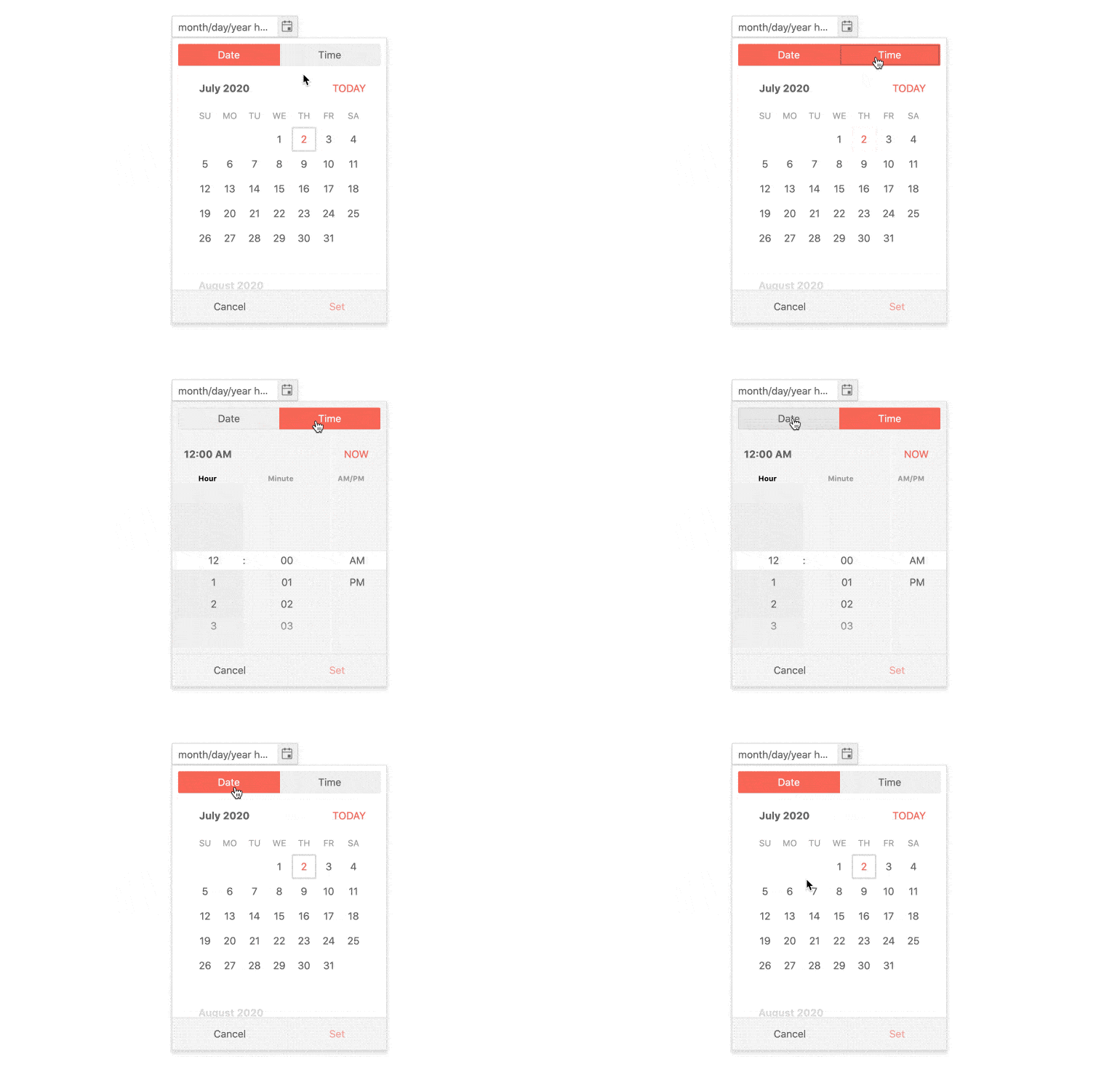
The Kendo UI for Angular Date Inputs package is a collection of seven components designed to add date selection functionality to your applications. Whether you need date input fields or calendar pickers, everything is inside. Each component is highly customizable, high-performance, and well-documented.

Among the many features which the Kendo UI for Angular Date Inputs deliver are:
For any issues you might encounter while working with the Kendo UI for Angular Date Inputs, you have the following support channels available:
Copyright © 2024 Progress Software Corporation and/or one of its subsidiaries or affiliates. All rights reserved.
Progress, Telerik, and certain product names used herein are trademarks or registered trademarks of Progress Software Corporation and/or one of its subsidiaries or affiliates in the U.S. and/or other countries.
FAQs
Kendo UI for Angular Date Inputs Package - Everything you need to add date selection functionality to apps (DatePicker, TimePicker, DateInput, DateRangePicker, DateTimePicker, Calendar, and MultiViewCalendar).
The npm package @progress/kendo-angular-dateinputs receives a total of 26,406 weekly downloads. As such, @progress/kendo-angular-dateinputs popularity was classified as popular.
We found that @progress/kendo-angular-dateinputs demonstrated a healthy version release cadence and project activity because the last version was released less than a year ago. It has 0 open source maintainers collaborating on the project.
Did you know?

Socket for GitHub automatically highlights issues in each pull request and monitors the health of all your open source dependencies. Discover the contents of your packages and block harmful activity before you install or update your dependencies.

Security News
PEP 770 proposes adding SBOM support to Python packages to improve transparency and catch hidden non-Python dependencies that security tools often miss.

Security News
Socket CEO Feross Aboukhadijeh discusses open source security challenges, including zero-day attacks and supply chain risks, on the Cyber Security Council podcast.

Security News
Research
Socket researchers uncover how threat actors weaponize Out-of-Band Application Security Testing (OAST) techniques across the npm, PyPI, and RubyGems ecosystems to exfiltrate sensitive data.