Kendo UI for Angular Tooltips Component
Important
- This package is part of Kendo UI for Angular—a commercial library designed and built for developing business applications with Angular. Every UI component in the Kendo UI for Angular suite has been built from the ground-up specifically for Angular.
- You will need to install a license key when adding the package to your project. For more information, please refer to the Kendo UI for Angular My License page.
- To receive a license key, you need to either purchase a license or register for a free trial. Doing so indicates that you accept the Kendo UI for Angular License Agreement.
- The 30-day free trial gives you access to all the Kendo UI for Angular components and their full functionality. Additionally, for the period of your license, you get access to our legendary technical support provided directly by the Kendo UI for Angular dev team!
Start using Kendo UI for Angular and speed up your development process!
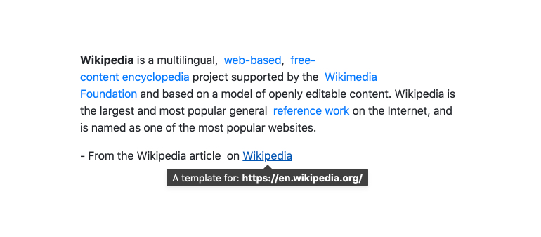
The Kendo UI for Angular Tooltips Package contains two components, the Angular Tooltip and the Angular Popover. They both render popups with information related to UI elements and can be displayed when the element is focused or hovered over (or clicked in the Popover case). With tons of configuration options, they allow building custom tooltips in Angular.
Angular Tooltip Component
The Angular Tooltip Component renders a customizable tooltip that can be used stand alone of with other Kendo UI for Angular components.

- Anchor Elements—Specify which elements (anchors) will render a tooltip.
- Programtic Opening—The Tooltip provides options for consuming its API programmatically.
- Closable—Optionally add a close button.
- Positioning—Choose the position on the screen that the Tooltip appears.
- Templates—Provide your own layout and style templates for the Tooltop content.
Angular Popover Component
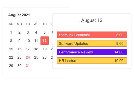
The Angular Popover Component is nearly identical to the Angular Tooltip component, except it is designed to display richer content and it can be opened via click. For example, it is possible to host a calendar or a grid in the Popover while the Tooltop is designed mostly for text.

- Single or Multiple Anchor Elements—Associate the Popover with a single element or associate one Popover with multiple elements.
- Programitic Control—The Popover provides options for consuming its API programmatically.
- Positioning—Choose the position on the screen that the Popover appears.
- Templates—Provide your own layout and style templates for the Popover content.
- Animations—Enable animations that will be applied on the opening of the Popover.
Resources
Questions and Feedback
Copyright © 2022 Progress Software Corporation and/or one of its subsidiaries or affiliates. All rights reserved.
Progress, Telerik, and certain product names used herein are trademarks or registered trademarks of Progress Software Corporation and/or one of its subsidiaries or affiliates in the U.S. and/or other countries.


