Security News
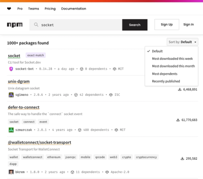
npm Updates Search Experience with New Objective Sorting Options
npm has a revamped search experience with new, more transparent sorting options—Relevance, Downloads, Dependents, and Publish Date.
@purpurds/text-field
Advanced tools
import { Meta, Stories, ArgTypes, Primary, Subtitle } from "@storybook/blocks";
import { Meta, Stories, ArgTypes, Primary, Subtitle } from "@storybook/blocks";
import * as TextFieldStories from "./src/text-field.stories"; import packageInfo from "./package.json";
Version {packageInfo.version}
Except for the props below, all "native" input attributs are also valid props. The only exceptions are:
type - Restricted to "email" | "number" | "password" | "search" | "tel" | "text"id - RequiredAdd the dependency to your consumer app like "@purpurds/purpur": "^x.y.z"
In MyApp.tsx
import "@purpurds/purpur/styles";
In MyComponent.tsx
import { TextField } from "@purpurds/purpur";

export const MyComponent = () => {
  return (
    <div>
      <TextField {...someProps}>Some content</TextField>
    </div>
  );
};
FAQs
Unknown package
The npm package @purpurds/text-field receives a total of 1,565 weekly downloads. As such, @purpurds/text-field popularity was classified as popular.
We found that @purpurds/text-field demonstrated a healthy version release cadence and project activity because the last version was released less than a year ago. It has 0 open source maintainers collaborating on the project.
Did you know?

Socket for GitHub automatically highlights issues in each pull request and monitors the health of all your open source dependencies. Discover the contents of your packages and block harmful activity before you install or update your dependencies.

Security News
npm has a revamped search experience with new, more transparent sorting options—Relevance, Downloads, Dependents, and Publish Date.

Security News
A supply chain attack has been detected in versions 1.95.6 and 1.95.7 of the popular @solana/web3.js library.

Research
Security News
A malicious npm package targets Solana developers, rerouting funds in 2% of transactions to a hardcoded address.