Security News
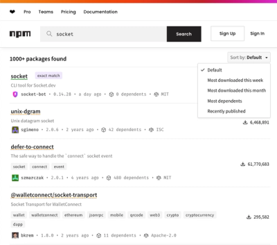
npm Updates Search Experience with New Objective Sorting Options
npm has a revamped search experience with new, more transparent sorting options—Relevance, Downloads, Dependents, and Publish Date.
@radix-ui/react-alert-dialog
Advanced tools
@radix-ui/react-alert-dialog is a React component library that provides accessible and customizable alert dialogs. These dialogs are used to interrupt the user with important information and require a response before they can proceed.
Basic Alert Dialog
This code demonstrates a basic alert dialog with a trigger button, a title, a description, and action buttons for confirming or canceling the action.
import { AlertDialog, AlertDialogTrigger, AlertDialogContent, AlertDialogTitle, AlertDialogDescription, AlertDialogAction, AlertDialogCancel } from '@radix-ui/react-alert-dialog';
function BasicAlertDialog() {
return (
<AlertDialog>
<AlertDialogTrigger>Open Alert</AlertDialogTrigger>
<AlertDialogContent>
<AlertDialogTitle>Are you sure?</AlertDialogTitle>
<AlertDialogDescription>This action cannot be undone.</AlertDialogDescription>
<AlertDialogAction>Confirm</AlertDialogAction>
<AlertDialogCancel>Cancel</AlertDialogCancel>
</AlertDialogContent>
</AlertDialog>
);
}Custom Styling
This code demonstrates how to apply custom styles to the alert dialog components using CSS classes.
import { AlertDialog, AlertDialogTrigger, AlertDialogContent, AlertDialogTitle, AlertDialogDescription, AlertDialogAction, AlertDialogCancel } from '@radix-ui/react-alert-dialog';
import './customStyles.css';

function CustomStyledAlertDialog() {
  return (
    <AlertDialog>
      <AlertDialogTrigger className="custom-trigger">Open Custom Alert</AlertDialogTrigger>
      <AlertDialogContent className="custom-content">
        <AlertDialogTitle className="custom-title">Custom Styled Alert</AlertDialogTitle>
        <AlertDialogDescription className="custom-description">This alert has custom styles.</AlertDialogDescription>
        <AlertDialogAction className="custom-action">Confirm</AlertDialogAction>
        <AlertDialogCancel className="custom-cancel">Cancel</AlertDialogCancel>
      </AlertDialogContent>
    </AlertDialog>
  );
}
Controlled Alert Dialog
This code demonstrates a controlled alert dialog where the open state is managed by React state.
import { useState } from 'react';
import { AlertDialog, AlertDialogTrigger, AlertDialogContent, AlertDialogTitle, AlertDialogDescription, AlertDialogAction, AlertDialogCancel } from '@radix-ui/react-alert-dialog';

function ControlledAlertDialog() {
  const [open, setOpen] = useState(false);

  return (
    <AlertDialog open={open} onOpenChange={setOpen}>
      <AlertDialogTrigger onClick={() => setOpen(true)}>Open Controlled Alert</AlertDialogTrigger>
      <AlertDialogContent>
        <AlertDialogTitle>Controlled Alert</AlertDialogTitle>
        <AlertDialogDescription>This alert is controlled by state.</AlertDialogDescription>
        <AlertDialogAction onClick={() => setOpen(false)}>Confirm</AlertDialogAction>
        <AlertDialogCancel onClick={() => setOpen(false)}>Cancel</AlertDialogCancel>
      </AlertDialogContent>
    </AlertDialog>
  );
}react-modal is a widely-used package for creating accessible modal dialogs in React. It provides a flexible API for creating modals, but requires more setup for accessibility compared to @radix-ui/react-alert-dialog.
react-bootstrap provides a set of accessible and customizable UI components, including modals. It integrates well with the Bootstrap framework, but may be heavier if you only need alert dialogs.
material-ui is a popular React component library that follows Google's Material Design guidelines. It includes a Dialog component that can be used for alert dialogs, offering a rich set of features and customization options.
react-alert-dialog$ yarn add @radix-ui/react-alert-dialog
# or
$ npm install @radix-ui/react-alert-dialog
View docs here.
FAQs
Unknown package
The npm package @radix-ui/react-alert-dialog receives a total of 777,306 weekly downloads. As such, @radix-ui/react-alert-dialog popularity was classified as popular.
We found that @radix-ui/react-alert-dialog demonstrated a healthy version release cadence and project activity because the last version was released less than a year ago. It has 6 open source maintainers collaborating on the project.
Did you know?

Socket for GitHub automatically highlights issues in each pull request and monitors the health of all your open source dependencies. Discover the contents of your packages and block harmful activity before you install or update your dependencies.

Security News
npm has a revamped search experience with new, more transparent sorting options—Relevance, Downloads, Dependents, and Publish Date.

Security News
A supply chain attack has been detected in versions 1.95.6 and 1.95.7 of the popular @solana/web3.js library.

Research
Security News
A malicious npm package targets Solana developers, rerouting funds in 2% of transactions to a hardcoded address.