Security News
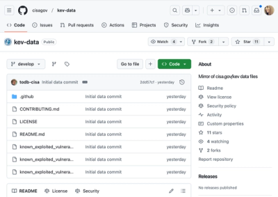
CISA Brings KEV Data to GitHub
CISA's KEV data is now on GitHub, offering easier access, API integration, commit history tracking, and automated updates for security teams and researchers.
@react-aria/button
Advanced tools
@react-aria/button is a React library that provides accessible button components. It is part of the React Aria collection of hooks and components designed to help developers build accessible web applications. The package ensures that buttons are keyboard and screen reader accessible, adhering to WAI-ARIA guidelines.
Basic Button
This code demonstrates how to create a basic accessible button using the useButton hook from @react-aria/button. The useButton hook provides the necessary props to ensure the button is accessible.
import { useButton } from '@react-aria/button';
import { useRef } from 'react';
function MyButton(props) {
let ref = useRef();
let { buttonProps } = useButton(props, ref);
return (
<button {...buttonProps} ref={ref}>
{props.children}
</button>
);
}Button with Event Handling
This example shows how to handle events with the useButton hook. The onPress event is used to trigger an alert when the button is pressed.
import { useButton } from '@react-aria/button';
import { useRef } from 'react';

function MyButton(props) {
  let ref = useRef();
  let { buttonProps } = useButton({
    ...props,
    onPress: () => alert('Button pressed!')
  }, ref);

  return (
    <button {...buttonProps} ref={ref}>
      {props.children}
    </button>
  );
}
Disabled Button
This code demonstrates how to create a disabled button using the useButton hook. The isDisabled property ensures that the button is not interactive.
import { useButton } from '@react-aria/button';
import { useRef } from 'react';

function MyButton(props) {
  let ref = useRef();
  let { buttonProps } = useButton({
    ...props,
    isDisabled: true
  }, ref);

  return (
    <button {...buttonProps} ref={ref} disabled>
      {props.children}
    </button>
  );
}React-Bootstrap provides a set of accessible UI components, including buttons, that follow the Bootstrap design framework. It offers a higher-level abstraction compared to @react-aria/button, making it easier to use but less flexible for custom accessibility needs.
Chakra UI is a component library that provides accessible and customizable UI components, including buttons. It offers a more comprehensive set of components and theming capabilities compared to @react-aria/button, but may not be as focused on accessibility specifics.
Material-UI provides a set of React components that implement Google's Material Design. It includes accessible button components but focuses more on adhering to Material Design guidelines rather than providing low-level accessibility hooks like @react-aria/button.
This package is part of react-spectrum. See the repo for more details.
FAQs
Spectrum UI components in React
The npm package @react-aria/button receives a total of 490,789 weekly downloads. As such, @react-aria/button popularity was classified as popular.
We found that @react-aria/button demonstrated a healthy version release cadence and project activity because the last version was released less than a year ago. It has 2 open source maintainers collaborating on the project.
Did you know?

Socket for GitHub automatically highlights issues in each pull request and monitors the health of all your open source dependencies. Discover the contents of your packages and block harmful activity before you install or update your dependencies.

Security News
CISA's KEV data is now on GitHub, offering easier access, API integration, commit history tracking, and automated updates for security teams and researchers.

Security News
Opengrep forks Semgrep to preserve open source SAST in response to controversial licensing changes.

Security News
Critics call the Node.js EOL CVE a misuse of the system, sparking debate over CVE standards and the growing noise in vulnerability databases.