Security News
PyPI’s New Archival Feature Closes a Major Security Gap
PyPI now allows maintainers to archive projects, improving security and helping users make informed decisions about their dependencies.
@react-aria/progress
Advanced tools
@react-aria/progress is a library that provides accessible progress indicators for React applications. It is part of the React Aria collection of hooks and components that help build accessible web applications.
ProgressBar
The ProgressBar component provides a visual representation of progress. It uses the useProgressBar hook to manage accessibility attributes and the useProgressBarState hook to manage the state of the progress bar.
import { useProgressBar } from '@react-aria/progress';
import { useProgressBarState } from '@react-stately/progress';
function ProgressBar(props) {
let { progressBarProps } = useProgressBar(props);
let state = useProgressBarState(props);
return (
<div {...progressBarProps} style={{ width: '100%', backgroundColor: '#e0e0e0' }}>
<div style={{ width: `${state.value}%`, backgroundColor: '#0078d4', height: '100%' }} />
</div>
);
}CircularProgress
The CircularProgress component provides a circular progress indicator. It uses the useProgressCircle hook for accessibility and the useProgressCircleState hook to manage the state of the circular progress.
import { useProgressCircle } from '@react-aria/progress';
import { useProgressCircleState } from '@react-stately/progress';

function CircularProgress(props) {
  let { progressCircleProps } = useProgressCircle(props);
  let state = useProgressCircleState(props);

  return (
    <svg {...progressCircleProps} viewBox="0 0 100 100" width="100" height="100">
      <circle cx="50" cy="50" r="45" fill="none" stroke="#e0e0e0" strokeWidth="10" />
      <circle
        cx="50"
        cy="50"
        r="45"
        fill="none"
        stroke="#0078d4"
        strokeWidth="10"
        strokeDasharray={Math.PI * 2 * 45}
        strokeDashoffset={Math.PI * 2 * 45 * (1 - state.value / 100)}
      />
    </svg>
  );
}react-progressbar is a simple and customizable progress bar component for React. It is less feature-rich compared to @react-aria/progress but provides basic progress bar functionality with easy customization.
react-circular-progressbar is a library for creating circular progress bars in React. It offers more customization options for circular progress indicators compared to @react-aria/progress but does not include linear progress bars.
react-loader-spinner provides a variety of loading spinners and progress indicators for React applications. It offers more visual variety compared to @react-aria/progress but may not be as focused on accessibility.
This package is part of react-spectrum. See the repo for more details.
FAQs
Spectrum UI components in React
We found that @react-aria/progress demonstrated a healthy version release cadence and project activity because the last version was released less than a year ago. It has 2 open source maintainers collaborating on the project.
Did you know?

Socket for GitHub automatically highlights issues in each pull request and monitors the health of all your open source dependencies. Discover the contents of your packages and block harmful activity before you install or update your dependencies.

Security News
PyPI now allows maintainers to archive projects, improving security and helping users make informed decisions about their dependencies.

Research
Security News
Malicious npm package postcss-optimizer delivers BeaverTail malware, targeting developer systems; similarities to past campaigns suggest a North Korean connection.

Security News
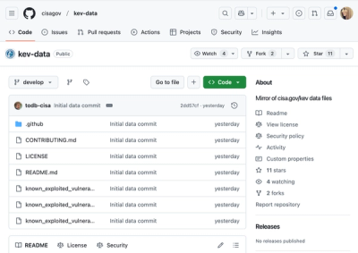
CISA's KEV data is now on GitHub, offering easier access, API integration, commit history tracking, and automated updates for security teams and researchers.