Security News
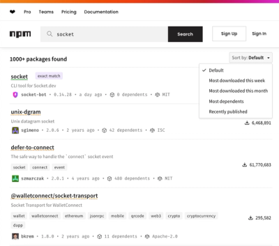
npm Updates Search Experience with New Objective Sorting Options
npm has a revamped search experience with new, more transparent sorting options—Relevance, Downloads, Dependents, and Publish Date.
@react-aria/tabs
Advanced tools
@react-aria/tabs is a library that provides accessible tab components for React applications. It is part of the React Aria collection, which focuses on providing high-quality, accessible UI components. The package helps developers create tabbed interfaces that are compliant with WAI-ARIA standards, ensuring that they are usable by people with disabilities.
Basic Tab Implementation
This code demonstrates a basic implementation of a tabbed interface using @react-aria/tabs. It sets up a tab list with two tabs and their corresponding content.
```jsx
import { useTabListState } from '@react-stately/tabs';
import { useTab, useTabList, useTabPanel } from '@react-aria/tabs';
import { TabList, Tab, TabPanel } from '@react-spectrum/tabs';
function MyTabs() {
let state = useTabListState({
defaultSelectedKey: 'tab1',
children: [
{ key: 'tab1', title: 'Tab 1', children: 'Content 1' },
{ key: 'tab2', title: 'Tab 2', children: 'Content 2' }
]
});
let { tabListProps } = useTabList(state);
return (
<div>
<TabList {...tabListProps}>
{state.collection.map((item) => (
<Tab key={item.key} item={item} state={state} />
))}
</TabList>
<TabPanel key={state.selectedItem.key} state={state} />
</div>
);
}
```Customizable Tabs
This example shows how to customize the appearance of the tabs and tab panels using inline styles. The tabs have a blue color, and the tab list has a light gray background.
```jsx
import { useTabListState } from '@react-stately/tabs';
import { useTab, useTabList, useTabPanel } from '@react-aria/tabs';
import { TabList, Tab, TabPanel } from '@react-spectrum/tabs';

function CustomTabs() {
  let state = useTabListState({
    defaultSelectedKey: 'tab1',
    children: [
      { key: 'tab1', title: 'Tab 1', children: 'Content 1' },
      { key: 'tab2', title: 'Tab 2', children: 'Content 2' }
    ]
  });

  let { tabListProps } = useTabList(state);

  return (
    <div>
      <TabList {...tabListProps} style={{ backgroundColor: 'lightgray' }}>
        {state.collection.map((item) => (
          <Tab key={item.key} item={item} state={state} style={{ color: 'blue' }} />
        ))}
      </TabList>
      <TabPanel key={state.selectedItem.key} state={state} style={{ padding: '10px' }} />
    </div>
  );
}
```
Dynamic Tabs
This example demonstrates how to create dynamic tabs that can be added or removed at runtime. The `addTab` function adds a new tab to the state, and the tab list updates accordingly.
```jsx
import { useState } from 'react';
import { useTabListState } from '@react-stately/tabs';
import { useTab, useTabList, useTabPanel } from '@react-aria/tabs';
import { TabList, Tab, TabPanel } from '@react-spectrum/tabs';

function DynamicTabs() {
  const [tabs, setTabs] = useState([
    { key: 'tab1', title: 'Tab 1', children: 'Content 1' },
    { key: 'tab2', title: 'Tab 2', children: 'Content 2' }
  ]);

  let state = useTabListState({
    defaultSelectedKey: 'tab1',
    children: tabs
  });

  let { tabListProps } = useTabList(state);

  const addTab = () => {
    const newTab = { key: `tab${tabs.length + 1}`, title: `Tab ${tabs.length + 1}`, children: `Content ${tabs.length + 1}` };
    setTabs([...tabs, newTab]);
  };

  return (
    <div>
      <button onClick={addTab}>Add Tab</button>
      <TabList {...tabListProps}>
        {state.collection.map((item) => (
          <Tab key={item.key} item={item} state={state} />
        ))}
      </TabList>
      <TabPanel key={state.selectedItem.key} state={state} />
    </div>
  );
}
```react-tabs is a popular library for creating accessible tabbed interfaces in React. It provides a simple API and is highly customizable. Compared to @react-aria/tabs, react-tabs is more lightweight but may require additional effort to ensure full accessibility compliance.
react-bootstrap is a complete UI framework for React that includes a variety of components, including tabs. It is built on top of Bootstrap and provides a consistent design language. While it offers more components than @react-aria/tabs, it may be heavier and less focused on accessibility.
material-ui is a comprehensive UI library for React that follows Google's Material Design guidelines. It includes a wide range of components, including tabs. It offers a rich set of features and customization options but may be more complex to use compared to @react-aria/tabs.
This package is part of react-spectrum. See the repo for more details.
FAQs
Spectrum UI components in React
The npm package @react-aria/tabs receives a total of 632,646 weekly downloads. As such, @react-aria/tabs popularity was classified as popular.
We found that @react-aria/tabs demonstrated a healthy version release cadence and project activity because the last version was released less than a year ago. It has 2 open source maintainers collaborating on the project.
Did you know?

Socket for GitHub automatically highlights issues in each pull request and monitors the health of all your open source dependencies. Discover the contents of your packages and block harmful activity before you install or update your dependencies.

Security News
npm has a revamped search experience with new, more transparent sorting options—Relevance, Downloads, Dependents, and Publish Date.

Security News
A supply chain attack has been detected in versions 1.95.6 and 1.95.7 of the popular @solana/web3.js library.

Research
Security News
A malicious npm package targets Solana developers, rerouting funds in 2% of transactions to a hardcoded address.