d3-rs-theme
d3-rs-theme color and theme support for charts. Currently, a light theme and dark theme are provided. The light theme is considered the default.
Builds

Script Import
//static.redsift.io/reusable/d3-rs-theme/latest/d3-rs-theme.umd-es2015.min.js
Example
View @redsift/d3-rs-theme on Codepen
Brand color palette

This package includes the Red Sift brand color scheme. These colors are typically only used for UI.
Presentation color palette

Primary use for this package is central access to the Red Sift presentation color scheme.
The colors above represent the d3_rs_theme.presentation10 arrays which is a ordinal color scale. The entries should be used in sequence as they are arranged to provide distinctive contrasts. The primary theme and the one that should be used normally is the standard scale at d3_rs_theme.presentation10.standard. d3_rs_theme.presentation10.darker and d3_rs_theme.presentation10.lighter variations are also provided if options are required. A helper map is also provided at d3_rs_theme.presentation10.names to access the index values of colors by name.
// Example browser usage
let siftBlue = d3_rs_theme.presentation10.standard[d3_rs_theme.presentation10.names.blue];
// siftBlue is the string #73c5eb
Patterns

In addition to colors, the theme module has build in generators for SVG patterns that can be combined with the colors. The patterns are packaged using the reusable chart convention and can be applied by injecting them into the parent SVG and referencing them when required.
// typically use the first pattern, diagonal1
let pattern = d3_rs_theme.diagonals('optional-name', d3_rs_theme.patterns.diagonal1);

// set the foreground to the standard color
pattern.foreground(d3_rs_theme.presentation10.standard[d3_rs_theme.presentation10.names.blue]);

// set the background to the light variant
pattern.background(d3_rs_theme.presentation10.lighter[d3_rs_theme.presentation10.names.blue]);

// add the pattern to the svg (here svg is from d3-rs-svg)
d3.select('body').call(svg).select(svg.self()).call(pattern);

.....

// get the reference for the fill
..append('rect').attr('fill', pattern.url());
Highlights

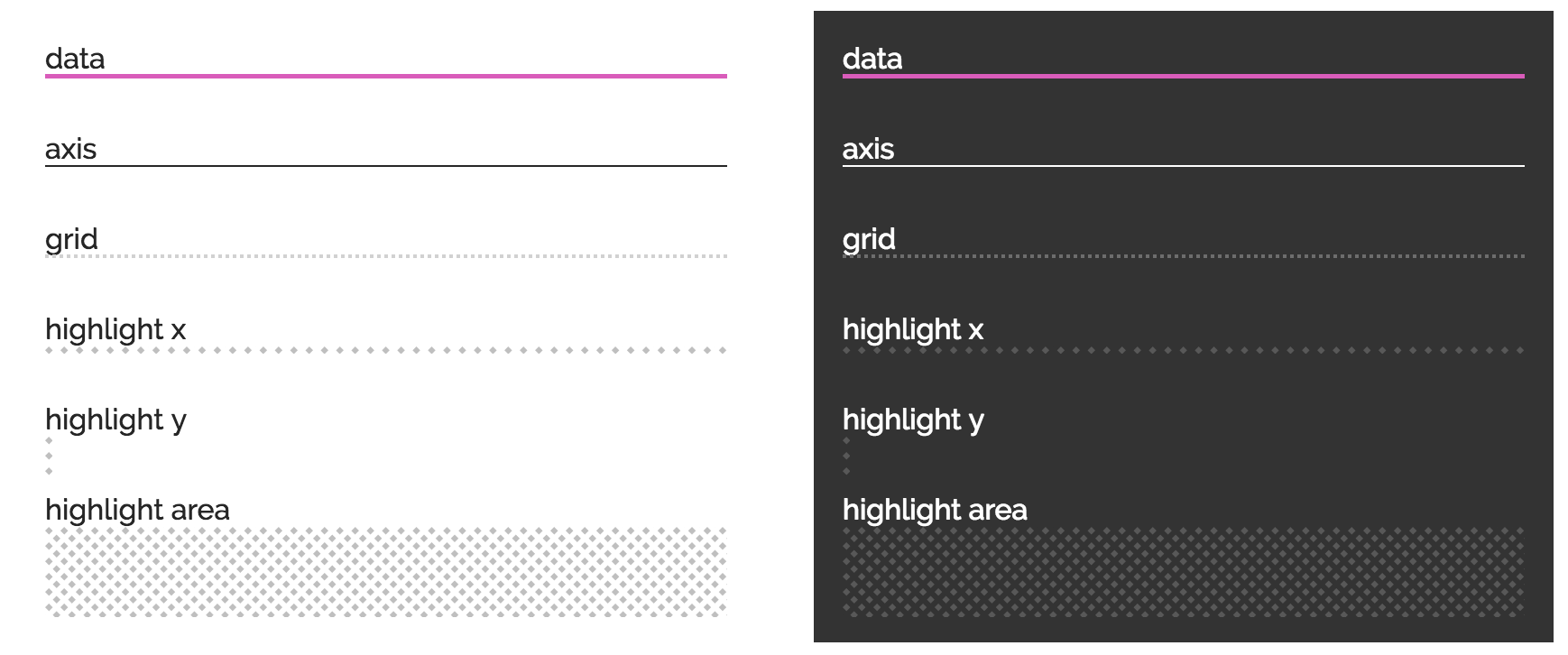
A specific highlight pattern is provided to draw area markers. It can also be used to draw a line marker. Highlights have additional support for pattern alignment so alighment is ensured at the origin.
align() should be used to ensure the width and height sizes also meet these pattern boundaries.
let highlight = d3_rs_theme.highlights('highlight-' + theme);
highlight.foreground(d3_rs_theme.display[theme].highlight);

d3.select('body').call(svg).select(svg.self()).call(highlight);

.....

..append('rect')
	.attr('fill', highlight.url()), // get the reference for the fill
	.attr('width', highlight.align(svg.childWidth())) // size the width to the svg with align
	.attr('height', highlight.align(1)); // size the height to the minimum pattern size
Lines

A number of line styles are provided for data presentation. Colors are under d3_rs_theme.display[theme].axis|grid and the stroke thicknesses are d3_rs_theme.widths.data, d3_rs_theme.widths.axis and d3_rs_theme.widths.grid. Additionally the grid line has a dash style that is applied to the style attribute stroke-dasharray under d3_rs_theme.dashes.grid.
Remember to use the CSS style shape-rendering: crispEdges for lines and paths that you know are straight e.g. grids and axis lines.
Fonts

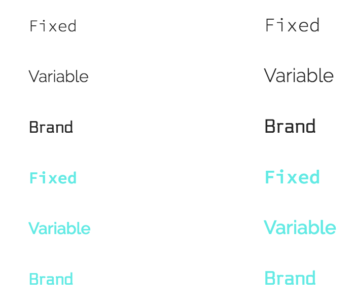
Fixed width, variable width and brand fonts are provided with sane fallbacks. Using these fonts will first required a CSS import.
let svg = d3_rs_svg.html()...;
svg.style([
          d3_rs_theme.fonts.variable.cssImport,
          `${svg.self()} text { font-family: ${d3_rs_theme.fonts.variable.family}; fill: ${d3_rs_theme.display[theme].text};  }`
        ].join('\n'));
Font sizes are calculated based on the available SVG width via the function fontSizeForWidth().
Animations

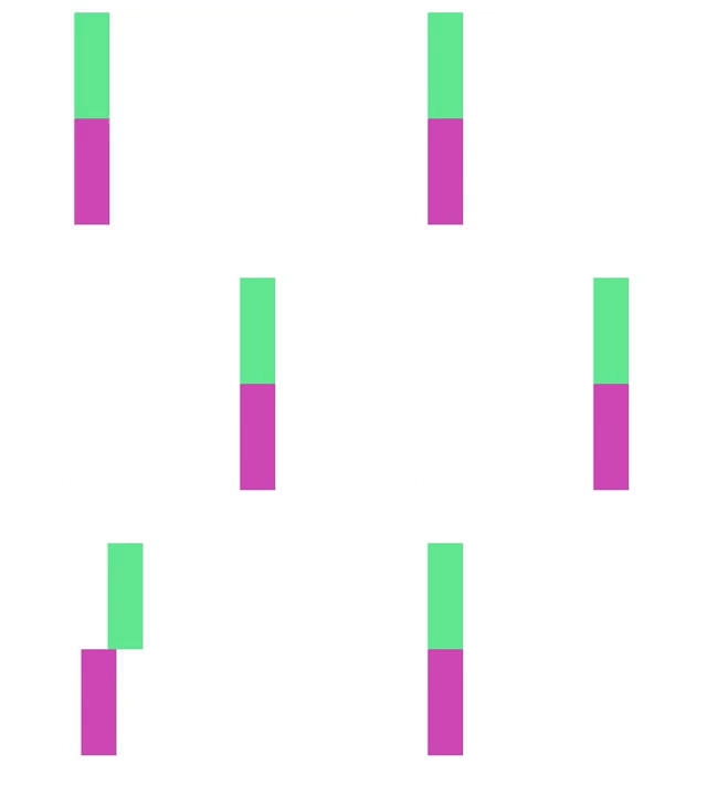
A custom easing function is provided to animate transitions. This is primarily for motion as opposed to fades or other transitions.
// set the x value on the rect using the custom duration and easing
rect.transition().duration(d3_rs_theme.duration).ease(d3_rs_theme.easing()).attr('x', newValue);
Filters
SVG filters can be programatically created and applied to elements. Like patterns, the filters need to be injected into the DOM before they can be used.
// Typically applied using the filter attribute
..append('image')
	.attr('xlink:href', url)
	.attr('filter', filter.url());
greyscale()
Drains an image of color.
emboss()
Creates a near monochrome embossed image. Typically used for presenting logo quilts.
Other tools
You can create a theme shadow for SVG elements using d3_rs_theme.shadow() in a manner similar to patterns.
Check text color legibility using the d3_rs_theme.contrasts.white() function. It will return false if the color provided will not provide adequate contrast with white text.
// fill with white or black text depending on the value of color
let t = d3_rs_theme.contrasts.white(color) ?
		d3_rs_theme.display.text.white : d3_rs_theme.display.text.black;
text.attr('fill', t);
ES6 Usage
If you are using rollup or a suitable es6 module compatible system, you benefit from tree shaking.
import {
	random as random,
	contrasts as contrasts,
	presentation10 as presentation10
} from '@redsift/d3-rs-theme';

// make a random theme color function based on the standard presentation10 with grey filtered out. because reasons.
let colors = random(presentation10.standard.filter((e, i) => i !== presentation10.names.grey));

// get a random rgb string
let rgb = colors();

// get a random color as a function of the string 'hashme'
let rgb = colors('hashme');
Acknowledgements
This uses code from https://github.com/MoOx/color-convert under MIT
This uses thinking from http://hci.stanford.edu/~cagatay/projects/pk/perceptual-kernels.pdf


