

Security News
Oracle Drags Its Feet in the JavaScript Trademark Dispute
Oracle seeks to dismiss fraud claims in the JavaScript trademark dispute, delaying the case and avoiding questions about its right to the name.
By Sarah Gooding - Feb 07, 2025
@schlomoh/react-cookieconsent
Advanced tools
npm install @schlomoh/react-cookieConsent
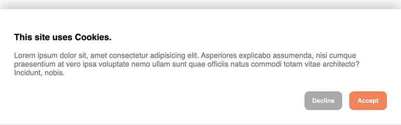
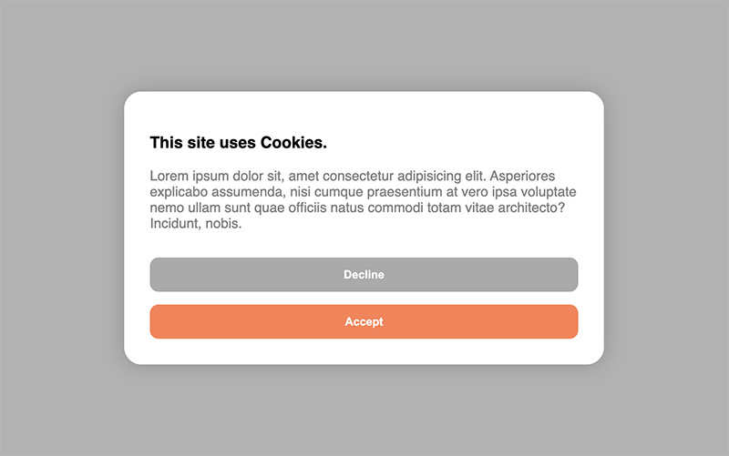
You can either use the Banner right out of the box without setting any properties or completely customize either one of the consent components in your own taste.
import {CookieModal} from '@schlomoh/react-cookieConsent'

const MyApp = () => (
    <>
        <CookieBanner > // above the rest of the page
        <MyPage />
    </>
)
import {CookieBanner} from '@schlomoh/react-cookieConsent'

const MyApp = () => (
    <>
        <CookieModal > // above the rest of the page
        <MyPage />
    </>
)
(all properties work for both modal and banner)
...
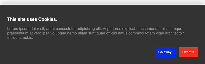
const Content = () => (
<>
<h3>I'm using cookies on my site.</h3>
<p>Bla Bla Bla this is my own informational text.</p>
</>
)
const containerStyle = {backgroundColor: '#333'};
const buttonStyle = {borderRadius: 0}
const primaryButtonStyle={...buttonStyle, backgroundColoe:'red'}
const secondaryButtonStyle={...buttonStyle, backgroundColoe:'blue'}
const MyApp = () => (
<>
<CookieBanner
acceptButtonText='I want it'
declineButtonText='Go away'
headingColor='white'
paragraphColor='grey'
containerStyle={containerStyle}
primaryButtonStyle={primaryButtonStyle}
secondaryButtonStyle={secondaryButtonStyle}
infoContent={<Content />}
/>
<MyPage />
</>
)
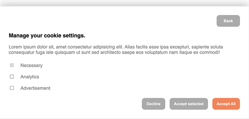
To let a visitor select their cookie preferences the property enableManagement has to be set to true.
You can then set an array of cookie categories which the user can select from. There is always the category "Necessary" predefined and set to true and disabled by default.
When enableManagement is set you can also override the default text of the button by setting managementButtonText='whatever'. This button is a secondary button.
<>
    <CookieBanner
        enableManagement
        managementButtonText='whatever'
        cookieCategories={['analytics', 'advertisement']}
    />
</>
You can define the callbacks which are called on either accept or decline. Simply pass a function into the onAccept or onDecline property which gets executed accordingly.
The onAccept event can pass an object with the selected cookies as ICookieObject into your accept callback.
const onAccept = (cookies : ICookieObject) => {
    console.log(cookies);
};

const onDecline = () => {
    console.log('declined');
}

const App = () => (
    <>
        <CookieBanner
        onAccept={onAccept}
        onDecline={onDecline}
        />
    <>
)
| Prop | Type | Default | Description |
|---|---|---|---|
| onAccept | function(cookies?: ICookieObject){} | ()=>{} | Function called when user clicks "accept" |
| onDecline | function(){} | ()=>{} | Function called when user clicks "decline" |
| infoContent | JSX.Element | - | A JSX component that should contain the heading and paragraph of the greeting view |
| managementContent | JSX.Element | - | A JSX component rendered in the management view above the cookie checkboxes best containing heading and paragraph text. |
| acceptButtonText | string | "Accept" | String displayed in the accept button |
| declineButtonText | string | "Decline" | String displayed in the decline button |
| managementButtonText | string | "Manage Cookies" | String displayed in the management toggle button |
| enableManagement | boolean | false | Set to true to display the third button which toggles the management view (where visitors select their cookie preferences). |
| cookieCategories | string[] (array of strings) | [] | An array listing the available cookie preferences to choose from. |
| accentColor | string (React.CSSProperties.backgroundColor) | 'coral' | The accent color used for the primary butttons |
| headingColor | string (React.CSSProperties.color) | 'black' | The color applied to h1, h2, h3, h4 elements inside the views |
| paragraphColor | string (React.CSSProperties.color) | 'grey' | The color applied to p elements inside the views |
| containerStyle | object (React.CSSProperties) | - | Style object overriding the banner or modal style |
| primaryButtonStyle | object (React.CSSProperties) | - | Style object overriding the primary buttons' style |
| secondaryButtonStyle | object (React.CSSProperties) | - | Style object overriding the secondary buttons' style |
FAQs
Cookie consent components written in typescript and react. Usable with only one line of code.
The npm package @schlomoh/react-cookieconsent receives a total of 80 weekly downloads. As such, @schlomoh/react-cookieconsent popularity was classified as not popular.
We found that @schlomoh/react-cookieconsent demonstrated a not healthy version release cadence and project activity because the last version was released a year ago. It has 1 open source maintainer collaborating on the project.
Did you know?

Socket for GitHub automatically highlights issues in each pull request and monitors the health of all your open source dependencies. Discover the contents of your packages and block harmful activity before you install or update your dependencies.
Security News
Oracle seeks to dismiss fraud claims in the JavaScript trademark dispute, delaying the case and avoiding questions about its right to the name.

Security News
The Linux Foundation is warning open source developers that compliance with global sanctions is mandatory, highlighting legal risks and restrictions on contributions.

Security News
Maven Central now validates Sigstore signatures, making it easier for developers to verify the provenance of Java packages.