Research
Security News
Threat Actor Exposes Playbook for Exploiting npm to Build Blockchain-Powered Botnets
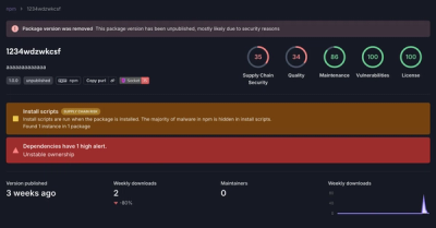
A threat actor's playbook for exploiting the npm ecosystem was exposed on the dark web, detailing how to build a blockchain-powered botnet.
@spectrum-web-components/action-button
Advanced tools
An `<sp-action-button>` represents an action a user can take.
An <sp-action-button> represents an action a user can take.
yarn add @spectrum-web-components/action-button
Import the side effectful registration of <sp-action-button> via:
import '@spectrum-web-components/action-button/sp-action-button.js';
When looking to leverage the ActionButton base class as a type and/or for extension purposes, do so via:
import { ActionButton } from '@spectrum-web-components/action-button';
<sp-action-group size="xs">
    <sp-action-button>Edit</sp-action-button>
    <sp-action-button>
        <sp-icon-edit slot="icon"></sp-icon-edit>
        Edit
    </sp-action-button>
    <sp-action-button>
        <sp-icon-edit slot="icon"></sp-icon-edit>
    </sp-action-button>
    <sp-action-button hold-affordance>
        <sp-icon-edit slot="icon"></sp-icon-edit>
    </sp-action-button>
</sp-action-group>
<sp-action-group size="s">
    <sp-action-button>Edit</sp-action-button>
    <sp-action-button>
        <sp-icon-edit slot="icon"></sp-icon-edit>
        Edit
    </sp-action-button>
    <sp-action-button>
        <sp-icon-edit slot="icon"></sp-icon-edit>
    </sp-action-button>
    <sp-action-button hold-affordance>
        <sp-icon-edit slot="icon"></sp-icon-edit>
    </sp-action-button>
</sp-action-group>
<sp-action-group size="m">
    <sp-action-button>Edit</sp-action-button>
    <sp-action-button>
        <sp-icon-edit slot="icon"></sp-icon-edit>
        Edit
    </sp-action-button>
    <sp-action-button>
        <sp-icon-edit slot="icon"></sp-icon-edit>
    </sp-action-button>
    <sp-action-button hold-affordance>
        <sp-icon-edit slot="icon"></sp-icon-edit>
    </sp-action-button>
</sp-action-group>
<sp-action-group size="l">
    <sp-action-button>Edit</sp-action-button>
    <sp-action-button>
        <sp-icon-edit slot="icon"></sp-icon-edit>
        Edit
    </sp-action-button>
    <sp-action-button>
        <sp-icon-edit slot="icon"></sp-icon-edit>
    </sp-action-button>
    <sp-action-button hold-affordance>
        <sp-icon-edit slot="icon"></sp-icon-edit>
    </sp-action-button>
</sp-action-group>
<sp-action-group size="xl">
    <sp-action-button>Edit</sp-action-button>
    <sp-action-button>
        <sp-icon-edit slot="icon"></sp-icon-edit>
        Edit
    </sp-action-button>
    <sp-action-button>
        <sp-icon-edit slot="icon"></sp-icon-edit>
    </sp-action-button>
    <sp-action-button hold-affordance>
        <sp-icon-edit slot="icon"></sp-icon-edit>
    </sp-action-button>
</sp-action-group>
The <sp-action-button> can be customized with either or both of the emphasized and quiet attributes. These will pair with either or both of the state attributes (selected and disabled) to decide the final visual delivery of the <sp-action-button>. Content addressed to the icon slot can also be provided and will be positioned just before the rest of the the supplied button content.
<div
    style="display: grid; grid-template-columns: repeat(auto-fill, minmax(210px, 1fr)); gap: 2em;"
>
    <div>
        <sp-field-label for="standard">Default</sp-field-label>
        <sp-action-group id="standard">
            <sp-action-button>Edit</sp-action-button>
            <sp-action-button>
                <sp-icon-edit slot="icon"></sp-icon-edit>
                Edit
            </sp-action-button>
            <sp-action-button>
                <sp-icon-edit slot="icon"></sp-icon-edit>
            </sp-action-button>
            <sp-action-button hold-affordance>
                <sp-icon-edit slot="icon"></sp-icon-edit>
            </sp-action-button>
        </sp-action-group>
    </div>

    <div>
        <sp-field-label for="standard-selected">Selected</sp-field-label>
        <sp-action-group id="standard-selected">
            <sp-action-button selected>Edit</sp-action-button>
            <sp-action-button selected>
                <sp-icon-edit slot="icon"></sp-icon-edit>
                Edit
            </sp-action-button>
            <sp-action-button selected>
                <sp-icon-edit slot="icon"></sp-icon-edit>
            </sp-action-button>
            <sp-action-button selected hold-affordance>
                <sp-icon-edit slot="icon"></sp-icon-edit>
            </sp-action-button>
        </sp-action-group>
    </div>

    <div>
        <sp-field-label for="standard-disabled">Disabled</sp-field-label>
        <sp-action-group id="standard-disabled">
            <sp-action-button disabled>Edit</sp-action-button>
            <sp-action-button disabled>
                <sp-icon-edit slot="icon"></sp-icon-edit>
                Edit
            </sp-action-button>
            <sp-action-button disabled>
                <sp-icon-edit slot="icon"></sp-icon-edit>
            </sp-action-button>
            <sp-action-button disabled hold-affordance>
                <sp-icon-edit slot="icon"></sp-icon-edit>
            </sp-action-button>
        </sp-action-group>
    </div>

    <div>
        <sp-field-label for="standard-disabled-selected">
            Disabled + Selected
        </sp-field-label>
        <sp-action-group id="standard-disabled-selected">
            <sp-action-button disabled selected>Edit</sp-action-button>
            <sp-action-button disabled selected>
                <sp-icon-edit slot="icon"></sp-icon-edit>
                Edit
            </sp-action-button>
            <sp-action-button disabled selected>
                <sp-icon-edit slot="icon"></sp-icon-edit>
            </sp-action-button>
            <sp-action-button disabled selected hold-affordance>
                <sp-icon-edit slot="icon"></sp-icon-edit>
            </sp-action-button>
        </sp-action-group>
    </div>
</div>
<div
    style="display: grid; grid-template-columns: repeat(auto-fill, minmax(210px, 1fr)); gap: 2em;"
>
    <div>
        <sp-field-label for="standard">Default</sp-field-label>
        <sp-action-group quiet id="standard">
            <sp-action-button quiet>Edit</sp-action-button>
            <sp-action-button quiet>
                <sp-icon-edit slot="icon"></sp-icon-edit>
                Edit
            </sp-action-button>
            <sp-action-button quiet>
                <sp-icon-edit slot="icon"></sp-icon-edit>
            </sp-action-button>
            <sp-action-button quiet hold-affordance>
                <sp-icon-edit slot="icon"></sp-icon-edit>
            </sp-action-button>
        </sp-action-group>
    </div>

    <div>
        <sp-field-label for="standard-selected">Selected</sp-field-label>
        <sp-action-group quiet id="standard-selected">
            <sp-action-button quiet selected>Edit</sp-action-button>
            <sp-action-button quiet selected>
                <sp-icon-edit slot="icon"></sp-icon-edit>
                Edit
            </sp-action-button>
            <sp-action-button quiet selected>
                <sp-icon-edit slot="icon"></sp-icon-edit>
            </sp-action-button>
            <sp-action-button quiet selected hold-affordance>
                <sp-icon-edit slot="icon"></sp-icon-edit>
            </sp-action-button>
        </sp-action-group>
    </div>

    <div>
        <sp-field-label for="standard-disabled">Disabled</sp-field-label>
        <sp-action-group quiet id="standard-disabled">
            <sp-action-button quiet disabled>Edit</sp-action-button>
            <sp-action-button quiet disabled>
                <sp-icon-edit slot="icon"></sp-icon-edit>
                Edit
            </sp-action-button>
            <sp-action-button quiet disabled>
                <sp-icon-edit slot="icon"></sp-icon-edit>
            </sp-action-button>
            <sp-action-button quiet disabled hold-affordance>
                <sp-icon-edit slot="icon"></sp-icon-edit>
            </sp-action-button>
        </sp-action-group>
    </div>

    <div>
        <sp-field-label for="standard-disabled-selected">
            Disabled + Selected
        </sp-field-label>
        <sp-action-group quiet id="standard-disabled-selected">
            <sp-action-button quiet disabled selected>Edit</sp-action-button>
            <sp-action-button quiet disabled selected>
                <sp-icon-edit slot="icon"></sp-icon-edit>
                Edit
            </sp-action-button>
            <sp-action-button quiet disabled selected>
                <sp-icon-edit slot="icon"></sp-icon-edit>
            </sp-action-button>
            <sp-action-button quiet disabled selected hold-affordance>
                <sp-icon-edit slot="icon"></sp-icon-edit>
            </sp-action-button>
        </sp-action-group>
    </div>
</div>
<div
    style="display: grid; grid-template-columns: repeat(auto-fill, minmax(210px, 1fr)); gap: 2em;"
>
    <div>
        <sp-field-label for="standard">Default</sp-field-label>
        <sp-action-group emphasized id="standard">
            <sp-action-button emphasized>Edit</sp-action-button>
            <sp-action-button emphasized>
                <sp-icon-edit slot="icon"></sp-icon-edit>
                Edit
            </sp-action-button>
            <sp-action-button emphasized>
                <sp-icon-edit slot="icon"></sp-icon-edit>
            </sp-action-button>
            <sp-action-button emphasized hold-affordance>
                <sp-icon-edit slot="icon"></sp-icon-edit>
            </sp-action-button>
        </sp-action-group>
    </div>

    <div>
        <sp-field-label for="standard-selected">Selected</sp-field-label>
        <sp-action-group emphasized id="standard-selected">
            <sp-action-button emphasized selected>Edit</sp-action-button>
            <sp-action-button emphasized selected>
                <sp-icon-edit slot="icon"></sp-icon-edit>
                Edit
            </sp-action-button>
            <sp-action-button emphasized selected>
                <sp-icon-edit slot="icon"></sp-icon-edit>
            </sp-action-button>
            <sp-action-button emphasized selected hold-affordance>
                <sp-icon-edit slot="icon"></sp-icon-edit>
            </sp-action-button>
        </sp-action-group>
    </div>

    <div>
        <sp-field-label for="standard-disabled">Disabled</sp-field-label>
        <sp-action-group emphasized id="standard-disabled">
            <sp-action-button emphasized disabled>Edit</sp-action-button>
            <sp-action-button emphasized disabled>
                <sp-icon-edit slot="icon"></sp-icon-edit>
                Edit
            </sp-action-button>
            <sp-action-button emphasized disabled>
                <sp-icon-edit slot="icon"></sp-icon-edit>
            </sp-action-button>
            <sp-action-button emphasized disabled hold-affordance>
                <sp-icon-edit slot="icon"></sp-icon-edit>
            </sp-action-button>
        </sp-action-group>
    </div>

    <div>
        <sp-field-label for="standard-disabled-selected">
            Disabled + Selected
        </sp-field-label>
        <sp-action-group emphasized id="standard-disabled-selected">
            <sp-action-button emphasized disabled selected>
                Edit
            </sp-action-button>
            <sp-action-button emphasized disabled selected>
                <sp-icon-edit slot="icon"></sp-icon-edit>
                Edit
            </sp-action-button>
            <sp-action-button emphasized disabled selected>
                <sp-icon-edit slot="icon"></sp-icon-edit>
            </sp-action-button>
            <sp-action-button emphasized disabled selected hold-affordance>
                <sp-icon-edit slot="icon"></sp-icon-edit>
            </sp-action-button>
        </sp-action-group>
    </div>
</div>
<div
    style="display: grid; grid-template-columns: repeat(auto-fill, minmax(210px, 1fr)); gap: 2em;"
>
    <div>
        <sp-field-label for="standard">Default</sp-field-label>
        <sp-action-group emphasized quiet id="standard">
            <sp-action-button emphasized quiet>Edit</sp-action-button>
            <sp-action-button emphasized quiet>
                <sp-icon-edit slot="icon"></sp-icon-edit>
                Edit
            </sp-action-button>
            <sp-action-button emphasized quiet>
                <sp-icon-edit slot="icon"></sp-icon-edit>
            </sp-action-button>
            <sp-action-button emphasized quiet hold-affordance>
                <sp-icon-edit slot="icon"></sp-icon-edit>
            </sp-action-button>
        </sp-action-group>
    </div>

    <div>
        <sp-field-label for="standard-selected">Selected</sp-field-label>
        <sp-action-group emphasized quiet id="standard-selected">
            <sp-action-button emphasized quiet selected>Edit</sp-action-button>
            <sp-action-button emphasized quiet selected>
                <sp-icon-edit slot="icon"></sp-icon-edit>
                Edit
            </sp-action-button>
            <sp-action-button emphasized quiet selected>
                <sp-icon-edit slot="icon"></sp-icon-edit>
            </sp-action-button>
            <sp-action-button emphasized quiet selected hold-affordance>
                <sp-icon-edit slot="icon"></sp-icon-edit>
            </sp-action-button>
        </sp-action-group>
    </div>

    <div>
        <sp-field-label for="standard-disabled">Disabled</sp-field-label>
        <sp-action-group emphasized quiet id="standard-disabled">
            <sp-action-button emphasized quiet disabled>Edit</sp-action-button>
            <sp-action-button emphasized quiet disabled>
                <sp-icon-edit slot="icon"></sp-icon-edit>
                Edit
            </sp-action-button>
            <sp-action-button emphasized quiet disabled>
                <sp-icon-edit slot="icon"></sp-icon-edit>
            </sp-action-button>
            <sp-action-button emphasized quiet disabled hold-affordance>
                <sp-icon-edit slot="icon"></sp-icon-edit>
            </sp-action-button>
        </sp-action-group>
    </div>

    <div>
        <sp-field-label for="standard-disabled-selected">
            Disabled + Selected
        </sp-field-label>
        <sp-action-group emphasized quiet id="standard-disabled-selected">
            <sp-action-button emphasized quiet disabled selected>
                Edit
            </sp-action-button>
            <sp-action-button emphasized quiet disabled selected>
                <sp-icon-edit slot="icon"></sp-icon-edit>
                Edit
            </sp-action-button>
            <sp-action-button emphasized quiet disabled selected>
                <sp-icon-edit slot="icon"></sp-icon-edit>
            </sp-action-button>
            <sp-action-button
                emphasized
                quiet
                disabled
                selected
                hold-affordance
            >
                <sp-icon-edit slot="icon"></sp-icon-edit>
            </sp-action-button>
        </sp-action-group>
    </div>
</div>
The use of the hold-affordance attribute signifies that the <sp-action-button> in question will be delivered with a visual affordance outlining that special interaction with the button will dispatch a longpress event. Via a pointer input, this even will be dispatched when 300ms has passed after a pointerdown event without the presence of a pointerup or pointercancel event. Via the keyboard, an event with a code of Space or or ArrowDown while altKey === true will dispatch the event.
<div
    style="display: grid; grid-template-columns: repeat(auto-fill, minmax(200px, 1fr)); gap: 2em;"
>
    <overlay-trigger placement="bottom-start">
        <sp-action-button label="Edit" hold-affordance slot="trigger">
            <sp-icon-edit slot="icon"></sp-icon-edit>
        </sp-action-button>
        <sp-popover slot="longpress-content" dialog tip>
            <p style="color: var(--spectrum-neutral-content-color-default);">
                This content is triggered by the "longpress" interaction.
            </p>
        </sp-popover>
    </overlay-trigger>

    <overlay-trigger placement="top">
        <sp-action-button hold-affordance quiet slot="trigger">
            Show Longpress Content
        </sp-action-button>
        <sp-popover slot="longpress-content" dialog tip>
            <p style="color: var(--spectrum-neutral-content-color-default);">
                This content is triggered by the "longpress" interaction.
            </p>
        </sp-popover>
    </overlay-trigger>

    <overlay-trigger placement="top-end">
        <sp-action-button hold-affordance selected slot="trigger">
            <sp-icon-edit slot="icon"></sp-icon-edit>
            Extended Content with Longpress
        </sp-action-button>
        <sp-popover slot="longpress-content" dialog tip>
            <p style="color: var(--spectrum-neutral-content-color-default);">
                This content is triggered by the "longpress" interaction.
            </p>
        </sp-popover>
    </overlay-trigger>
</div>
With the application of the toggles attribute, the button will self manage its selected property on click. When this value is updated, a cancellable change event will be dispatched to inform the parent application.
<div
    style="display: grid; grid-template-columns: repeat(auto-fill, minmax(100px, 1fr)); gap: 2em;"
>
    <div>
        <sp-field-label for="toggles-default">Standard</sp-field-label>
        <sp-action-button toggles id="toggles-default">
            Toggle button
        </sp-action-button>
    </div>
    <div>
        <sp-field-label for="toggles-quiet">Quiet</sp-field-label>
        <sp-action-button toggles quiet id="toggles-quiet">
            Toggle button
        </sp-action-button>
    </div>
    <div>
        <sp-field-label for="toggles-emphasized">Emphasized</sp-field-label>
        <sp-action-button toggles emphasized id="toggles-emphasized">
            Toggle button
        </sp-action-button>
    </div>
    <div>
        <sp-field-label for="toggles-emphasized-quiet">
            Emphasized + Quiet
        </sp-field-label>
        <sp-action-button
            toggles
            emphasized
            quiet
            id="toggles-emphasized-quiet"
        >
            Toggle button
        </sp-action-button>
    </div>
</div>
FAQs
An `<sp-action-button>` represents an action a user can take.
The npm package @spectrum-web-components/action-button receives a total of 5,808 weekly downloads. As such, @spectrum-web-components/action-button popularity was classified as popular.
We found that @spectrum-web-components/action-button demonstrated a healthy version release cadence and project activity because the last version was released less than a year ago. It has 0 open source maintainers collaborating on the project.
Did you know?

Socket for GitHub automatically highlights issues in each pull request and monitors the health of all your open source dependencies. Discover the contents of your packages and block harmful activity before you install or update your dependencies.

Research
Security News
A threat actor's playbook for exploiting the npm ecosystem was exposed on the dark web, detailing how to build a blockchain-powered botnet.

Security News
NVD’s backlog surpasses 20,000 CVEs as analysis slows and NIST announces new system updates to address ongoing delays.

Security News
Research
A malicious npm package disguised as a WhatsApp client is exploiting authentication flows with a remote kill switch to exfiltrate data and destroy files.