Security News
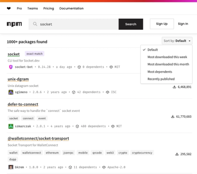
npm Updates Search Experience with New Objective Sorting Options
npm has a revamped search experience with new, more transparent sorting options—Relevance, Downloads, Dependents, and Publish Date.
@spectrum-web-components/action-menu
Advanced tools
An `<sp-action-menu>` is an action button with a Popover. Use an `<sp-menu>` element to outline the items that will be made available to the user when interacting with the `sp-action-menu` element.
An <sp-action-menu> is an action button with a Popover. Use an <sp-menu> element to outline the items that will be made available to the user when interacting with the sp-action-menu element.
yarn add @spectrum-web-components/action-menu
Import the side effectful registration of <sp-action-menu> via:
import '@spectrum-web-components/action-menu/sp-action-menu.js';
When looking to leverage the ActionMenu base class as a type and/or for extension purposes, do so via:
import { ActionMenu } from '@spectrum-web-components/action-menu';
<sp-action-menu>
    <span slot="label">More Actions</span>
    <sp-menu-item>
        Deselect
    </sp-menu-item>
    <sp-menu-item>
        Select inverse
    </sp-menu-item>
    <sp-menu-item>
        Feather...
    </sp-menu-item>
    <sp-menu-item>
        Select and mask...
    </sp-menu-item>
    <sp-menu-divider></sp-menu-divider>
    <sp-menu-item>
        Save selection
    </sp-menu-item>
    <sp-menu-item disabled>
        Make work path
    </sp-menu-item>
</sp-action-menu>
The visible label that is be provided via the default <slot> interface can be ommitted in preference of an icon only interface. In this context be sure that the <sp-action-menu> continued to be accessible to screen readers by applying the label attribute. This will apply an aria-label attribute of the same value to the <button> element that toggles the menu list.
<sp-action-menu label="More Actions">
    <sp-menu-item>
        Deselect
    </sp-menu-item>
    <sp-menu-item>
        Select inverse
    </sp-menu-item>
    <sp-menu-item>
        Feather...
    </sp-menu-item>
    <sp-menu-item>
        Select and mask...
    </sp-menu-item>
    <sp-menu-divider></sp-menu-divider>
    <sp-menu-item>
        Save selection
    </sp-menu-item>
    <sp-menu-item disabled>
        Make work path
    </sp-menu-item>
</sp-action-menu>
A custom icon can be supplied via the icon slot in order to replace the default meatballs icon.
<sp-action-menu label="More actions">
    <sp-icon slot="icon" size="m"><svg xmlns="http://www.w3.org/2000/svg" height="18" viewBox="0 0 18 18" width="18"><rect id="Canvas" fill="#ff13dc" opacity="0" width="18" height="18" /><path class="a" d="M16.45,7.8965H14.8945a5.97644,5.97644,0,0,0-.921-2.2535L15.076,4.54a.55.55,0,0,0,.00219-.77781L15.076,3.76l-.8365-.836a.55.55,0,0,0-.77781-.00219L13.4595,2.924,12.357,4.0265a5.96235,5.96235,0,0,0-2.2535-.9205V1.55a.55.55,0,0,0-.55-.55H8.45a.55.55,0,0,0-.55.55V3.106a5.96235,5.96235,0,0,0-2.2535.9205l-1.1-1.1025a.55.55,0,0,0-.77781-.00219L3.7665,2.924,2.924,3.76a.55.55,0,0,0-.00219.77781L2.924,4.54,4.0265,5.643a5.97644,5.97644,0,0,0-.921,2.2535H1.55a.55.55,0,0,0-.55.55V9.55a.55.55,0,0,0,.55.55H3.1055a5.967,5.967,0,0,0,.921,2.2535L2.924,13.4595a.55.55,0,0,0-.00219.77782l.00219.00218.8365.8365a.55.55,0,0,0,.77781.00219L4.5405,15.076,5.643,13.9735a5.96235,5.96235,0,0,0,2.2535.9205V16.45a.55.55,0,0,0,.55.55H9.55a.55.55,0,0,0,.55-.55V14.894a5.96235,5.96235,0,0,0,2.2535-.9205L13.456,15.076a.55.55,0,0,0,.77782.00219L14.236,15.076l.8365-.8365a.55.55,0,0,0,.00219-.77781l-.00219-.00219L13.97,12.357a5.967,5.967,0,0,0,.921-2.2535H16.45a.55.55,0,0,0,.55-.55V8.45a.55.55,0,0,0-.54649-.55349ZM11.207,9A2.207,2.207,0,1,1,9,6.793H9A2.207,2.207,0,0,1,11.207,9Z" /></svg></sp-icon>
    <span slot="label">Actions under the gear</span>
    <sp-menu-item>
        Deselect
    </sp-menu-item>
    <sp-menu-item>
        Select inverse
    </sp-menu-item>
    <sp-menu-item>
        Feather...
    </sp-menu-item>
    <sp-menu-item>
        Select and mask...
    </sp-menu-item>
    <sp-menu-divider></sp-menu-divider>
    <sp-menu-item>
        Save selection
    </sp-menu-item>
    <sp-menu-item disabled>
        Make work path
    </sp-menu-item>
</sp-action-menu>
An <sp-action-menu> parent will ensure that the internal <sp-menu> features a role of listbox and contains children with the role option. Upon focusing the <sp-action-menu> using ArrowDown will also open the menu while throwing focus into first selected (or unselected when none are selected) menu item to assist in selecting of a new value.
FAQs
An `<sp-action-menu>` is an action button that triggers an overlay with `<sp-menu-items>` for activation. Use an `<sp-menu>` element to outline the items that will be made available to the user when interacting with the `<sp-action-menu>` element. By defa
The npm package @spectrum-web-components/action-menu receives a total of 2,326 weekly downloads. As such, @spectrum-web-components/action-menu popularity was classified as popular.
We found that @spectrum-web-components/action-menu demonstrated a healthy version release cadence and project activity because the last version was released less than a year ago. It has 0 open source maintainers collaborating on the project.
Did you know?

Socket for GitHub automatically highlights issues in each pull request and monitors the health of all your open source dependencies. Discover the contents of your packages and block harmful activity before you install or update your dependencies.

Security News
npm has a revamped search experience with new, more transparent sorting options—Relevance, Downloads, Dependents, and Publish Date.

Security News
A supply chain attack has been detected in versions 1.95.6 and 1.95.7 of the popular @solana/web3.js library.

Research
Security News
A malicious npm package targets Solana developers, rerouting funds in 2% of transactions to a hardcoded address.