Research
Security News
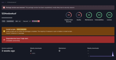
Threat Actor Exposes Playbook for Exploiting npm to Build Blockchain-Powered Botnets
A threat actor's playbook for exploiting the npm ecosystem was exposed on the dark web, detailing how to build a blockchain-powered botnet.
@spectrum-web-components/help-text
Advanced tools
Web component implementation of a Spectrum design HelpText
An <sp-help-text> provides either an informative description or an error message that gives more context about what a user needs to input. It's commonly used in forms.
yarn add @spectrum-web-components/help-text
Import the side effectful registration of <sp-help-text> via:
import '@spectrum-web-components/help-text/sp-help-text.js';
When looking to leverage the HelpText base class as a type and/or for extension purposes, do so via:
import { HelpText } from '@spectrum-web-components/help-text';
Good descriptive help text includes 1-2 short sentences information such as:
<sp-field-label size="s" for="size-s">Password</sp-field-label>
<sp-textfield size="s" id="size-s" type="password">
    <sp-help-text size="s" slot="help-text">
        Create a password with at least 8 characters.
    </sp-help-text>
</sp-textfield>
<sp-field-label size="m" for="size-m">Password</sp-field-label>
<sp-textfield size="m" id="size-m" type="password">
    <sp-help-text size="m" slot="help-text">
        Create a password with at least 8 characters.
    </sp-help-text>
</sp-textfield>
<sp-field-label size="l" for="size-l">Password</sp-field-label>
<sp-textfield size="l" id="size-l" type="password">
    <sp-help-text size="l" slot="help-text">
        Create a password with at least 8 characters.
    </sp-help-text>
</sp-textfield>
<sp-field-label size="xl" for="size-xl">Password</sp-field-label>
<sp-textfield size="xl" id="size-xl" type="password">
    <sp-help-text size="xl" slot="help-text">
        Create a password with at least 8 characters.
    </sp-help-text>
</sp-textfield>
The negative variant of <sp-help-text> is used to convey error messages.
Help text displays either a description (the neutral variant) or an error message (the negative variant) in the same space. When a description is present and an error is triggered, it is replaced with an error message. Once the error is resolved, the help text description reappears.
Since one gets replaced by the other, the language of the help text description and the error need to work together to convey the same messaging. The description text explains the requirements or adds supplementary context for how to successfully interact with a component. The error message text tells a user how to fix the error by re-stating the interaction requirements. Make sure that the help text description and error message include the same essential information so that it isn’t lost if one replaces the other.
Communicate error messages in a human-centered way by guiding a user and showing them a solution — don’t simply state what’s wrong and then leave them guessing as to how to resolve it. Ambiguous error messages can be frustrating and even shame-inducing for users. Also, keep in mind that something that a system may deem an error may not actually be perceived as an error to a user.
For help text, usually the error is related to something that needs to be fixed for in-line validation, so a helpful tone is most appropriate. For example, if someone were to miss filling out a required field that asks for their email address, write the error text like you’re offering a hint or a tip to help guide them to understand what needs to go in the missing field: “Enter your email address.”
<sp-field-label for="negative">Password</sp-field-label>
<sp-textfield id="negative" type="password" required invalid>
    <sp-help-text slot="help-text">
        Create a password with at least 8 characters.
    </sp-help-text>
    <sp-help-text variant="negative" slot="help-text-negative">
        Passwords must be at least 8 characters
    </sp-help-text>
</sp-textfield>
When associated with content that does not supply an icon outlining the presence of an error, use the icon attribute to display one as part of the <sp-help-text> element.
<sp-field-group horizontal id="fruit">
    <sp-checkbox value="apple">Apple</sp-checkbox>
    <sp-checkbox
        value="not-a-fruit"
        onchange="javascript:this.parentElement.invalid = this.checked"
    >
        Lettuce
    </sp-checkbox>
    <sp-checkbox value="strawberry" checked>Strawberry</sp-checkbox>
    <sp-help-text slot="help-text">One of these is not a fruit.</sp-help-text>
    <sp-help-text icon slot="negative-help-text" icon>
        Choose actual fruit(s).
    </sp-help-text>
</sp-field-group>
When associated to content the is disabled, use the disabled attribute to match the delivery of the <sp-help-text> element to that content.
<sp-field-label for="color" disabled>Color</sp-field-label>
<sp-combobox id="color" disabled>
    <sp-menu-item value="red">Red</sp-menu-item>
    <sp-menu-item value="green">Green</sp-menu-item>
    <sp-menu-item value="blue">Blue</sp-menu-item>
    <sp-help-text slot="help-text" disabled>
        Choose or add at least one color.
    </sp-help-text>
</sp-combobox>
It is not currently possible to provide accessible ARIA references between elements in different shadow roots, so help text must be used in the help-text or help-text-negative slot of a <sp-text-field>, <sp-field-group>, <sp-combobox> or <sp-picker>.
To add help text to your own custom element, see Help Text Mixin.
FAQs
Web component implementation of a Spectrum design HelpText
The npm package @spectrum-web-components/help-text receives a total of 3,919 weekly downloads. As such, @spectrum-web-components/help-text popularity was classified as popular.
We found that @spectrum-web-components/help-text demonstrated a healthy version release cadence and project activity because the last version was released less than a year ago. It has 0 open source maintainers collaborating on the project.
Did you know?

Socket for GitHub automatically highlights issues in each pull request and monitors the health of all your open source dependencies. Discover the contents of your packages and block harmful activity before you install or update your dependencies.

Research
Security News
A threat actor's playbook for exploiting the npm ecosystem was exposed on the dark web, detailing how to build a blockchain-powered botnet.

Security News
NVD’s backlog surpasses 20,000 CVEs as analysis slows and NIST announces new system updates to address ongoing delays.

Security News
Research
A malicious npm package disguised as a WhatsApp client is exploiting authentication flows with a remote kill switch to exfiltrate data and destroy files.