Security News
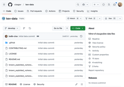
CISA Brings KEV Data to GitHub
CISA's KEV data is now on GitHub, offering easier access, API integration, commit history tracking, and automated updates for security teams and researchers.
@spectrum-web-components/icons-ui
Advanced tools
Deliver [Spectrum UI Icons](https://spectrum.adobe.com/page/icons/) as either:
Deliver Spectrum UI Icons as either:
<sp-icon-arrow75>)IconArrow75)Arrow75Icon())Search a full list of icons to find an icon for your project or find technical information about extended use cases, like consuming this package in various UI frameworks below.
Remember to consult Spectrum's Iconography Guidelines when planning how to leverage these icons in the visual delivery of your application.
yarn add @spectrum-web-components/icons-ui
Import the side effectful registration of a single element (e.g. <sp-icon-arrow75>) via:
import '@spectrum-web-components/icons-ui/icons/sp-icon-arrow75.js';
Leverage a single icon base class (e.g. IconArrow75) as a type, or for extension purposes, do so, via:
import { IconArrow75 } from '@spectrum-web-components/icons-ui/src/elements/IconArrow75.js';
Search the available Spectrum Workflow icons below.
Complete search experience available at: https://opensource.adobe.com/spectrum-web-components/components/icons-ui/.
You can import raw icons (e.g. Arrow75Icon()) via:
import { Arrow75Icon } from '@spectrum-web-components/icons-ui/src/icons/Arrow75.js';
@spectrum-web-components/icons-ui exports all icons. If your build process tree-shakes dependencies, you can import from it directly:
import { Arrow75Icon } from '@spectrum-web-components/icons-ui';
These icon literals are prepared with the html template tag from lit-html, the default value of an icon export will be as follows:
import { LitElement, html } from 'lit-element';
import '@spectrum-web-components/icon';
import { Arrow75Icon } from '@spectrum-web-components/icons-ui';

class ElementWithIcon extends LitElement {
    protected override render(): TemplateResult {
        return html`
            <sp-icon>
                ${Arrow75Icon()}
            </sp-icon>
        `
    }
}

customElements.define('element-with-icon', ElementWithIcon);
Every icons can be customized via the following options:
{
    width: 24, // number outlining the width to deliver the SVG element with
    height: 24, // number outlining the height to delivery the SVG element with
    hidden: false, // boolean representing whether to apply the `aria-hidden` attribute
    title: 'Icon title', // string of the title to deliver the icon with
}
The default exports of this package are pre-wrapped via setCustomTemplateLiteralTag in the html template tag from lit-html, and work like the following::
import { Arrow75Icon } from '@spectrum-web-components/icons-ui';

console.log(Arrow75Icon());

/***
TemplateResult {strings: Array[1], values: Array[0], type: "html", processor: DefaultTemplateProcessor, constructor: Object}
***/
When working in the context of other frameworks, it is possible to import the icons with a generic template tag as follows:
import { Arrow75Icon } from '@spectrum-web-components/icons-ui/src/icons.js';

console.log(Arrow75Icon());

/***
<svg
    xmlns="http://www.w3.org/2000/svg"
    viewBox="0 0 36 36"
    role="img"
    fill="currentColor"
    height="24"
    width="24"
    aria-hidden="false"
    aria-label="Circle"
>
    <path
      d="M9.26 4.406L6.528 1.672A.84.84 0 005.34 2.859L6.64 4.16H1.396a.84.84 0 000 1.68H6.64l-1.301 1.3a.84.84 0 001.188 1.188l2.734-2.734a.84.84 0 000-1.188z"
    />
</svg>
***/
What's more, if you're already working with a specific parser in your project, you can assign it as the one to use when delivering the icons in order to be sure that the SVG content is delivered as parsed content to your final template. The means if you were working with Preact via the htm tag as bound to the provided hyperscript function:
import {
    Arrow75Icon,
    setCustomTemplateLiteralTag,
} from '@spectrum-web-components/icons-ui/src/icons.js';
import htm from 'htm';
import { h } from 'preact';

const hPreact = htm.bind(h);

setCustomTemplateLiteralTag(hPreact);

console.log(Arrow75Icon());

/***
VNode {nodeName: "svg", children: Array[1], attributes: Object, key: undefined, constructor: Object}
***/
In this way the icons exported by @spectrum-web-components/icons-ui can be leveraged in projects powered by the the likes of hyperHTML, lighterhtml, lit-html, Preact, React, Vanilla JS, Vue.js, and more!
FAQs
Deliver [Spectrum UI Icons](https://spectrum.adobe.com/page/icons/) as either:
The npm package @spectrum-web-components/icons-ui receives a total of 11,022 weekly downloads. As such, @spectrum-web-components/icons-ui popularity was classified as popular.
We found that @spectrum-web-components/icons-ui demonstrated a healthy version release cadence and project activity because the last version was released less than a year ago. It has 13 open source maintainers collaborating on the project.
Did you know?

Socket for GitHub automatically highlights issues in each pull request and monitors the health of all your open source dependencies. Discover the contents of your packages and block harmful activity before you install or update your dependencies.

Security News
CISA's KEV data is now on GitHub, offering easier access, API integration, commit history tracking, and automated updates for security teams and researchers.

Security News
Opengrep forks Semgrep to preserve open source SAST in response to controversial licensing changes.

Security News
Critics call the Node.js EOL CVE a misuse of the system, sparking debate over CVE standards and the growing noise in vulnerability databases.