Research
Security News
Threat Actor Exposes Playbook for Exploiting npm to Build Blockchain-Powered Botnets
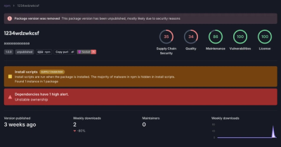
A threat actor's playbook for exploiting the npm ecosystem was exposed on the dark web, detailing how to build a blockchain-powered botnet.
@spectrum-web-components/number-field
Advanced tools
Web component implementation of a Spectrum design NumberField
<sp-number-field> elements are used for numeric inputs. Upon interaction via the ArrowUp or ArrowDown keys, the scroll wheel, or the stepper UI, when not hidden by the hide-stepper attribute, the input value incrementally increases or decreases by the value of the step attribute. The shift key can be used to apply steps at 10 time (or the value of the step-modifier attribute times) their normal rate.
yarn add @spectrum-web-components/number-field
Import the side effectful registration of <sp-number-field> via:
import '@spectrum-web-components/number-field/sp-number-field.js';
When looking to leverage the NumberField base class as a type and/or for extension purposes, do so via:
import { NumberField } from '@spectrum-web-components/number-field';
<sp-number-field
    label="Size"
    value="1024"
    size="s"
    style="--spectrum-stepper-width: 85px"
></sp-number-field>
<sp-number-field
    label="Size"
    value="1024"
    size="m"
    style="--spectrum-stepper-width: 110px"
></sp-number-field>
<sp-number-field
    label="Size"
    value="1024"
    size="l"
    style="--spectrum-stepper-width: 135px"
></sp-number-field>
<sp-number-field
    label="Size"
    value="1024"
    size="xl"
    style="--spectrum-stepper-width: 160px"
></sp-number-field>
An <sp-number-field> element will process its numeric value with new Intl.NumberFormat(this.resolvedLanguage, this.formatOptions).format(this.value) in order to prepare it for visual delivery in the input. In order to customize this processing supply your own Intl.NumberFormatOptions via the formatOptions property, or format-options attribute as seen below.
this.resolvedLanguage represents the language in which the <sp-number-field> element is currently being delivered. By default, this value will represent the language established by the lang attribute on the root <html> element while falling back to navigator.language when that is not present. This value can be customized via a language context provided by a parent element that listens for the sp-language-context event and supplies update language settings to the callback function contained therein. Applications leveraging the <sp-theme> element to manage the visual delivery or text direction of their content will be also be provided a reactive context for supplying language information to its descendants.
The following example uses the signDisplay option to include the plus sign for positive numbers, for example to display an offset from some value. In addition, it always displays a minimum of 1 digit after the decimal point, and allows up to 2 fraction digits. If the user enters more than 2 fraction digits, the result will be rounded.
<sp-field-label for="decimals">Adjust exposure</sp-field-label>
<sp-number-field
    id="decimals"
    value="0"
    style="width: 100px"
    format-options='{
        "signDisplay": "exceptZero",
        "minimumFractionDigits": 1,
        "maximumFractionDigits": 2
    }'
></sp-number-field>
The style: 'percent' option can be passed to the formatOptions property to treat the value as a percentage. In this mode, the value is multiplied by 100 before it is displayed, i.e. 0.45 is displayed as "45%". The reverse is also true: when the user enters a value, the change event will be triggered with the entered value divided by 100. When the percent option is enabled, the default step automatically changes to 0.01 such that incrementing and decrementing occurs by 1%. This can be overridden with the step property.
<sp-field-label for="percents">Sales tax</sp-field-label>
<sp-number-field
    id="percents"
    style="width: 200px"
    value="0.05"
    format-options='{
        "style": "percent"
    }'
></sp-number-field>
The style: 'currency' option can be passed to the formatOptions property to treat the value as a currency value. The currency option must also be passed to set the currency code (e.g. USD) to use. In addition, the currencyDisplay option can be used to choose whether to display the currency symbol, currency code, or currency name. Finally, the currencySign option can be set to accounting to use accounting notation for negative numbers, which uses parentheses rather than a minus sign in some locales.
If you need to allow the user to change the currency, you should include a separate dropdown next to the sp-number-field. The sp-number-field itself will not determine the currency from the user input.
<sp-field-label for="currency">Transaction amount</sp-field-label>
<sp-number-field
    id="currency"
    style="width: 200px"
    value="45"
    format-options='{
        "style": "currency",
        "currency": "EUR",
        "currencyDisplay": "code",
        "currencySign": "accounting"
    }'
></sp-number-field>
The style: 'unit' option can be passed to the formatOptions property to format the value with a unit of measurement. The unit option must also be passed to set which unit to use (e.g. inch). In addition, the unitDisplay option can be used to choose whether to display the unit in long, short, or narrow format.
If you need to allow the user to change the unit, you should include a separate dropdown next to the number field. The number field itself will not determine the unit from the user input.
Note: The unit style is not currently supported in Safari. A polyfill may be necessary.
<sp-field-label for="units">Package width</sp-field-label>
<sp-number-field
    id="units"
    style="width: 200px"
    value="4"
    format-options='{
        "style": "unit",
        "unit": "inch",
        "unitDisplay": "long"
    }'
></sp-number-field>
Intl.NumberFormatOptionsWhile Intl.NumberFormatOptions does support a wide range of units, it is possible to encounter units (e.g. the graphics units of pixel, pixels, points, etc.) that are not supported therein. When this occurs, an <sp-number-field> element will attempt to polyfill support for this unit. See the following example delivering { style: "unit", unit: "px" } below:
<sp-field-label for="units">Document width in pixels</sp-field-label>
<sp-number-field
    id="units"
    style="width: 200px"
    value="500"
    format-options='{
        "style": "unit",
        "unit": "px"
    }'
></sp-number-field>
Note: the polyfilling done here is very simplistic and is triggered by supplying options that would otherwise cause the Intl.NumberFormat() call to throw an error. Once the unsupporting unit of px causes the construction of the object to throw, a back up formatter/parser pair will be created without the supplied unit data. When the style is set to unit, the unit value of will be adopted as the static unit display. This means that neither pluralization or translation will be handled within the <sp-number-field> element itself. If pluralization or translation is important to the delivered interface, please be sure to handle passing those strings into to element via the formatOptions property reactively to the value of the element or locale of that page in question.
The max and max properties can be used to limit the entered value to a specific range. The value will be clamped when the user commits the value to the <sp-number-field> element. In addition, the increment and decrement buttons will be disabled when the value is within one step value from the bounds. Ranges can be open ended by only providing a value for either min or max rather than both.
If a valid range is known ahead of time, it is a good idea to provide it to <sp-number-field> so it can optimize the experience. For example, when the minimum value is greater than or equal to zero, it is possible to use a numeric keyboard on iOS rather than a full text keyboard (necessary to enter a minus sign).
<sp-field-label for="red">Red value</sp-field-label>
<sp-number-field id="red" value="4" min="0" max="255"></sp-number-field>
The step prop can be used to snap the value to certain increments. If there is a min defined, the steps are calculated starting from that minimum value. For example, if min === 2, and step === 3, the valid step values would be 2, 5, 8, 11, etc. If no min is defined, the steps are calculated starting from zero and extending in both directions. In other words, such that the values are evenly divisible by the step. A step can be any positive decimal. If no step is defined, any decimal value may be typed, but incrementing and decrementing snaps the value to an integer.
If the user types a value that is between two steps and blurs the input, the value will be snapped to the nearest step. When incrementing or decrementing, the value is snapped to the nearest step that is higher or lower, respectively. When incrementing or decrementing from an empty field, the value starts at the minValue or maxValue, respectively, if defined. Otherwise, the value starts from 0.
<sp-field-label
    for="step"
>Step</sp-field-label>
<sp-number-field
    id="step"
    step="10"
></sp-number-field>

<sp-field-label
    for="step-min"
>Step + min</sp-field-label>
<sp-number-field
    id="step-min"
    min="2"
    step="3"
></sp-number-field>

<sp-field-label
    for="step-min-max"
>Step + min + max</sp-field-label>
<sp-number-field
    id="step-min-max"
    min="2"
    max="21"
    step="3"
></sp-number-field>
The <sp-number-field> component doesn't manage a default value by itself. This means that consumers can set the value of the number-field as an empty string by clearing the input. If we want the number-field to reset to a default-value when the user clears the input, we can listen for the change event on the number-field component and set its value to the desired default-value if the input is empty.
<sp-field-label for="default">
    Default value of this number field is 42
</sp-field-label>
<sp-number-field id="default" value="20"></sp-number-field>

<script type="module">
    customElements.whenDefined('sp-number-field').then(() => {
        const numberField = document.querySelector('#default');

        numberField.addEventListener('change', (event) => {
            const target = event.target;
            if (isNaN(target.value)) {
                target.value = '42';
            }
        });
    });
</script>
FAQs
Web component implementation of a Spectrum design NumberField
The npm package @spectrum-web-components/number-field receives a total of 643 weekly downloads. As such, @spectrum-web-components/number-field popularity was classified as not popular.
We found that @spectrum-web-components/number-field demonstrated a healthy version release cadence and project activity because the last version was released less than a year ago. It has 0 open source maintainers collaborating on the project.
Did you know?

Socket for GitHub automatically highlights issues in each pull request and monitors the health of all your open source dependencies. Discover the contents of your packages and block harmful activity before you install or update your dependencies.

Research
Security News
A threat actor's playbook for exploiting the npm ecosystem was exposed on the dark web, detailing how to build a blockchain-powered botnet.

Security News
NVD’s backlog surpasses 20,000 CVEs as analysis slows and NIST announces new system updates to address ongoing delays.

Security News
Research
A malicious npm package disguised as a WhatsApp client is exploiting authentication flows with a remote kill switch to exfiltrate data and destroy files.