Security News
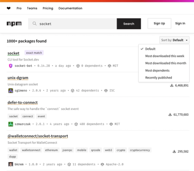
npm Updates Search Experience with New Objective Sorting Options
npm has a revamped search experience with new, more transparent sorting options—Relevance, Downloads, Dependents, and Publish Date.
@sproutsocial/racine
Advanced tools
“A single word often betrays a great design.” — Jean Racine
Racine is a component library consisting of documented, reusable components built for consumption in Sprout Social’s web products. The design principals of this library are based off Sprout Social’s Design System SEEDS and the components are expressed as React components which encapsulate logic, styling, example usage and documentation.
To get started running Racine locally, make sure you have Node.js, NPM and Yarn installed and then clone or download this GitHub repo, navigate in terminal to the project's folder and run the following commands:
$ yarn install
$ yarn start
Contributions to Racine are welcome from any part of the team, whether updating component presets, documentation or adding a new component to the library. If you are interested in getting involved, feel free to submit a Pull Request, create a ticket on the Design Systems Jira Board, or join us at the Component Library Guild meeting.
Contents
...have an easily statable, specific purpose.
| ✓ | ⚠ |
|---|---|
| A component should be able to be described in a maximum of 1-3 sentences | Don’t make components so specific or vague that they can’t be reused or are easy to confuse with other components |
...attempt to solve a single concern.
| ⚠ |
|---|
| If a component requires constant tweaks or one off changes, it is probably doing too much or needs further refinement or to be split into multiple components |
...have well documented props and a verbose description.
| ⚠ |
|---|
| Avoid scenarios like declaring, “this is a theme prop”, explain what exactly is being themed and how that theme was derived |
...incorporate its own error and default states.
| ⚠ |
|---|
| The end-to-end experience should be considered as a part of the component’s creation, not as an afterthought |
...contain tests and QA attributes when appropriate.
| ✓ | ⚠ |
|---|---|
| Contributors should leverage available testing tools like Jest as needed and work with QA to determine if specific attributes are needed for testing | If modifying the component has the potential to ruin your team members’ or our customers day, it probably needs to be tested |
…be context agnostic.
| ✓ | ⚠ |
|---|---|
| Should be able to work in any of Sprout’s products | Avoiding defining any layout, sizes, color or spacing assumptions that may hinder reusability |
…be tested in all relevant supported browsers and platforms.
| ✓ |
|---|
| If there are technology limitations then the component should gracefully degrade or contain a polyfill |
| Users should be able to use the component for its stated purpose in all supported browsers and platforms unless otherwise noted |
…have at least one functional preset defined.
| ✓ |
|---|
| The more context available, the easier it is to convey the component’s purpose |
| Components should use as many presets as is needed to demonstrate its intended uses |
…define its own styles.
| ⚠ |
|---|
| Don’t override or style other components or DOM elements outside of the scope of the component |
…be able to be easily categorized.
| ✓ | ⚠ |
|---|---|
| “Atomically” as well as in other taxonomies available in the Component library | If a component cannot easily be categorized, it might be too complex or have a purpose that is not well defined |
Let's go from idea to delivery. In this example, we will create a new component called KurtRussell.
Does this need to be in Racine?
In order to ensure the longevity of Racine, the components that are added need to be reusable and of high quality. Ask yourself, does KurtRussell need to be in Racine? Will other teams benefit from this pattern? Does it deliver a need no other component delivers? Is there more value in creating a new component, or should an existing component be extended? For example, if Racine already has PatrickSwayze, would we be better served with a HollywoodActor component that covers both?
If you are having trouble answering these questions, then talk about it:
What category does this belong to?
After discussion, it's agreed that, yes, KurtRussell belongs in Racine. Of course, naming things is hard. If KurtRussell doesn't fit in any of our existing categories, discuss with the Design developer and or Front-End engineers on your team, add it to the agenda of the Component Library Guild meeting at or reach out in the #design-systems #eng_web Slack channels to get advice.
What should I name the component?
Are you making a Patrick Swayze Card? Then here's how you should name the component.
Card pattern? Your component should be CardPatrickSwayze.PatrickSwayzeCard.To build a new Racine component, simply use the command:
$ yarn new
This command will walk you through naming, categorizing and tagging your new component.
One complete, the scaffolding tool will generate three files for your new component:
index.js: The component JavaScript and JSX goes hereindex.test.js: Jest tests for the componentpresets.js: Presets and example use cases for the componentdata.js: Component Metadata like categories, tags and accessibility status_styles.scss: Component styles. Note: global variables and Sass mixins are automatically imported, so there's no need to @import them in these files.Documentation should be written inline in KurtRussell.js, following the existing boilerplate comments the file after running yarn new. The documentation is extracted with react-docgen.
Prop names should, along with their Flow types, be self-documenting. Props should be documented if they would not be clear to other developers who are not familiar with the component. Certain basic universal props like onClick and isHidden probably don't need a thorough documentation but you should strive to add as much context as needed.
presets.js should contain, at a minimum, the common use cases for this component. They are included in this file as Javascript objects in an exported array.
As the author of a global component, you are accountable for soliciting feedback from fellow designers and developers on your team as well other teams who might be affected. If you would like to start a discussion about the component, the #design-systems and #eng-web channels on Slack are a great place to start.
We use standard-version to automatically update the changelog and decide new version numbers. As such, we need commit messages to follow a consistent format (drawn from conventional commits).
Example commit messages (simply match this pattern and your commit message will be accepted):
git commit -m "feat: add Alert component"git commit -m "fix(Alert): display the correct icon when type is \"danger\"" -m "fixes RD-999"git commit -m "feat(Alert): remove \"danger\" Alert type" -m "BREAKING CHANGE: removes one option for \"type\" prop"git commit -m "feat(icons): add reporting range icon"git commit -m "docs: update accessibility statuses"git commit -m "feat(dependencies): upgrade classnames to 2.2.5"git commit -m "chore(dependencies): upgrade babel dependencies to latest version" (chore because they are devDependencies)git commit -m "feat(build): add dist/iconList.js to package output"Commit message format:
type(scope?): subject

body?

footer?
type is one of the following:
scope is optional but, with few exceptions, should be used for all feat and fix commits. Common scopes include:
dependencies should be feat, and devDependencies should be chorefeat or fixFeel free to suggest additional scope options
subject requirements:
body is optional and allows for more details to be added
footer contains meta-information about pull requests, e.g. "fixes RD-999", referring to a Jira ticket
Before submitting a PR to Racine, please review the Racine Git Worflow Chart for an overview of the process.

$ git checkout -b my-branch-name
Make your changes
Test your changes
$ yarn test
$ git add -A
$ git commit -m "MESSAGE"
$ git push origin my-branch-name
Open a PR (you should see the option to open a PR at the top of the Racine Github page)
Once your PR is tested, approved and passes the automated validation tasks, you can "Squash and Merge" it (this will be the only merge option available). Please double check that the squashed commit message still follows our commit guidelines.
Congrats, thanks for contributing!
Only those with admin privileges to the Racine repo can publish new versions of the package. Contact one of the following about releasing a new version:
$ git checkout master
$ git pull origin master --tags
$ yarn release
$ # go to Jenkins and trigger final publishing
Admins: The release script uses standard-version to automatically pick a new package version and update the CHANGELOG based on the commits since the last release. You will be prompted to confirm the next version of the package before anything gets pushed to GitHub. Note that the package will not automatically be published to NPM. You will have to manually go to Jenkins and click to complete the release (see image below).

Consuming a Racine component can be done in a number of ways, depending on it's stage of development.
Test any local package in another project by utilizing yarn link. Below is an example workflow to link Racine to web-app-core.
Navigate to your local copy of Racine in a terminal window
$ cd ~/YourCodeFolder/racine
$ yarn link # only needs to be run once
$ yarn start
Note: This build task packages all Racine components into the bundle, not just the specific components you are adding or modifying. After yarn link succeeds and Racine is globally linked, you shouldn't have to run link again.
Navigate to the folder you wish to use Racine components in your terminal (such as web-app-core) and complete the link
$ cd ~/YourCodeFolder/web-app-core
$ yarn link "@sproutsocial/racine"
$ yarn start
You can now use any components from your local instance of Racine in your project. See below for an example usage
/* ~/YourCodeFolder/web-app-core/YourFile.js */
import {Icon} from '@sproutsocial/racine';
// ...
<Icon name='compose' />
When you are done, be sure to unlink Racine so you are using the app's version of the package
$ yarn unlink "@sproutsocial/racine"
A Video walkthrough of this process can be found here.
To consume a Racine component that has been merged and published, do the following:
Check your project's package.json to make sure you are importing the latest version of Racine. If you need to update the Racine version. If an update is needed, you can either run yarn upgrade @sproutsocial/racine or manually update the version number in your project’s package.json.
Import and use the component as desired
import {Icon} from '@sproutsocial/racine';
// ...
<Icon name='compose' />
FAQs
README.NPM.md
The npm package @sproutsocial/racine receives a total of 671 weekly downloads. As such, @sproutsocial/racine popularity was classified as not popular.
We found that @sproutsocial/racine demonstrated a healthy version release cadence and project activity because the last version was released less than a year ago. It has 0 open source maintainers collaborating on the project.
Did you know?

Socket for GitHub automatically highlights issues in each pull request and monitors the health of all your open source dependencies. Discover the contents of your packages and block harmful activity before you install or update your dependencies.

Security News
npm has a revamped search experience with new, more transparent sorting options—Relevance, Downloads, Dependents, and Publish Date.

Security News
A supply chain attack has been detected in versions 1.95.6 and 1.95.7 of the popular @solana/web3.js library.

Research
Security News
A malicious npm package targets Solana developers, rerouting funds in 2% of transactions to a hardcoded address.