Security News
Python Overtakes JavaScript as Top Programming Language on GitHub
Python becomes GitHub's top language in 2024, driven by AI and data science projects, while AI-powered security tools are gaining adoption.
@stoplight/mosaic
Advanced tools
!WIP! :)
Much of the foundational architecture is in place, but only a few components are ready for use.
Intall deps: yarn
Just import and use. No context providers or wrapping components required.
import { Box, Button } from '@stoplight/mosaic';

const MyComponent = () => {
  return (
    <Box>
      <Button appearance="primary" onClick={() => alert('hello')}>
        Click Me
      </Button>
    </Box>
  );
};
Currently there are 4 packages managed in this repository:
@stoplight/mosaic: The core components - think button, input, panel, etc.@stoplight/mosaic-code-viewer: Read only code viewer component.@stoplight/mosaic-code-editor: Simple code editor component.@stoplight/mosaic-live-code: Code editor component with react live for previewing.Visit http://localhost:4200 after starting. Most of the components in the left sidebar are semi-transparent - these
are placeholders for future work.
See the Try It article in the playground for a pretty comprehensive example.
# In terminal 1
yarn start playground

# In terminal 2
yarn start playground-api
All libraries: yarn build:libs
Specific lib: yarn build core --prod --with-deps
Built apps and libs are put in the dist folder.
Bundle size is important. Run yarn size-limit after yarn build:libs to check end user bundle size for the libraries.
Run yarn size-limit --why to open webpack visualizer for the libraries.
libs/core/src/componets/Icon/index.ts: The icons that are bundled with the library. Other icons can be used by
loading font awesome in the consuming applicationlibs/core/src/theme.css: Css variables for the built in themes (light, dark)libs/core/tailwind.config.js: Primary tailwind config, important!libs/core/src/utils/*: Utility functions that translate react props -> tailwind classesSee NX_README.md for more details on nx commands.
Change --importPath to the appropriate package name.
yarn nx g @nrwl/react:library --publishable --importPath @stoplight/mosaic --buildable
Change the final argument to the appropriate app name.
yarn nx generate @nrwl/express:application playground-api
FAQs
Unknown package
The npm package @stoplight/mosaic receives a total of 32,577 weekly downloads. As such, @stoplight/mosaic popularity was classified as popular.
We found that @stoplight/mosaic demonstrated a healthy version release cadence and project activity because the last version was released less than a year ago. It has 1 open source maintainer collaborating on the project.
Did you know?

Socket for GitHub automatically highlights issues in each pull request and monitors the health of all your open source dependencies. Discover the contents of your packages and block harmful activity before you install or update your dependencies.

Security News
Python becomes GitHub's top language in 2024, driven by AI and data science projects, while AI-powered security tools are gaining adoption.

Security News
Dutch National Police and FBI dismantle Redline and Meta infostealer malware-as-a-service operations in Operation Magnus, seizing servers and source code.

Research
Security News
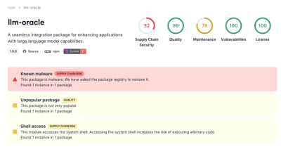
Socket is tracking a new trend where malicious actors are now exploiting the popularity of LLM research to spread malware through seemingly useful open source packages.