@storyblok/astro
Astro integration for the Storyblok Headless CMS.


Live Demo
If you are in a hurry, check out our official live demo on StackBlitz.
Usage
If you are first-time user of Storyblok, read the Getting Started guide to get a project ready in less than 5 minutes.
Installation
Install @storyblok/astro:
npm install @storyblok/astro
Add the following code to astro.config.mjs and replace the accessToken with the preview API token of your Storyblok space.
import { defineConfig } from "astro/config";
import storyblok from "@storyblok/astro";

export default defineConfig({
  integrations: [
    storyblok({
      accessToken: "<your-access-token>",
    }),
  ],
});
Warning
This SDK uses the Fetch API under the hood. If your environment doesn't support it, you need to install a polyfill like isomorphic-fetch. More info on storyblok-js-client docs.
Options
When you initialize the integration, you can pass all @storyblok/js options.
storyblok({
accessToken: "<your-access-token>",
bridge: true,
apiOptions: {},
components: {},
componentsDir: "src",
enableFallbackComponent: false,
customFallbackComponent: "",
useCustomApi: false,
});
Note
By default, the apiPlugin from @storyblok/js is loaded. If you want to use your own method to fetch data from Storyblok, you can disable this behavior by setting useCustomApi to true, resulting in an optimized final bundle.
Region parameter
Possible values:
eu (default): For spaces created in the EUus: For spaces created in the UScn: For spaces created in China
Full example for a space created in the US:
storyblok({
  accessToken: "<your-access-token>",
  apiOptions: {
    region: "us",
  },
});
Warning
For spaces created in the United States or China, the region parameter must be specified.
Getting started
1. Creating and linking your components to the Storyblok Visual Editor
In order to link your Astro components to their equivalents you created in Storyblok:
First, you need to load them globally by specifying their name and their path in astro.config.mjs:
components: {
  page: "storyblok/Page",
  feature: "storyblok/Feature",
  grid: "storyblok/Grid",
  teaser: "storyblok/Teaser",
},
Note
The src folder is automatically added to the beginning of the path, so in this example your Astro components should be located here:
src/storyblok/Page.astrosrc/storyblok/Feature.astrosrc/storyblok/Grid.astrosrc/storyblok/Teaser.astro
You can choose any other folder in the src directory for your Astro components.
Note: If you prefer to use a different folder than src, you can specify one using the componentsDir option:
storyblok({
  componentsDir: "app",
});
Now, your Storyblok components can be located anywhere in the app folder, e.g. app/storyblok/Page.astro.
For each component, use the storyblokEditable() function on its root element, passing the blok property that they receive:
---
import { storyblokEditable } from "@storyblok/astro";

const { blok } = Astro.props
---

<div {...storyblokEditable(blok)}>
  <h2>{blok.headline}</h2>
</div>
Finally, you can use the provided <StoryblokComponent> for nested components; it will automatically render them (if they have been registered globally beforehand):
---
import { storyblokEditable } from "@storyblok/astro";
import StoryblokComponent from "@storyblok/astro/StoryblokComponent.astro";

const { blok } = Astro.props
---

<main {...storyblokEditable(blok)}>
  {blok.body?.map(blok => {return <StoryblokComponent blok="{blok}" />})}
</main>
Note
The blok is the actual blok data coming from Storblok's Content Delivery API.
Using fallback components
By default, @storyblok/astro throws an error if a component is not implemented. Setting enableFallbackComponent to true bypasses that behavior, rendering a fallback component in the frontend instead. You can also use a custom fallback component by (for example) setting customFallbackComponent: "storyblok/MyCustomFallback".
Using partial hydration
If you want to use partial hydration with any of the frameworks supported by Astro, follow these steps:
- Install the official Astro integration for your desired framework
- Create an Astro component that serves as a wrapper and utilizes the most suitable client directive
- Create the actual component in Vue, Svelte, React or any other supported framework
For working examples, please refer to the Live Demo on Stackblitz.
2. Getting Storyblok Stories and using the Storyblok Bridge
Fetching one Story
Use the useStoryblokApi function to have access to an instance of storyblok-js-client:
---
import { useStoryblokApi } from "@storyblok/astro";
import StoryblokComponent from "@storyblok/astro/StoryblokComponent.astro";

const storyblokApi = useStoryblokApi();
const { data } = await storyblokApi.get("cdn/stories/home", {
  version: "draft",
});

const story = data.story;
---

<StoryblokComponent blok="{story.content}" />
Note
The available methods are described in the [storyblok-js-client] repository(https://github.com/storyblok/storyblok-js-client#method-storyblokget)
Dynamic Routing
In order to dynamically generate Astro pages based on the Stories in your Storyblok Space, you can use the Storyblok Links API and the Astro getStaticPaths() function similar to this example:
---
import { useStoryblokApi } from "@storyblok/astro";
import StoryblokComponent from "@storyblok/astro/StoryblokComponent.astro";

export async function getStaticPaths() {
  const storyblokApi = useStoryblokApi();

  const { data } = await storyblokApi.get("cdn/links", {
    version: "draft",
  });
  let links = data.links;
  links = Object.values(links);

  return links.map((link) => {
    return {
      params: { slug: link.slug },
    };
  });
}

const { slug } = Astro.params;

const storyblokApi = useStoryblokApi();

const { data } = await storyblokApi.get(`cdn/stories/${slug}`, {
  version: "draft",
});

const story = data.story;
---

<StoryblokComponent blok="{story.content}" />
Using the Storyblok Bridge
The Storyblok Bridge is enabled by default. If you would like to disable it or enable it conditionally (e.g. depending on the environment) you can set the bridge parameter to true or false in astro.config.mjs:
Note
Since Astro is not a reactive JavaScript framework and renders everything as HTML, the Storyblok Bridge will not provide real-time editing as you may know it from other frameworks. However, it automatically refreshes the site for you whenever you save or publish a story.
You can also provide a StoryblokBridgeConfigV2 configuration object to the bridge parameter.
bridge: {
customParent?: string,
preventClicks?: boolean,
resolveRelations?: strings[],
resolveLinks?: string
}
customParent is used to provide a custom URL for the Storyblok editor iframe.preventClicks prevents the default behaviour of clicks when inside the Storyblok editor.resolveRelations may be needed to resolve the same relations that are already resolved in the API requests via the resolve_relations parameter.resolveLinks may be needed to resolve link fields.
Note
resolveRelations and resolveLinks will not have any effect in Astro, since the Storyblok Bridge is configured to reload the page. Thus, all the requests needed will be performed after the reload.
The provided options will be used when initializing the Storyblok Bridge. You can find more information about the Storyblok Bridge and its configuration options on the In Depth Storyblok Bridge guide.
If you want to deploy a dedicated preview environment with the Bridge enabled, allowing users of the Storyblok CMS to see their changes being reflected on the frontend directly without having to rebuild the static site, you can enable Server Side Rendering for that particular use case. More information can be found in the Astro Docs.
Rendering Rich Text
You can easily render rich text by using either the renderRichText function or the <RichTextRenderer /> component, both of which are included in @storyblok/astro.
Use renderRichText, which only supports parsing and returning native HTML tags, if you are not embedding bloks in your rich text. Then you can use the set:html directive:
---
import { renderRichText } from "@storyblok/astro";

const { blok } = Astro.props

const renderedRichText = renderRichText(blok.text)
---

<div set:html="{renderedRichText}"></div>
Use the <RichTextRenderer /> component if you are embedding bloks in your rich text:
---
import RichTextRenderer from "@storyblok/astro/RichTextRenderer.astro";

const { blok } = Astro.props
---

<RichTextRenderer richTextData={blok.richtext} />
You can also set a custom Schema and component resolver by passing the options as the second parameter of the renderRichText function:
import { RichTextSchema, renderRichText } from "@storyblok/astro";
import cloneDeep from "clone-deep";
const mySchema = cloneDeep(RichTextSchema);
const { blok } = Astro.props;
const renderedRichText = renderRichText(blok.text, {
schema: mySchema,
resolver: (component, blok) => {
switch (component) {
case "my-custom-component":
return `<div class="my-component-class">${blok.text}</div>`;
break;
default:
return `Component ${component} not found`;
}
},
});
The same can be done with the <RichTextRenderer /> component by passing along the options via the richTextOptions prop:
---
import { RichTextSchema } from "@storyblok/astro";
import RichTextRenderer from "@storyblok/astro/RichTextRenderer.astro";
import cloneDeep from "clone-deep";
const mySchema = cloneDeep(RichTextSchema);
const { blok } = Astro.props;
const options = {
schema: mySchema,
resolver: (component, blok) => {
switch (component) {
case "my-custom-component":
return `<div class="my-component-class">${blok.text}</div>`;
break;
default:
return `Component ${component} not found`;
}
},
};
---
<RichTextRenderer richTextData={blok.richtext} richTextOptions={options} />
Note
Please be aware that the <RichTextRenderer /> component is not supported when using Astro v1. Make sure to use Astro v2 or v3.
API
useStoryblokApi()
Returns the instance of the storyblok-js-client.
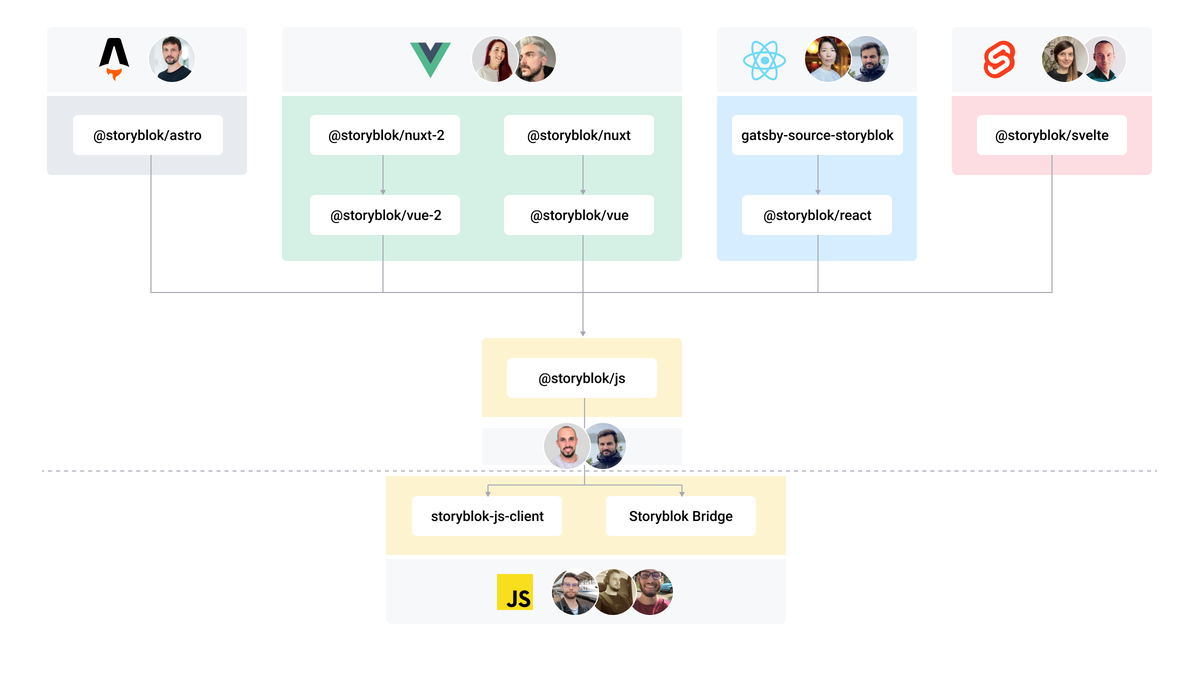
The Storyblok JavaScript SDK Ecosystem

Acknowledgements
A huge thank you goes to the Astro Team. In particular to Tony Sullivan, who has provided extraordinary support and made automagically rendering Storyblok components a reality.
Related Links
More Resources
Support
Contributing
Please see our contributing guidelines and our code of conduct.
This project uses semantic-release for generating new versions by using commit messages. We use the Angular Convention to name the commits.


