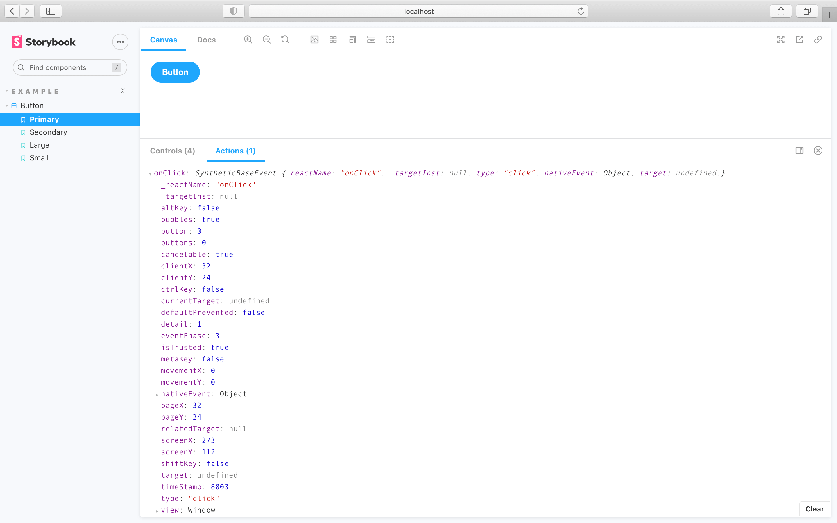
What is @storybook/addon-actions?
The @storybook/addon-actions package is a Storybook addon that allows you to log interactions with your UI components. It is useful for debugging and for getting feedback on how components respond to user actions. With this addon, you can capture events and their payloads, making it easier to understand the behavior of your components during development.
What are @storybook/addon-actions's main functionalities?
Log Actions
This feature allows you to log actions in the Storybook UI. When the button is clicked, the 'button-click' action is logged, showing the event and its payload.
import { action } from '@storybook/addon-actions';
export default {
title: 'Button',
argTypes: { onClick: { action: 'clicked' } },
};
export const TextButton = () => (
<button onClick={action('button-click')}>Hello Button</button>
);
Customize Output
This feature allows you to customize the output of the action logger. In this example, the default behavior of the click event is prevented, and a custom label is used for logging.
import { action } from '@storybook/addon-actions';

const createClickHandler = (label) => action(label, (e) => e.preventDefault());

export const PreventDefaultButton = () => (
  <button onClick={createClickHandler('prevent-default-click')}>Click Me</button>
);
Other packages similar to @storybook/addon-actions
@storybook/addon-knobs
This package allows you to edit React props dynamically using the Storybook UI. It is similar to @storybook/addon-actions in that it enhances the interactive capabilities of Storybook, but it focuses on editing props rather than logging actions.
@storybook/addon-controls
This addon provides a UI for editing the properties of components. It is the evolution of @storybook/addon-knobs and offers a more integrated and automatic way to create property controls based on component metadata. It differs from @storybook/addon-actions by focusing on component inputs rather than capturing user interactions.
@storybook/addon-viewport
The addon-viewport allows you to adjust the viewport size to test responsive designs within Storybook. While it does not log actions like @storybook/addon-actions, it complements the interactive testing experience by simulating different screen sizes.
Storybook Addon Actions
Storybook Addon Actions can be used to display data received by event handlers in Storybook.
Framework Support

Installation
Actions is part of essentials and so is installed in all new Storybooks by default. If you need to add it to your Storybook, you can run:
npm i -D @storybook/addon-actions
Then, add following content to .storybook/main.js:
export default {
  addons: ['@storybook/addon-actions'],
};
Usage
The basic usage is documented in the documentation. For legacy usage, see the advanced README.


