Research
Security News
Malicious PyPI Package Exploits Deezer API for Coordinated Music Piracy
Socket researchers uncovered a malicious PyPI package exploiting Deezer’s API to enable coordinated music piracy through API abuse and C2 server control.
@storybook/addon-backgrounds
Advanced tools
Switch backgrounds to view components in different settings
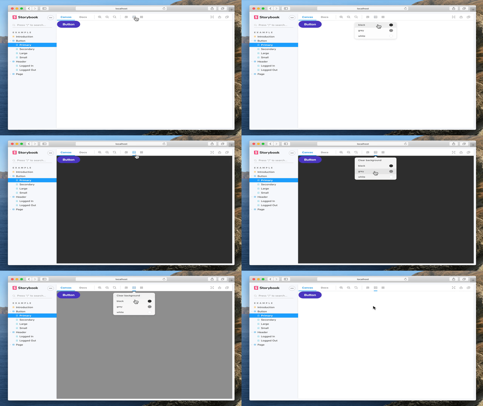
The @storybook/addon-backgrounds package is a Storybook addon that allows developers to switch between different backgrounds for their components' preview in the Storybook UI. It is useful for visualizing how components look against different backgrounds and can be used to simulate different environments.
Setting default backgrounds
This feature allows you to set default backgrounds that will be available for all stories. You can specify a default background that will be pre-selected when a story is loaded.
import { addParameters } from '@storybook/react';
addParameters({
backgrounds: [
{ name: 'twitter', value: '#00aced', default: true },
{ name: 'facebook', value: '#3b5998' },
],
});Configuring backgrounds for individual stories
This feature allows you to configure backgrounds for individual stories. You can override the default backgrounds for specific stories to tailor the background to the component's needs.
import { storiesOf } from '@storybook/react';
storiesOf('Button', module)
  .addParameters({
    backgrounds: [
      { name: 'dark', value: '#222222' },
      { name: 'light', value: '#eeeeee' },
    ],
  })
.add('with text', () => <button>Click me</button>);The @storybook/addon-knobs package allows you to edit React props dynamically using the Storybook UI. It is similar to @storybook/addon-backgrounds in that it enhances the Storybook experience by allowing for real-time changes to the component's environment, but it focuses on props rather than backgrounds.
The @storybook/addon-actions package can be used to display data received by event handlers in Storybook. It is similar to @storybook/addon-backgrounds in that it helps in visualizing and debugging components, but it focuses on capturing and displaying actions rather than changing backgrounds.
The @storybook/addon-viewport package allows you to adjust the viewport size and layout for responsive design testing within Storybook. While @storybook/addon-backgrounds changes the background behind components, @storybook/addon-viewport changes the size of the frame that the component is rendered within.
Storybook Addon Backgrounds can be used to change background colors inside the preview in Storybook.

Backgrounds is part of essentials and so is installed in all new Storybooks by default. If you need to add it to your Storybook, you can run:
npm i -D @storybook/addon-backgrounds
Then, add following content to .storybook/main.js:
export default {
  addons: ['@storybook/addon-backgrounds'],
};
The usage is documented in the documentation.
FAQs
Switch backgrounds to view components in different settings
The npm package @storybook/addon-backgrounds receives a total of 4,866,739 weekly downloads. As such, @storybook/addon-backgrounds popularity was classified as popular.
We found that @storybook/addon-backgrounds demonstrated a healthy version release cadence and project activity because the last version was released less than a year ago. It has 0 open source maintainers collaborating on the project.
Did you know?

Socket for GitHub automatically highlights issues in each pull request and monitors the health of all your open source dependencies. Discover the contents of your packages and block harmful activity before you install or update your dependencies.

Research
Security News
Socket researchers uncovered a malicious PyPI package exploiting Deezer’s API to enable coordinated music piracy through API abuse and C2 server control.

Research
The Socket Research Team discovered a malicious npm package, '@ton-wallet/create', stealing cryptocurrency wallet keys from developers and users in the TON ecosystem.

Security News
Newly introduced telemetry in devenv 1.4 sparked a backlash over privacy concerns, leading to the removal of its AI-powered feature after strong community pushback.