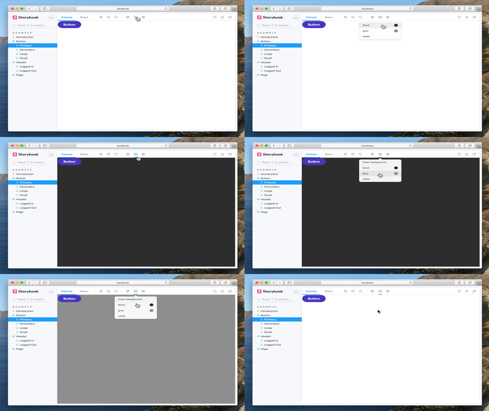
What is @storybook/addon-backgrounds?
The @storybook/addon-backgrounds package is a Storybook addon that allows developers to switch between different backgrounds for their components' preview in the Storybook UI. It is useful for visualizing how components look against different backgrounds and can be used to simulate different environments.
What are @storybook/addon-backgrounds's main functionalities?
Setting default backgrounds
This feature allows you to set default backgrounds that will be available for all stories. You can specify a default background that will be pre-selected when a story is loaded.
import { addParameters } from '@storybook/react';
addParameters({
backgrounds: [
{ name: 'twitter', value: '#00aced', default: true },
{ name: 'facebook', value: '#3b5998' },
],
});
Configuring backgrounds for individual stories
This feature allows you to configure backgrounds for individual stories. You can override the default backgrounds for specific stories to tailor the background to the component's needs.
import { storiesOf } from '@storybook/react';
storiesOf('Button', module)
  .addParameters({
    backgrounds: [
      { name: 'dark', value: '#222222' },
      { name: 'light', value: '#eeeeee' },
    ],
  })
  .add('with text', () => <button>Click me</button>);
Other packages similar to @storybook/addon-backgrounds
@storybook/addon-knobs
The @storybook/addon-knobs package allows you to edit React props dynamically using the Storybook UI. It is similar to @storybook/addon-backgrounds in that it enhances the Storybook experience by allowing for real-time changes to the component's environment, but it focuses on props rather than backgrounds.
@storybook/addon-actions
The @storybook/addon-actions package can be used to display data received by event handlers in Storybook. It is similar to @storybook/addon-backgrounds in that it helps in visualizing and debugging components, but it focuses on capturing and displaying actions rather than changing backgrounds.
@storybook/addon-viewport
The @storybook/addon-viewport package allows you to adjust the viewport size and layout for responsive design testing within Storybook. While @storybook/addon-backgrounds changes the background behind components, @storybook/addon-viewport changes the size of the frame that the component is rendered within.
Storybook Addon Backgrounds
Storybook Addon Backgrounds can be used to change background colors inside the preview in Storybook.
Framework Support

Installation
Backgrounds is part of essentials and so is installed in all new Storybooks by default. If you need to add it to your Storybook, you can run:
npm i -D @storybook/addon-backgrounds
Configuration
Then, add following content to .storybook/main.js:
export default {
  addons: ['@storybook/addon-backgrounds'],
};
Usage
The usage is documented in the documentation.


