What is @storybook/addon-docs?
The @storybook/addon-docs package is a Storybook addon that allows developers to write documentation alongside their stories. It uses MDX (Markdown with JSX) to let you document components in a rich, interactive way. It can generate documentation automatically based on your stories and supports a wide range of component frameworks.
What are @storybook/addon-docs's main functionalities?
MDX Documentation
Allows writing documentation using MDX, which can include both Markdown and JSX. You can define metadata, write narrative documentation, and showcase live examples and prop tables.
import { Meta, Story, ArgsTable, Canvas } from '@storybook/addon-docs/blocks';
<Meta title='MyComponent' />
# MyComponent
This is a **custom documentation** for `MyComponent`.
<Canvas>
<Story name='Basic' args={{ label: 'Hello World' }}>
{args => <MyComponent {...args} />}
</Story>
</Canvas>
<ArgsTable story='Basic' />
Automatic Props Table
Generates a table of the component's props automatically. This table includes the prop names, types, default values, and descriptions if they are specified in the component's propTypes or TypeScript definitions.
import { Meta, Story, ArgsTable } from '@storybook/addon-docs/blocks';

<Meta title='MyComponent' />

<Story name='Basic'>
  <MyComponent />
</Story>

<ArgsTable of={MyComponent} />
Embedding Stories
Allows embedding live Storybook stories within the documentation. This provides an interactive example of the component in use.
import { Meta, Story } from '@storybook/addon-docs/blocks';

<Meta title='MyComponent' />

<Story name='Basic'>
  <MyComponent />
</Story>
Other packages similar to @storybook/addon-docs
react-styleguidist
React Styleguidist is a component development environment with a living style guide. It allows developers to document components with Markdown and showcase usage examples. It differs from @storybook/addon-docs in that it is a standalone tool rather than an addon to Storybook, and it focuses more on the style guide aspect.
docz
Docz leverages MDX to allow developers to write documentation and demos for their components. It is similar to @storybook/addon-docs in its use of MDX, but it is a standalone documentation tool that provides its own UI and does not require Storybook.
docusaurus
Docusaurus is a static site generator that can be used to create documentation websites. It supports Markdown and MDX and can be used to document React components, but it is not specifically tied to component stories like @storybook/addon-docs. It is more general-purpose and can be used for a wide range of documentation needs.
Storybook Docs
migration guide: This page documents the method to configure Storybook introduced recently in 7.0.0, consult the migration guide if you want to migrate to this format of configuring Storybook.
Storybook Docs transforms your Storybook stories into world-class component documentation.
DocsPage. Out of the box, all your stories get a DocsPage. DocsPage is a zero-config aggregation of your component stories, text descriptions, docgen comments, props tables, and code examples into clean, readable pages.
MDX. If you want more control, MDX allows you to write long-form markdown documentation and include stories in one file. You can also use it to write pure documentation pages and embed them inside your Storybook alongside your stories.
Just like Storybook, Docs supports every major view layer including React, Vue 3, Angular, HTML, Web components, Svelte, and many more.
Read on to learn more:
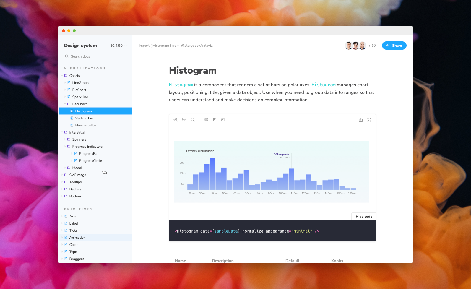
DocsPage
When you install Docs, every story gets a DocsPage. DocsPage pulls information from your stories, components, source code, and story metadata to construct a sensible, zero-config default.
Click on the Docs tab to see it:
For more information on how it works, see the DocsPage reference.
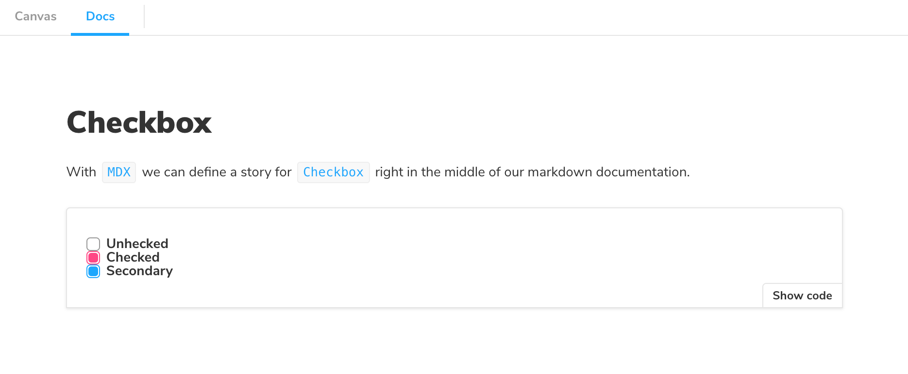
MDX
MDX is a syntax for writing long-form documentation with stories side-by-side in the same file. In contrast to DocsPage, which provides smart documentation out of the box, MDX gives you full control over your component documentation.
Here's an example file:
import { Meta, Story, Canvas } from '@storybook/blocks';
import * as CheckboxStories from './Checkbox.stories';

<Meta title="MDX/Checkbox" of={CheckboxStories} />

# Checkbox

With `MDX` we can include a story for `Checkbox` right in the middle of our
markdown documentation.

<Canvas>
  <Story of={CheckboxStories.Unchecked} />
</Canvas>
And here's how that's rendered in Storybook:
For more information on MDX, see the MDX reference.
Framework support
Storybook Docs supports all view layers that Storybook supports except for React Native (currently). There are some framework-specific features as well, such as props tables and inline story rendering. The following page captures the current state of support:
Framework Support
Note: # = WIP support
Want to add enhanced features to your favorite framework? Check out this dev guide
Installation
First add the package. Make sure that the versions for your @storybook/* packages match:
yarn add -D @storybook/addon-docs
Docs has peer dependencies on react. If you want to write stories in MDX, you may need to add this dependency as well:
yarn add -D react
Then add the following to your .storybook/main.js:
export default {
stories: [
'../src/**/*.mdx',
'../src/**/*.stories.@(js|jsx|ts|tsx)',
],
addons: [
'@storybook/addon-docs',
],
};
Be sure to check framework specific installation needs
Preset options
The addon-docs preset has a few configuration options that can be used to configure its babel/webpack loading behavior. Here's an example of how to use the preset with options:
export default {
  addons: [
    {
      name: '@storybook/addon-docs',
      options: {
        csfPluginOptions: null,
        mdxPluginOptions: {},
      },
    },
  ],
};
csfPluginOptions is an object for configuring @storybook/csf-plugin. When set to null it tells docs not to run the csf-plugin at all, which can be used as an optimization, or if you're already using csf-plugin in your main.js.
With the release of version 7.0, it is no longer possible to import .md files directly into Storybook using the transcludeMarkdown option. Instead, we recommend using the Markdown Doc Block for importing Markdown files into your Storybook documentation.
TypeScript configuration
As of SB6 TypeScript is zero-config and should work with SB Docs out of the box. For advanced configuration options, refer to the Props documentation.
More resources
Want to learn more? Here are some more articles on Storybook Docs: