Security News
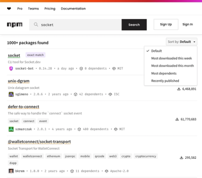
npm Updates Search Experience with New Objective Sorting Options
npm has a revamped search experience with new, more transparent sorting options—Relevance, Downloads, Dependents, and Publish Date.
@storybook/addon-styling
Advanced tools
A base addon for configuring popular styling tools
@storybook/addon-stylingGet started in Storybook 7 faster with popular styling tools.
Using Storybook 6? Check out the release-0-3 branch

To get started, install the package as a dev dependency
yarn:
yarn add -D @storybook/addon-styling
npm:
npm install -D @storybook/addon-styling
pnpm:
pnpm add -D @storybook/addon-styling
Then, include the addon in your .storybook/main.js file
module.exports = {
  stories: [
    "../stories/**/*.stories.mdx",
    "../stories/**/*.stories.@(js|jsx|ts|tsx)",
  ],
  addons: [
    "@storybook/addon-essentials",
+   "@storybook/addon-styling"
  ],
};
For tool-specific setup, check out the recipes below
Don't see your favorite tool listed? Don't worry! That doesn't mean this addon isn't for you. Check out the "Writing a custom decorator" section of the api reference.
If you want to override your theme for a particular component or story, you can use the theming.themeOverride parameter.
import React from "react";
import { Button } from "./Button";

export default {
  title: "Example/Button",
  component: Button,
  parameters: {
    theming: {
      themeOverride: "light", // component level override
    },
  },
};

const Template = (args) => <Button {...args} />;

export const Primary = Template.bind({});
Primary.args = {
  primary: true,
  label: "Button",
};

export const PrimaryDark = Template.bind({});
PrimaryDark.args = {
  primary: true,
  label: "Button",
};
PrimaryDark.parameters = {
  theming: {
    themeOverride: "dark", // Story level override
  },
};
If you'd like to contribute to this addon, THANK YOU, I'd love your help 🙏
yarn start runs babel in watch mode and starts Storybookyarn build build and package your addon codenext version on npm, and the development branch where most work occurslatest version on npm and the stable version that most users usenext branch, which depends on the next version of Storybook.next NPM tag.pick will get cherry-picked back to the main branch and will generate a release on the latest npm tag.FAQs
A base addon for configuring popular styling tools
The npm package @storybook/addon-styling receives a total of 192,641 weekly downloads. As such, @storybook/addon-styling popularity was classified as popular.
We found that @storybook/addon-styling demonstrated a not healthy version release cadence and project activity because the last version was released a year ago. It has 31 open source maintainers collaborating on the project.
Did you know?

Socket for GitHub automatically highlights issues in each pull request and monitors the health of all your open source dependencies. Discover the contents of your packages and block harmful activity before you install or update your dependencies.

Security News
npm has a revamped search experience with new, more transparent sorting options—Relevance, Downloads, Dependents, and Publish Date.

Security News
A supply chain attack has been detected in versions 1.95.6 and 1.95.7 of the popular @solana/web3.js library.

Research
Security News
A malicious npm package targets Solana developers, rerouting funds in 2% of transactions to a hardcoded address.