Huge News!Announcing our $40M Series B led by Abstract Ventures.Learn More
Socket
Sign inDemoInstall
Socket

@storybook/addon-themes

Package Overview
Dependencies
Maintainers
31
Versions
632
Alerts
File Explorer

Advanced tools

Socket logo

Install Socket

Detect and block malicious and high-risk dependencies

Install

@storybook/addon-themes

Switch between multiple themes for you components in Storybook

  • 7.2.3
  • Source
  • npm
  • Socket score

Version published
Weekly downloads
506K
decreased by-2.33%
Maintainers
31
Weekly downloads
 
Created
Source

`@storybook/addon-themes

Storybook Addon Themes can be used which between multiple themes for components inside the preview in Storybook.
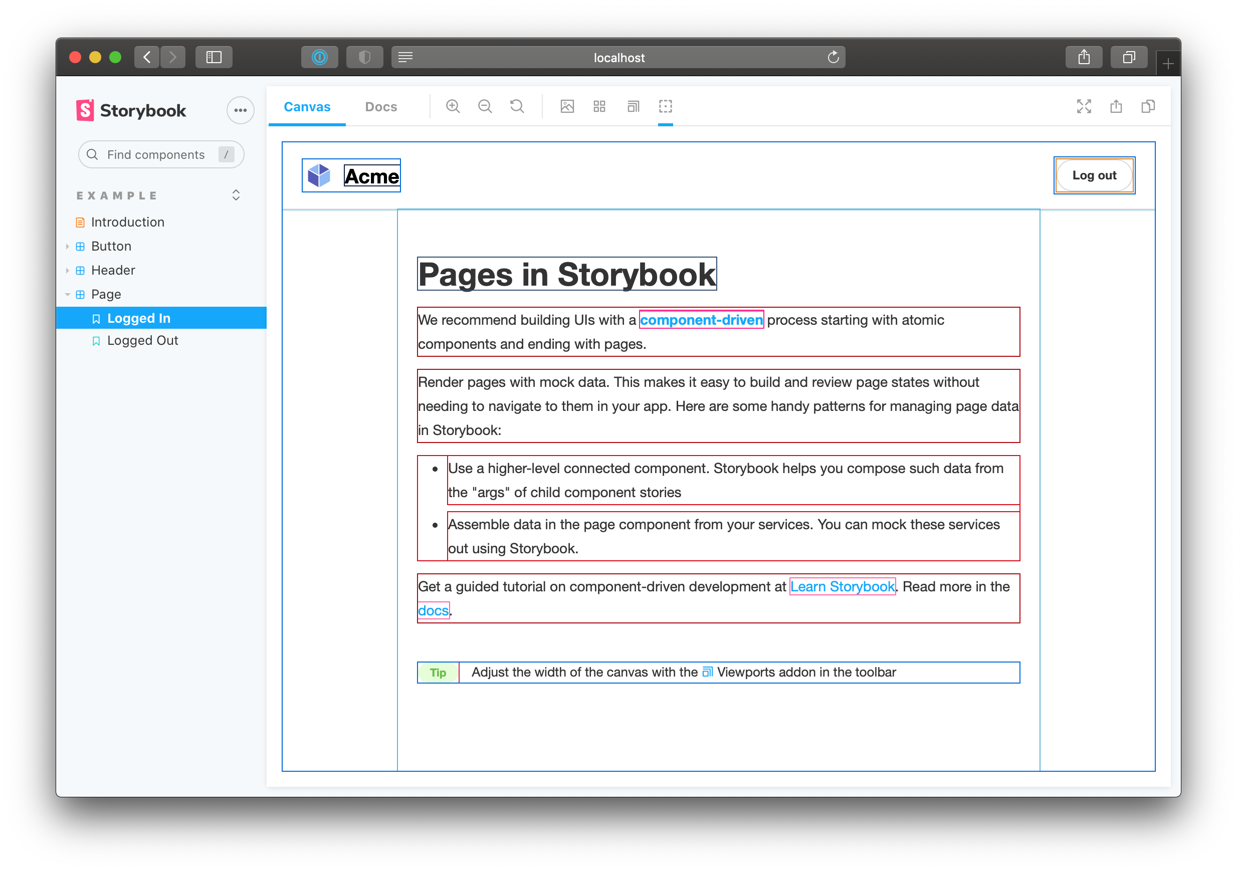
React Storybook Screenshot

Usage

Requires Storybook 7.0 or later. If you need to add it to your Storybook, you can run:

npm i -D @storybook/addon-themes

Then, add following content to .storybook/main.js:

export default {
  addons: ['@storybook/addon-themes'],
};

👇 Tool specific configuration

For tool-specific setup, check out the recipes below

Don't see your favorite tool listed? Don't worry! That doesn't mean this addon isn't for you. Check out the "Writing a custom decorator" section of the api reference.

❗️ Overriding theme

If you want to override your theme for a particular component or story, you can use the themes.themeOverride parameter.

import React from 'react';
import { Button } from './Button';

export default {
  title: 'Example/Button',
  component: Button,
  parameters: {
    themes: {
      themeOverride: 'light', // component level override
    },
  },
};

export const Primary = {
  args: {
    primary: true,
    label: 'Button',
  },
};

export const PrimaryDark = {
  args: {
    primary: true,
    label: 'Button',
  },
  parameters: {
    themes: {
      themeOverride: 'dark', // Story level override
    },
  },
};

Keywords

FAQs

Package last updated on 11 Aug 2023

Did you know?

Socket

Socket for GitHub automatically highlights issues in each pull request and monitors the health of all your open source dependencies. Discover the contents of your packages and block harmful activity before you install or update your dependencies.

Install

Related posts

SocketSocket SOC 2 Logo

Product

  • Package Alerts
  • Integrations
  • Docs
  • Pricing
  • FAQ
  • Roadmap
  • Changelog

Packages

npm

Stay in touch

Get open source security insights delivered straight into your inbox.


  • Terms
  • Privacy
  • Security

Made with ⚡️ by Socket Inc