Research
Security News
Malicious npm Packages Inject SSH Backdoors via Typosquatted Libraries
Socket’s threat research team has detected six malicious npm packages typosquatting popular libraries to insert SSH backdoors.
@storybook/addon-toolbars
Advanced tools
Create your own toolbar items that control story rendering
The @storybook/addon-toolbars package allows developers to add custom toolbars to their Storybook UI. These toolbars can be used to control various aspects of the stories being displayed, such as themes, locales, or any other context that might need to be adjusted dynamically. It enhances the development experience by providing a more interactive and customizable environment for testing UI components.
Global Toolbars
This feature allows you to add global toolbars that affect all stories. In the code sample, a global 'Theme' toolbar is defined with 'light', 'dark', and 'custom' options.
export const globalTypes = {
theme: {
name: 'Theme',
description: 'Global theme for components',
defaultValue: 'light',
toolbar: {
icon: 'circlehollow',
items: ['light', 'dark', 'custom'],
showName: true,
},
},
};Story-Specific Toolbars
This feature allows you to use toolbars to control story-specific parameters. The code sample shows a decorator that wraps the story in a ThemeProvider, which uses the global 'theme' parameter set by the toolbar.
export const decorators = [
  (Story, context) => (
    <ThemeProvider theme={context.globals.theme}>
      <Story />
    </ThemeProvider>
  ),
];The @storybook/addon-knobs package allows developers to add UI controls to tweak the component props in real-time. It is similar to @storybook/addon-toolbars in that it provides a way to dynamically adjust the presentation of components, but it focuses more on component props rather than global contexts.
The @storybook/addon-controls package is a successor to @storybook/addon-knobs. It automatically generates controls based on component properties and provides a more integrated and less manual approach compared to @storybook/addon-toolbars, which is more about setting global contexts.
The @storybook/addon-contexts package allows you to provide contextual data to your stories, such as themes or internationalization. It is similar to @storybook/addon-toolbars in that it can be used to switch contexts, but it does so through a different UI approach, using a panel rather than a toolbar.
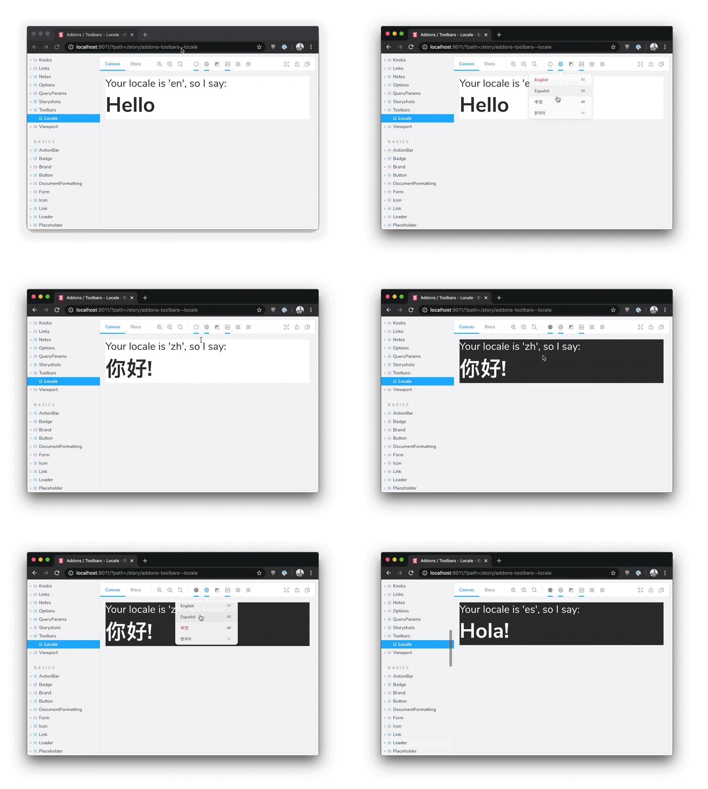
The Toolbars addon controls global story rendering options from Storybook's toolbar UI. It's a general purpose addon that can be used to:

Toolbars is part of essentials and so is installed in all new Storybooks by default. If you need to add it to your Storybook, you can run:
npm i -D @storybook/addon-toolbars
Then, add following content to .storybook/main.js:
export default {
  addons: ['@storybook/addon-toolbars'],
};
The usage is documented in the documentation.
addon-contexts?Addon-toolbars is the successor to addon-contexts, which provided convenient global toolbars in Storybook's toolbar.
The primary difference between the two packages is that addon-toolbars makes use of Storybook's new Story Args feature, which has the following advantages:
Standardization. Args are built into Storybook in 6.x. Since addon-toolbars is based on args, you don't need to learn any addon-specific APIs to use it.
Ergonomics. Global args are easy to consume in stories, in Storybook Docs, or even in other addons.
addon-toolbars is compatible with React, Vue 3, Angular, etc. out of the box with no framework logic needed in the addon.FAQs
Create your own toolbar items that control story rendering
The npm package @storybook/addon-toolbars receives a total of 4,201,388 weekly downloads. As such, @storybook/addon-toolbars popularity was classified as popular.
We found that @storybook/addon-toolbars demonstrated a healthy version release cadence and project activity because the last version was released less than a year ago. It has 12 open source maintainers collaborating on the project.
Did you know?

Socket for GitHub automatically highlights issues in each pull request and monitors the health of all your open source dependencies. Discover the contents of your packages and block harmful activity before you install or update your dependencies.

Research
Security News
Socket’s threat research team has detected six malicious npm packages typosquatting popular libraries to insert SSH backdoors.

Security News
MITRE's 2024 CWE Top 25 highlights critical software vulnerabilities like XSS, SQL Injection, and CSRF, reflecting shifts due to a refined ranking methodology.

Security News
In this segment of the Risky Business podcast, Feross Aboukhadijeh and Patrick Gray discuss the challenges of tracking malware discovered in open source softare.