Storybook for React Native
With Storybook for React Native you can design and develop individual React Native components without running your app.
This readme is for the 6.5 version, find the 5.3 readme here
For more information about storybook visit: storybook.js.org
NOTE: @storybook/react-native requires atleast 6.5.14, please set other storybook packages (like @storybook/addons) to ^6.5.14 or newer
If you want to help out or are just curious then check out the project board to see the open issues related to v6+.
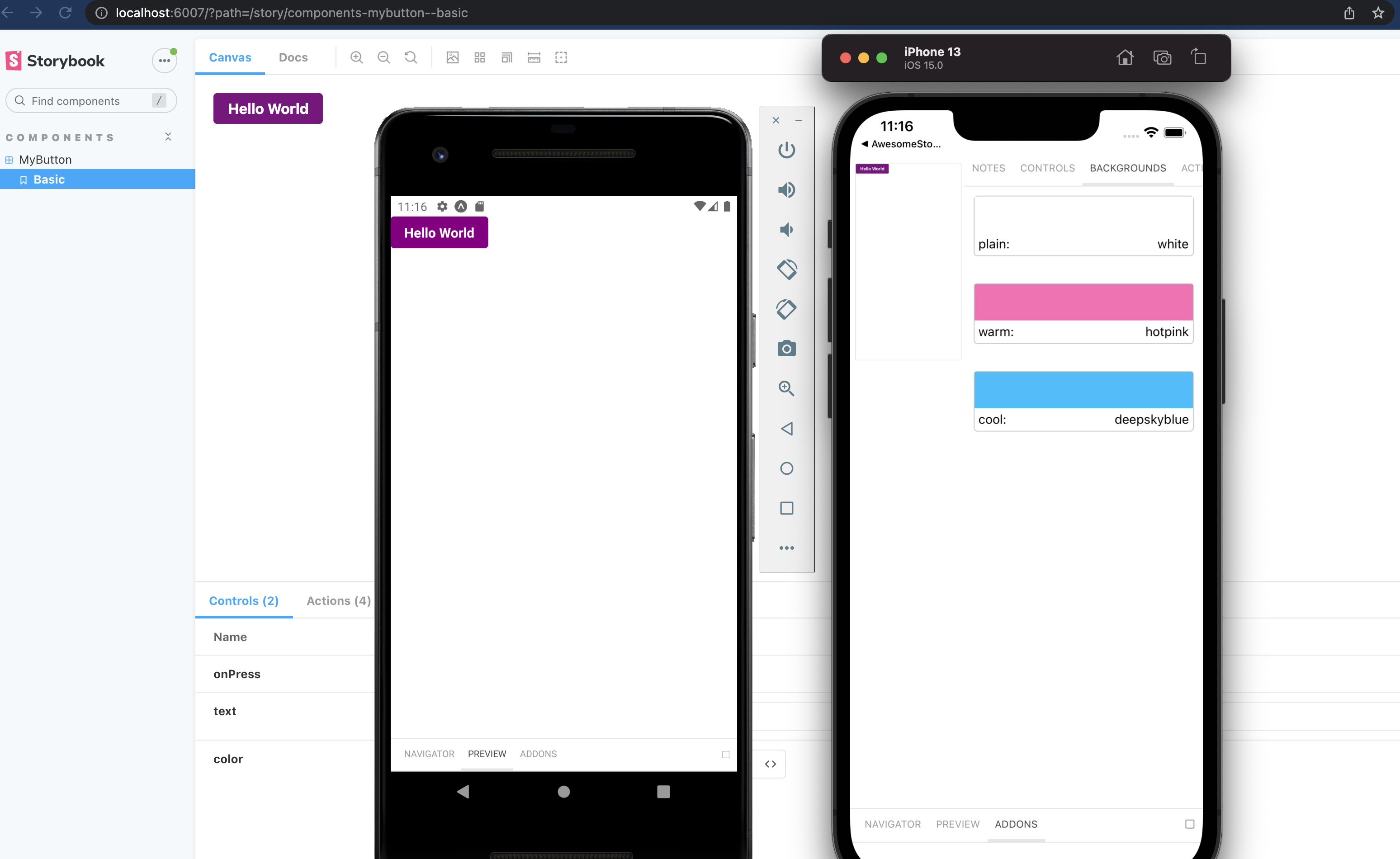
Pictured is from the template mentioned in getting started
Table of contents
Getting Started
New project
There is some project boilerplate with @storybook/react-native and @storybook/addons-react-native-web both already configured with a simple example.
For expo you can use this template with the following command
npx create-expo-app --template expo-template-storybook AwesomeStorybook
yarn create expo-app --template expo-template-storybook AwesomeStorybook
pnpm create expo-app --template expo-template-storybook AwesomeStorybook
For react native cli you can use this template
npx react-native init MyApp --template react-native-template-storybook
Existing project
Run init to setup your project with all the dependencies and configuration files:
npx sb init --type react_native
The only thing left to do is return Storybook's UI in your app entry point (such as App.js) like this:
export { default } from './.storybook';
If you want to be able to swap easily between storybook and your app, have a look at this blog post
If you want to add everything yourself check out the the manual guide here.
Additional steps: Update your metro config
We use the sbmodern resolver field in order to resolve the modern version of storybook packages. Doing this removes the polyfills that ship in commonjs modules and fixes multiple long standing issues such as the promises never resolving bug and more (caused by corejs promises polyfill).
Expo
First create metro config file if you don't have it yet.
npx expo customize metro.config.js
Then add sbmodern to the start of the resolver.resolverMainFields list.
// metro.config.js

const { getDefaultConfig } = require('expo/metro-config');

--module.exports = getDefaultConfig(__dirname);
++const defaultConfig = getDefaultConfig(__dirname);

++defaultConfig.resolver.resolverMainFields.unshift('sbmodern');

++module.exports = defaultConfig;
React native
module.exports = {
resolver: {
resolverMainFields: ['sbmodern', 'react-native', 'browser', 'main'],
},
};
Writing stories
In v6 you can use the CSF syntax that looks like this:
import { MyButton } from './Button';

export default {
  title: 'components/MyButton',
  component: MyButton,
};

export const Basic = (args) => <MyButton {...args} />;

Basic.args = {
  text: 'Hello World',
  color: 'purple',
};
You should configure the path to your story files in the main.js config file from the .storybook folder.
module.exports = {
stories: ['../components/**/*.stories.?(ts|tsx|js|jsx)'],
addons: [],
};
Decorators and Parameters
For stories you can add decorators and parameters on the default export or on a specifc story.
export default {
  title: 'Button',
  component: Button,
  decorators: [
    (Story) => (
      <View style={{ alignItems: 'center', justifyContent: 'center', flex: 1 }}>
        <Story />
      </View>
    ),
  ],
  parameters: {
    backgrounds: {
      values: [
        { name: 'red', value: '#f00' },
        { name: 'green', value: '#0f0' },
        { name: 'blue', value: '#00f' },
      ],
    },
  },
};
For global decorators and parameters, you can add them to preview.js inside your .storybook folder.
import { withBackgrounds } from '@storybook/addon-ondevice-backgrounds';
export const decorators = [
withBackgrounds,
(Story) => (
<View style={{ flex: 1, color: 'blue' }}>
<Story />
</View>
),
];
export const parameters = {
backgrounds: {
default: 'plain',
values: [
{ name: 'plain', value: 'white' },
{ name: 'warm', value: 'hotpink' },
{ name: 'cool', value: 'deepskyblue' },
],
},
};
Addons
The cli will install some basic addons for you such as controls and actions.
Ondevice addons are addons that can render with the device ui that you see on the phone.
Currently the addons available are:
Install each one you want to use and add them to the main.js addons list as follows:
addons: [
'@storybook/addon-ondevice-notes',
'@storybook/addon-ondevice-controls',
'@storybook/addon-ondevice-backgrounds',
'@storybook/addon-ondevice-actions',
],
Using the addons in your story
For details of each ondevice addon you can see the readme:
Hide/Show storybook
Storybook on react native is a normal React Native component that can be used or hidden anywhere in your RN application based on your own logic.
You can also create a separate app just for storybook that also works as a package for your visual components.
Some have opted to toggle the storybook component by using a custom option in the react native developer menu.
getStorybookUI options
You can pass these parameters to getStorybookUI call in your storybook entry point:
{
    tabOpen: Number (0)
        -- which tab should be open. -1 Sidebar, 0 Canvas, 1 Addons
    initialSelection: string | Object (undefined)
        -- initialize storybook with a specific story.  eg: `mybutton--largebutton` or `{ kind: 'MyButton', name: 'LargeButton' }`
    shouldDisableKeyboardAvoidingView: Boolean (false)
        -- Disable KeyboardAvoidingView wrapping Storybook's view
    keyboardAvoidingViewVerticalOffset: Number (0)
        -- With shouldDisableKeyboardAvoidingView=true, this will set the keyboardverticaloffset (https://facebook.github.io/react-native/docs/keyboardavoidingview#keyboardverticaloffset) value for KeyboardAvoidingView wrapping Storybook's view
}
Contributing
We welcome contributions to Storybook!
- 📥 Pull requests and 🌟 Stars are always welcome.
- Read our contributing guide to get started,
or find us on Discord and look for the react-native channel.
Looking for a first issue to tackle?
- We tag issues with Good First Issue when we think they are well suited for people who are new to the codebase or OSS in general.
- Talk to us, we'll find something to suits your skills and learning interest.
Examples
Here are some example projects to help you get started