Security News
Python Overtakes JavaScript as Top Programming Language on GitHub
Python becomes GitHub's top language in 2024, driven by AI and data science projects, while AI-powered security tools are gaining adoption.
@storybook/react
Advanced tools
@storybook/react is a development environment for UI components. It allows developers to create components independently and showcase components interactively in an isolated development environment. Storybook helps in building UI components in isolation from the business logic and context of the app, which makes it easier to develop hard-to-reach states and edge cases.
Component Story Format (CSF)
CSF is an ES Module-based standard for defining component examples. This format is simple and portable. Developers can write their component stories in plain JavaScript objects.
import React from 'react';
import { Button } from './Button';
export default {
title: 'Example/Button',
component: Button,
};
const Template = (args) => <Button {...args} />;
export const Primary = Template.bind({});
Primary.args = {
primary: true,
label: 'Button',
};Addons
Addons are essentially plugins that extend Storybook's core functionalities. With addons, developers can add features like knobs to dynamically change props, accessibility checks, and story source code display.
import { withKnobs, text, boolean, number } from '@storybook/addon-knobs';

export default {
  title: 'Example/Button',
  decorators: [withKnobs],
};

export const DynamicVariables = () => {
  const name = text('Name', 'Aragon');
  const age = number('Age', 30);
  const content = `I am ${name} and I'm ${age} years old.`;
  return <div>{content}</div>;
};
Controls
Controls give the ability to interact with a component's arguments dynamically without needing to code. It's a more robust version of the addon-knobs but built into Storybook by default.
export default {
  title: 'Example/Button',
  component: Button,
  argTypes: {
    backgroundColor: { control: 'color' },
    size: {
      control: { type: 'select', options: ['small', 'medium', 'large'] },
    },
  },
};

export const Primary = (args) => <Button {...args} />;
Primary.args = {
  primary: true,
  label: 'Button',
};React Cosmos is a development tool for creating reusable React components. It scans your project for components and enables you to render components with any context or state. Compared to @storybook/react, React Cosmos focuses more on the component's lifecycle and state rather than the component's variations.
Docz leverages MDX files to help you document your components easily. It's more focused on documentation than interactive development. Unlike @storybook/react, Docz provides a more straightforward approach to documenting components using markdown, but it lacks some of the interactive development features that Storybook offers.
FAQs
Storybook React renderer
The npm package @storybook/react receives a total of 4,310,979 weekly downloads. As such, @storybook/react popularity was classified as popular.
We found that @storybook/react demonstrated a healthy version release cadence and project activity because the last version was released less than a year ago. It has 11 open source maintainers collaborating on the project.
Did you know?

Socket for GitHub automatically highlights issues in each pull request and monitors the health of all your open source dependencies. Discover the contents of your packages and block harmful activity before you install or update your dependencies.

Security News
Python becomes GitHub's top language in 2024, driven by AI and data science projects, while AI-powered security tools are gaining adoption.

Security News
Dutch National Police and FBI dismantle Redline and Meta infostealer malware-as-a-service operations in Operation Magnus, seizing servers and source code.

Research
Security News
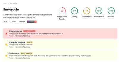
Socket is tracking a new trend where malicious actors are now exploiting the popularity of LLM research to spread malware through seemingly useful open source packages.