Security News
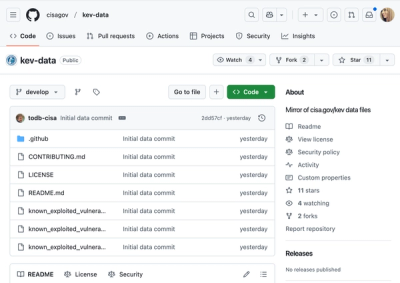
CISA Brings KEV Data to GitHub
CISA's KEV data is now on GitHub, offering easier access, API integration, commit history tracking, and automated updates for security teams and researchers.
@storybook/vue3
Advanced tools
@storybook/vue3 is a tool for developing UI components in isolation for Vue 3 applications. It allows developers to build, test, and document components in a standalone environment, which helps in creating robust and reusable components.
Component Development
Allows developers to create and showcase different states of Vue 3 components in isolation.
import { storiesOf } from '@storybook/vue3';
import MyButton from './MyButton.vue';
storiesOf('MyButton', module)
.add('default', () => ({
components: { MyButton },
template: '<my-button>Default</my-button>',
}))
.add('primary', () => ({
components: { MyButton },
template: '<my-button primary>Primary</my-button>',
}));Interactive Documentation
Enables the creation of interactive documentation for components, allowing users to see how components behave with different props and states.
import { Meta, Story } from '@storybook/vue3';
import MyButton from './MyButton.vue';

export default {
  title: 'Example/MyButton',
  component: MyButton,
} as Meta;

const Template: Story = (args) => ({
  components: { MyButton },
  setup() {
    return { args };
  },
  template: '<my-button v-bind="args" />',
});

export const Primary = Template.bind({});
Primary.args = {
  primary: true,
  label: 'Button',
};
Add-ons Support
Supports various add-ons to enhance the development experience, such as knobs for dynamic prop editing.
import { withKnobs, text, boolean } from '@storybook/addon-knobs';
import MyButton from './MyButton.vue';

export default {
  title: 'MyButton',
  decorators: [withKnobs],
};

export const withKnobsExample = () => ({
  components: { MyButton },
  props: {
    label: {
      type: String,
      default: text('Label', 'Button'),
    },
    primary: {
      type: Boolean,
      default: boolean('Primary', false),
    },
  },
  template: '<my-button :primary="primary">{{ label }}</my-button>',
});Vue Styleguidist is a component development environment with a focus on documentation. It allows developers to create and maintain a living style guide for Vue components. Compared to @storybook/vue3, Vue Styleguidist is more focused on documentation and less on interactive component development.
Docz is a documentation tool that supports multiple frameworks, including Vue. It allows developers to create interactive documentation for their components. While it provides similar documentation capabilities as @storybook/vue3, it is more general-purpose and not specifically tailored for Vue 3.
Vue Play is a minimalistic library for developing and testing Vue components in isolation. It offers a simpler and more lightweight alternative to @storybook/vue3, but lacks some of the advanced features and add-ons that Storybook provides.
FAQs
Storybook Vue 3 renderer
The npm package @storybook/vue3 receives a total of 268,783 weekly downloads. As such, @storybook/vue3 popularity was classified as popular.
We found that @storybook/vue3 demonstrated a healthy version release cadence and project activity because the last version was released less than a year ago. It has 12 open source maintainers collaborating on the project.
Did you know?

Socket for GitHub automatically highlights issues in each pull request and monitors the health of all your open source dependencies. Discover the contents of your packages and block harmful activity before you install or update your dependencies.

Security News
CISA's KEV data is now on GitHub, offering easier access, API integration, commit history tracking, and automated updates for security teams and researchers.

Security News
Opengrep forks Semgrep to preserve open source SAST in response to controversial licensing changes.

Security News
Critics call the Node.js EOL CVE a misuse of the system, sparking debate over CVE standards and the growing noise in vulnerability databases.