Security News
Node.js EOL Versions CVE Dubbed the "Worst CVE of the Year" by Security Experts
Critics call the Node.js EOL CVE a misuse of the system, sparking debate over CVE standards and the growing noise in vulnerability databases.
@syncfusion/ej2-angular-buttons
Advanced tools
A package of feature-rich Essential JS 2 components such as Button, CheckBox, RadioButton and Switch. for Angular
The Angular Buttons package includes the following list of components.
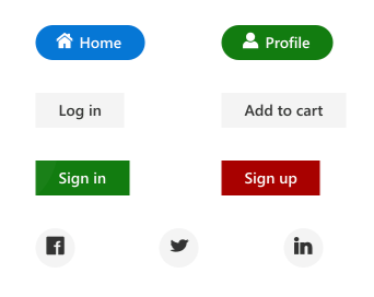
The Angular Button component is a custom HTML5 button component. It has several built-in features such as support for icons, predefined styles, different button types, different button sizes, and UI customization.
Getting Started . Online demos . Learn more

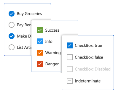
The Angular CheckBox component is a custom checkbox-type HTML5 input component for selecting one or more options from a list of predefined choices. It supports an indeterminate state, different sizes, custom labels and positions, and UI customization.
Getting Started . Online demos . Learn more

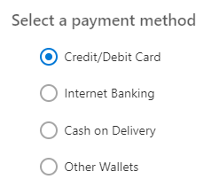
The Angular RadioButton component is a custom radio-type HTML5 input component for selecting one option from a list of predefined choices. It supports different states, sizes, labels, label positions, and UI customizations.
Getting Started . Online demos . Learn more

The Angular Switch component is a custom HTML5 input-type component control that allows you to perform a toggle (on/off) action between checked and unchecked states. It supports different sizes, labels, label positions, and UI customization.
Getting Started . Online demos . Learn more

Trusted by the world's leading companies

To install buttons and its dependent packages, use the following command.
npm install @syncfusion/ej2-angular-buttons
Button components are available in following list of frameworks.
 JavaScript |  React |  Vue |  ASP.NET Core |  ASP.NET MVC |
|---|
Product support is available through following mediums.
Check the changelog here. Get minor improvements and bug fixes every week to stay up to date with frequent updates.
This is a commercial product and requires a paid license for possession or use. Syncfusion’s licensed software, including this component, is subject to the terms and conditions of Syncfusion's EULA. To acquire a license for 80+ Angular UI components, you can purchase or start a free 30-day trial.
A free community license is also available for companies and individuals whose organizations have less than $1 million USD in annual gross revenue and five or fewer developers.
See LICENSE FILE for more info.
© Copyright 2023 Syncfusion, Inc. All Rights Reserved. The Syncfusion Essential Studio license and copyright applies to this distribution.
FAQs
A package of feature-rich Essential JS 2 components such as Button, CheckBox, RadioButton and Switch. for Angular
The npm package @syncfusion/ej2-angular-buttons receives a total of 15,020 weekly downloads. As such, @syncfusion/ej2-angular-buttons popularity was classified as popular.
We found that @syncfusion/ej2-angular-buttons demonstrated a healthy version release cadence and project activity because the last version was released less than a year ago. It has 0 open source maintainers collaborating on the project.
Did you know?

Socket for GitHub automatically highlights issues in each pull request and monitors the health of all your open source dependencies. Discover the contents of your packages and block harmful activity before you install or update your dependencies.

Security News
Critics call the Node.js EOL CVE a misuse of the system, sparking debate over CVE standards and the growing noise in vulnerability databases.

Security News
cURL and Go security teams are publicly rejecting CVSS as flawed for assessing vulnerabilities and are calling for more accurate, context-aware approaches.

Security News
Bun 1.2 enhances its JavaScript runtime with 90% Node.js compatibility, built-in S3 and Postgres support, HTML Imports, and faster, cloud-first performance.