Security News
38% of CISOs Fear They’re Not Moving Fast Enough on AI
CISOs are racing to adopt AI for cybersecurity, but hurdles in budgets and governance may leave some falling behind in the fight against cyber threats.
@syncfusion/ej2-angular-diagrams
Advanced tools
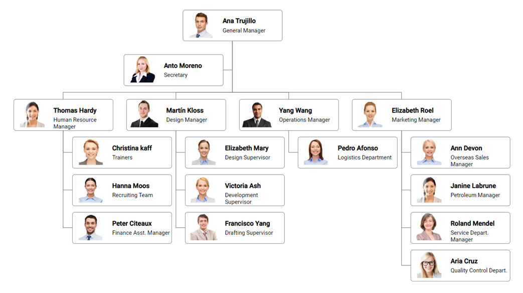
Feature-rich diagram control to create diagrams like flow charts, organizational charts, mind maps, and BPMN diagrams. Its rich feature set includes built-in shapes, editing, serializing, exporting, printing, overview, data binding, and automatic layouts.
The Angular Diagram component is used for visualizing, creating, and editing interactive diagrams. It supports creating flowcharts, organizational charts, mind maps, floor plans, UML diagrams, and BPMN charts either through code or a visual interface.
Getting started . Online demos . Learn more

Trusted by the world's leading companies

You can use Angular CLI to setup your Angular applications. To install the Angular CLI, use the following command.
npm install -g @angular/cli
Create a new Angular application using the following Angular CLI command.
ng new my-app
cd my-app
All Syncfusion Angular packages are available in npmjs.com. To install the Angular diagram package, use the following command.
ng add @syncfusion/ej2-angular-diagrams
The above command does the below configuration to your Angular app.
@syncfusion/ej2-angular-diagrams package and its peer dependencies to your package.json file.DiagramModule in your application module app.module.ts.angular.json file.This makes it easy to add the Syncfusion Angular Diagram module to your project and start using it in your application.
In src/app/app.component.ts, use <ejs-diagram> selector in the template attribute of the @Component directive to render the Syncfusion Angular Diagram component.
import { Component, OnInit } from '@angular/core';

@Component({
    selector: 'app-root',
    template: `<ejs-diagram #diagram id="diagram" width="100%" height="700px">
          <e-nodes>
            <e-node id="begin" [height]="40" [offsetX]="300" [offsetY]="80" [shape]="terminator">
              <e-node-annotations>
                <e-node-annotation content="Begin"> </e-node-annotation>
              </e-node-annotations>
            </e-node>
            <e-node id="process" [height]="80" [offsetX]="300" [offsetY]="160" [shape]="decision">
              <e-node-annotations>
                <e-node-annotation content="Process"> </e-node-annotation>
              </e-node-annotations>
            </e-node>
            <e-node id="end" [height]="40" [offsetX]="300" [offsetY]="240" [shape]="process">
              <e-node-annotations>
                <e-node-annotation content="End"> </e-node-annotation>
              </e-node-annotations>
            </e-node>
          </e-nodes>
          <e-connectors>
            <e-connector id="connector1" sourceID="begin" targetID="process">
            </e-connector>
            <e-connector id="connector2" sourceID="process" targetID="end">
            </e-connector>
          </e-connectors>
        </ejs-diagram>`
})
export class AppComponent implements OnInit {
    public terminator: FlowShapeModel = { type: 'Flow', shape: 'Terminator' };
    public decision: FlowShapeModel = { type: 'Flow', shape: 'Decision' };
}
Diagram component is also offered in the following list of frameworks.
 JavaScript |  React |  Vue |  ASP.NET Core |  ASP.NET MVC |
|---|
Product support is available through the following mediums.
Check the changelog here. Get minor improvements and bug fixes every week to stay up to date with frequent updates.
This is a commercial product and requires a paid license for possession or use. Syncfusion’s licensed software, including this component, is subject to the terms and conditions of Syncfusion's EULA. To acquire a license for 80+ Angular UI components, you can purchase or start a free 30-day trial.
A free community license is also available for companies and individuals whose organizations have less than $1 million USD in annual gross revenue and five or fewer developers.
See LICENSE FILE for more info.
© Copyright 2024 Syncfusion, Inc. All Rights Reserved. The Syncfusion Essential Studio license and copyright applies to this distribution.
FAQs
Feature-rich diagram control to create diagrams like flow charts, organizational charts, mind maps, and BPMN diagrams. Its rich feature set includes built-in shapes, editing, serializing, exporting, printing, overview, data binding, and automatic layouts.
The npm package @syncfusion/ej2-angular-diagrams receives a total of 3,448 weekly downloads. As such, @syncfusion/ej2-angular-diagrams popularity was classified as popular.
We found that @syncfusion/ej2-angular-diagrams demonstrated a healthy version release cadence and project activity because the last version was released less than a year ago. It has 3 open source maintainers collaborating on the project.
Did you know?

Socket for GitHub automatically highlights issues in each pull request and monitors the health of all your open source dependencies. Discover the contents of your packages and block harmful activity before you install or update your dependencies.

Security News
CISOs are racing to adopt AI for cybersecurity, but hurdles in budgets and governance may leave some falling behind in the fight against cyber threats.

Research
Security News
Socket researchers uncovered a backdoored typosquat of BoltDB in the Go ecosystem, exploiting Go Module Proxy caching to persist undetected for years.

Security News
Company News
Socket is joining TC54 to help develop standards for software supply chain security, contributing to the evolution of SBOMs, CycloneDX, and Package URL specifications.