
Security News
RubyGems.org Adds New Maintainer Role
RubyGems.org has added a new "maintainer" role that allows for publishing new versions of gems. This new permission type is aimed at improving security for gem owners and the service overall.
@syncfusion/ej2-buttons
Advanced tools
A package of feature-rich Essential JS 2 components such as Button, CheckBox, RadioButton and Switch.
@syncfusion/ej2-buttons is a comprehensive package for creating various types of buttons in web applications. It provides a wide range of button components such as standard buttons, toggle buttons, radio buttons, and checkboxes, all of which are highly customizable and easy to integrate.
Standard Button
This feature allows you to create a standard button with customizable content. The button can be styled and configured to perform actions when clicked.
const button = new ej.buttons.Button({ content: 'Click Me' }); button.appendTo('#element');Toggle Button
This feature allows you to create a toggle button that can switch between two states. It is useful for scenarios where you need a button to represent an on/off state.
const toggleButton = new ej.buttons.Button({ content: 'Toggle', isToggle: true }); toggleButton.appendTo('#element');Radio Button
This feature allows you to create a radio button, which is part of a group of options where only one option can be selected at a time.
const radioButton = new ej.buttons.RadioButton({ label: 'Option 1', name: 'options' }); radioButton.appendTo('#element');Checkbox
This feature allows you to create a checkbox, which can be used for binary choices such as accepting terms and conditions.
const checkbox = new ej.buttons.CheckBox({ label: 'Accept Terms' }); checkbox.appendTo('#element');React-Bootstrap provides a set of React components that implement Bootstrap's styles and components. It includes button components similar to @syncfusion/ej2-buttons, but it is more focused on providing a complete UI framework based on Bootstrap.
Material-UI is a popular React component library that implements Google's Material Design. It offers a wide range of button components with extensive customization options, similar to @syncfusion/ej2-buttons, but it is part of a larger suite of Material Design components.
Ant Design (antd) is a comprehensive UI framework for React that includes a variety of button components. It provides similar functionalities to @syncfusion/ej2-buttons, with a focus on enterprise-level applications and a rich set of design guidelines.
The JavaScript Buttons package includes the following list of controls.
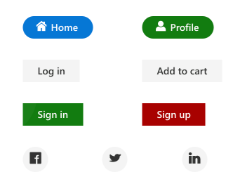
The JavaScript Button control is a custom HTML5 button component. It has several built-in features such as support for icons, predefined styles, different button types, different button sizes, and UI customization.
Getting Started. Online demos. Learn more.
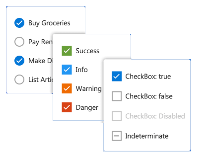
The JavaScript CheckBox control is a custom checkbox-type HTML5 input component for selecting one or more options from a list of predefined choices. It supports an indeterminate state, different sizes, custom labels and positions, and UI customization.
Getting Started . Online demos . Learn more
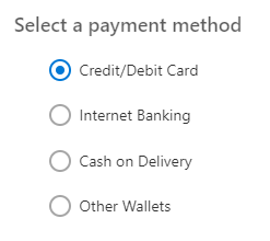
The JavaScript RadioButton control is a custom radio-type HTML5 input component for selecting one option from a list of predefined choices. It supports different states, sizes, labels, label positions, and UI customizations.
Getting Started . Online demos . Learn more
The JavaScript Switch control is a custom HTML5 input-type component control that allows you to perform a toggle (on/off) action between checked and unchecked states. It supports different sizes, labels, label positions, and UI customization.
Getting Started . Online demos . Learn more

The JavaScript Floating Action Button control performs the primary action that appears in front of all screen contents. It has several built-in features such as support for icons, predefined styles, positions, and UI customization.
Getting Started . Online demos . Learn more
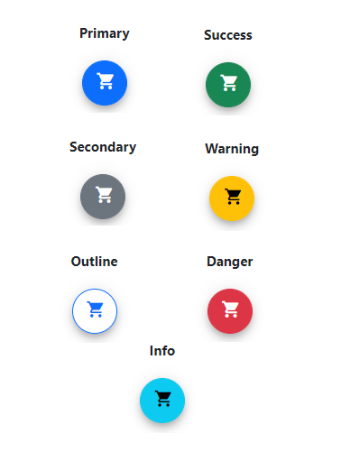
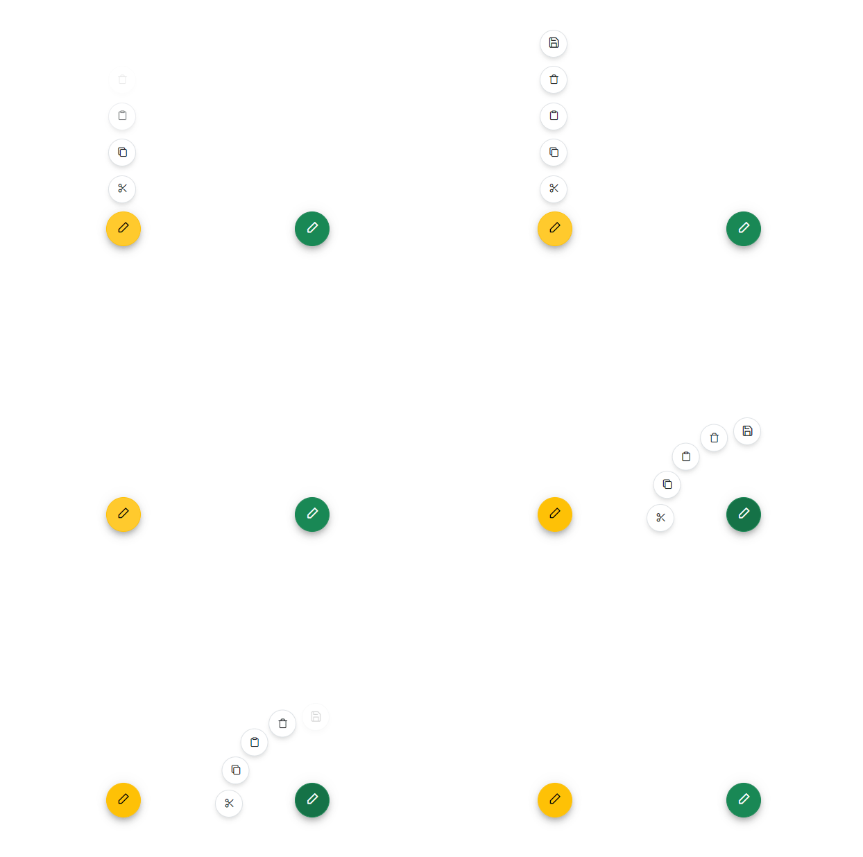
The JavaScript Speed Dial control is an extension of the floating action button that displays a list of action buttons when clicked. It has several built-in features such as support for items, predefined styles, positions, and UI customization.
Getting Started . Online demos . Learn more
Trusted by the world's leading companies

To install buttons and its dependent packages, use the following command,
npm install @syncfusion/ej2-buttons
Button controls are also offered to following list of frameworks.
 Angular |  React |  Vue |  ASP.NET Core |  ASP.NET MVC |
|---|
Product support is available through following mediums.
Check the changelog here. Get minor improvements and bug fixes every week to stay up to date with frequent updates.
This is a commercial product and requires a paid license for possession or use. Syncfusion’s licensed software, including this component, is subject to the terms and conditions of Syncfusion's EULA. To acquire a license for 80+ JavaScript UI controls, you can purchase or start a free 30-day trial.
A free community license is also available for companies and individuals whose organizations have less than $1 million USD in annual gross revenue and five or fewer developers.
See LICENSE FILE for more info.
© Copyright 2024 Syncfusion, Inc. All Rights Reserved. The Syncfusion Essential Studio license and copyright applies to this distribution.
FAQs
A package of feature-rich Essential JS 2 components such as Button, CheckBox, RadioButton and Switch.
The npm package @syncfusion/ej2-buttons receives a total of 89,454 weekly downloads. As such, @syncfusion/ej2-buttons popularity was classified as popular.
We found that @syncfusion/ej2-buttons demonstrated a healthy version release cadence and project activity because the last version was released less than a year ago. It has 0 open source maintainers collaborating on the project.
Did you know?

Socket for GitHub automatically highlights issues in each pull request and monitors the health of all your open source dependencies. Discover the contents of your packages and block harmful activity before you install or update your dependencies.

Security News
RubyGems.org has added a new "maintainer" role that allows for publishing new versions of gems. This new permission type is aimed at improving security for gem owners and the service overall.

Security News
Node.js will be enforcing stricter semver-major PR policies a month before major releases to enhance stability and ensure reliable release candidates.

Security News
Research
Socket's threat research team has detected five malicious npm packages targeting Roblox developers, deploying malware to steal credentials and personal data.