
Security News
Oracle Drags Its Feet in the JavaScript Trademark Dispute
Oracle seeks to dismiss fraud claims in the JavaScript trademark dispute, delaying the case and avoiding questions about its right to the name.
By Sarah Gooding - Feb 07, 2025
@syncfusion/ej2-grids
Advanced tools
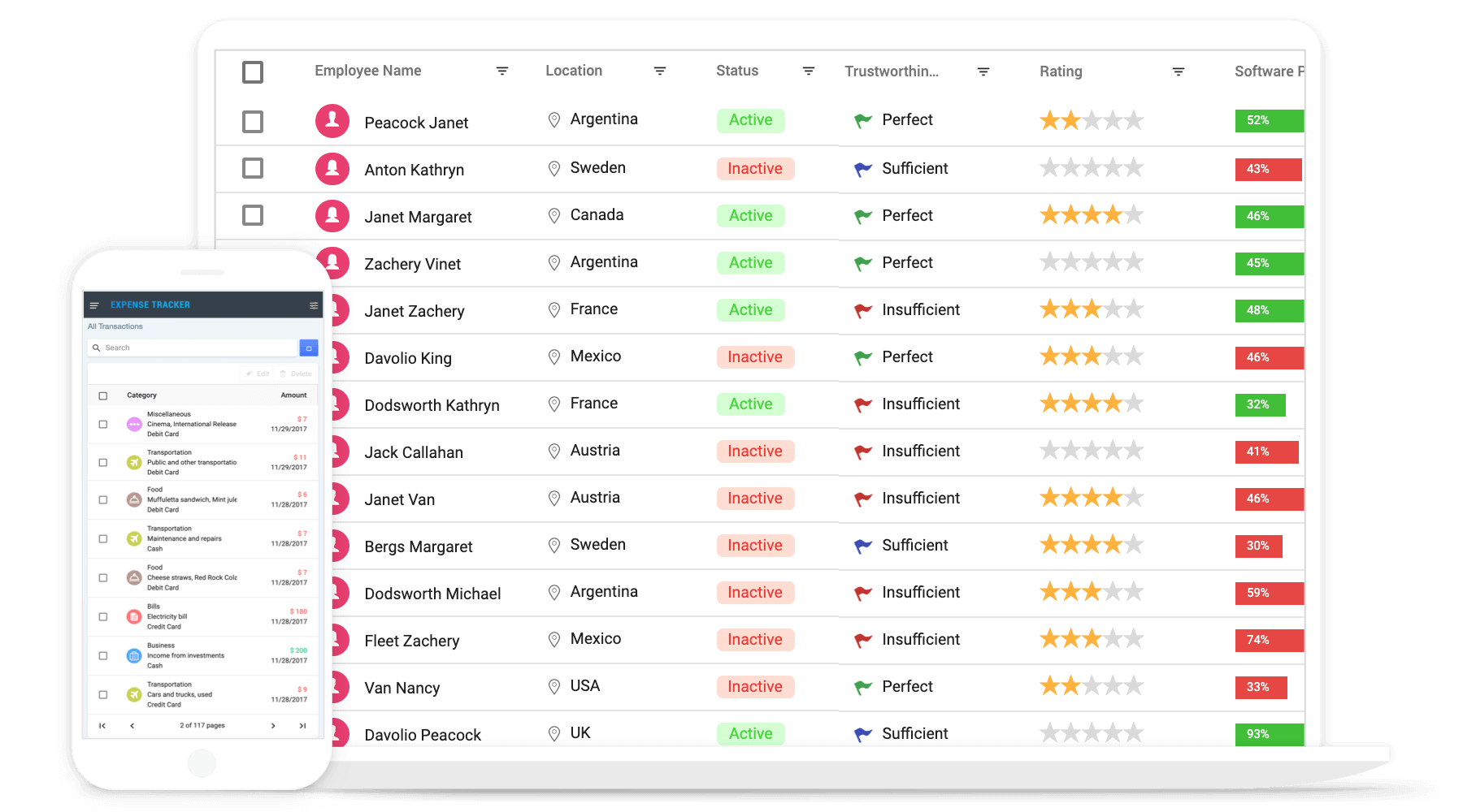
Feature-rich JavaScript datagrid (datatable) control with built-in support for editing, filtering, grouping, paging, sorting, and exporting to Excel.
The JavaScript Grid control is used to display and manipulate tabular data with configuration options to control the way the data is presented and manipulated. It will pull data from a data source, such as array of JSON objects, OData web services, or DataManager binding data fields to columns. Also displaying a column header to identify the field with support for grouped records.
Getting started . Online demos . Learn more
Trusted by the world's leading companies

To install Grid and its dependent packages, use the following command.
npm install @syncfusion/ej2-grids
Now, you can start adding the Grid control in the application. For getting started, add a div element for Grid control in index.html. Then refer the index.js file, below EJ2 style and EJ2 script reference into the index.html file.
To render the basic Grid, you can include the HTML code example below in your index.html file.
<!DOCTYPE html>
  <html xmlns="http://www.w3.org/1999/xhtml">
       <head>
            <title>Essential JS 2 Grid</title>
            <!-- Essential JS 2 material theme -->
            <link rel="stylesheet" href=https://cdn.syncfusion.com/ej2/{{ site.ej2version }}/material.css />
             <script src="node_modules/@syncfusion/ej2-base/dist/global/ej2-base.min.js" type="text/javascript"></script>
             <script src="node_modules/@syncfusion/ej2-data/dist/global/ej2-data.min.js" type="text/javascript"></script>
             <script src="node_modules/@syncfusion/ej2-popups/dist/global/ej2-popups.min.js" type="text/javascript"></script>
             <script src="node_modules/@syncfusion/ej2-grids/dist/global/ej2-grids.min.js" type="text/javascript"></script>
             <script src="index.js" type="text/javascript" defer></script>
       </head>
       <body>
       <div id="Grid"></div>
       </body>
  </html>
you can include the HTML code example below in your index.js file.
let data = [
    {'OrderID': 10248,'CustomerID': 'VINET', 'ShipCountry': 'France'},
    {'OrderID': 10249,'CustomerID': 'TOMSP', 'ShipCountry': 'Germany'},
    {'OrderID': 10250,'CustomerID': 'HANAR', 'ShipCountry': 'Brazil' },
    {'OrderID': 10251,'CustomerID': 'VICTE', 'ShipCountry': 'France'}
]
var grid = new ej.grids.Grid({
    dataSource: data,
    columns: [
                { field: 'OrderID', headerText: 'Order ID'},
                { field: 'CustomerID', headerText: 'Customer ID'},
                { field: 'ShipCountry', headerText: 'Ship Country' }
    ],
});

grid.appendTo('#Grid');
Grid control is also offered in following list of frameworks.
 Angular |  React |  Vue |  ASP.NET Core |  ASP.NET MVC |
|---|
Product support is available through following mediums,
Check the changelog here. Get minor improvements and bug fixes every week to stay up to date with frequent updates.
This is a commercial product and requires a paid license for possession or use. Syncfusion’s licensed software, including this component, is subject to the terms and conditions of Syncfusion's EULA. To acquire a license for 80+ JavaScript UI controls, you can purchase or start a free 30-day trial.
A free community license is also available for companies and individuals whose organizations have less than $1 million USD in annual gross revenue and five or fewer developers.
See LICENSE FILE for more info.
© Copyright 2022 Syncfusion, Inc. All Rights Reserved. The Syncfusion Essential Studio license and copyright applies to this distribution.
FAQs
Feature-rich JavaScript datagrid (datatable) control with built-in support for editing, filtering, grouping, paging, sorting, and exporting to Excel.
The npm package @syncfusion/ej2-grids receives a total of 0 weekly downloads. As such, @syncfusion/ej2-grids popularity was classified as not popular.
We found that @syncfusion/ej2-grids demonstrated a healthy version release cadence and project activity because the last version was released less than a year ago. It has 3 open source maintainers collaborating on the project.
Did you know?

Socket for GitHub automatically highlights issues in each pull request and monitors the health of all your open source dependencies. Discover the contents of your packages and block harmful activity before you install or update your dependencies.
Security News
Oracle seeks to dismiss fraud claims in the JavaScript trademark dispute, delaying the case and avoiding questions about its right to the name.

Security News
The Linux Foundation is warning open source developers that compliance with global sanctions is mandatory, highlighting legal risks and restrictions on contributions.

Security News
Maven Central now validates Sigstore signatures, making it easier for developers to verify the provenance of Java packages.