Security News
Node.js EOL Versions CVE Dubbed the "Worst CVE of the Year" by Security Experts
Critics call the Node.js EOL CVE a misuse of the system, sparking debate over CVE standards and the growing noise in vulnerability databases.
@syncfusion/ej2-react-gantt
Advanced tools
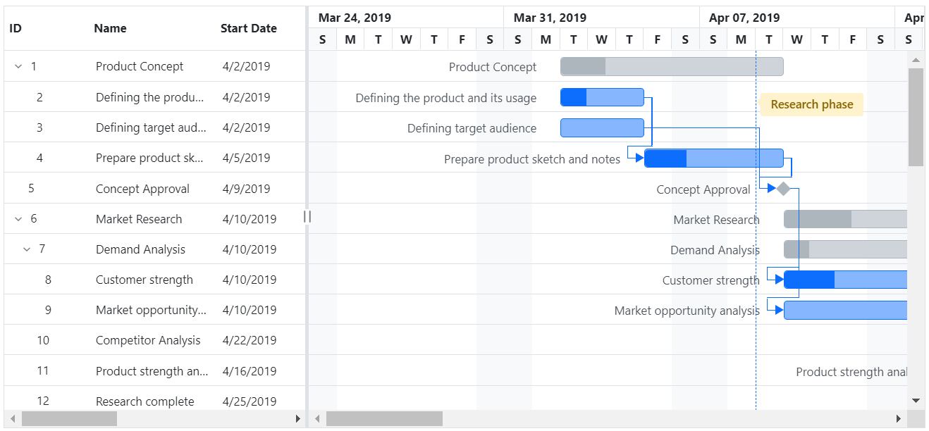
The React Gantt component is a project planning and management tool used to display and manage hierarchical tasks with timeline details. It helps assess how long a project should take, determine the resources needed, manage the dependencies between tasks, and plan the order in which the tasks should be completed.
Getting Started . Online demos . Learn more

Trusted by the world's leading companies

You can use create-react-app to setup applications. To create React app use the following command.
npx create-react-app my-app --template typescript
cd my-app
npm start
All Syncfusion react packages are published in the npmjs.com registry. To install the react gantt package, use the following command.
npm install @syncfusion/ej2-react-gantt --save
Add CSS references needed for a Gantt in src/App.css from the ../node_modules/@syncfusion package folder.
@import '../node_modules/@syncfusion/ej2-base/styles/material.css';
@import '../node_modules/@syncfusion/ej2-buttons/styles/material.css';
@import '../node_modules/@syncfusion/ej2-calendars/styles/material.css';
@import '../node_modules/@syncfusion/ej2-dropdowns/styles/material.css';
@import '../node_modules/@syncfusion/ej2-inputs/styles/material.css';
@import '../node_modules/@syncfusion/ej2-lists/styles/material.css';
@import '../node_modules/@syncfusion/ej2-layouts/styles/material.css';
@import '../node_modules/@syncfusion/ej2-navigations/styles/material.css';
@import '../node_modules/@syncfusion/ej2-popups/styles/material.css';
@import '../node_modules/@syncfusion/ej2-splitbuttons/styles/material.css';
@import '../node_modules/@syncfusion/ej2-grids/styles/material.css';
@import '../node_modules/@syncfusion/ej2-treegrid/styles/material.css';
@import '../node_modules/@syncfusion/ej2-react-gantt/styles/material.css';
In the src/App.tsx file, use the following code snippet to render the Syncfusion React Gantt component and import App.css to apply styles to the gantt:
import { GanttComponent } from '@syncfusion/ej2-react-gantt';
import './App.css';

function App() {
    let data = [
        {
            TaskID: 1,
            TaskName: 'Project Initiation',
            StartDate: new Date('04/02/2019'),
            EndDate: new Date('04/21/2019'),
            subtasks: [
                { TaskID: 2, TaskName: 'Identify Site location', StartDate: new Date('04/02/2019'), Duration: 4, Progress: 50 },
                { TaskID: 3, TaskName: 'Perform Soil test', StartDate: new Date('04/02/2019'), Duration: 4, Progress: 50  },
                { TaskID: 4, TaskName: 'Soil test approval', StartDate: new Date('04/02/2019'), Duration: 4, Progress: 50 },
            ]
        },
        {
            TaskID: 5,
            TaskName: 'Project Estimation',
            StartDate: new Date('04/02/2019'),
            EndDate: new Date('04/21/2019'),
            subtasks: [
                { TaskID: 6, TaskName: 'Develop floor plan for estimation', StartDate: new Date('04/04/2019'), Duration: 3, Progress: 50 },
                { TaskID: 7, TaskName: 'List materials', StartDate: new Date('04/04/2019'), Duration: 3, Progress: 50 },
                { TaskID: 8, TaskName: 'Estimation approval', StartDate: new Date('04/04/2019'), Duration: 3, Progress: 50 }
            ]
        }];
    let taskSettings = {id: 'TaskID', name: 'TaskName', startDate: 'StartDate', endDate: 'EndDate', duration: 'Duration', progress: 'Progress', child: 'subtasks' };

    return  <GanttComponent dataSource={data} treeColumnIndex={1} taskFields={taskSettings}></GanttComponent>
};
export default App;
Gantt component is also offered in the following list of frameworks.
 JavaScript |  Angular |  Vue |  ASP.NET Core |  ASP.NET MVC |
|---|
Product support is available through following mediums.
Check the changelog here. Get minor improvements and bug fixes every week to stay up to date with frequent updates.
This is a commercial product and requires a paid license for possession or use. Syncfusion® licensed software, including this component, is subject to the terms and conditions of Syncfusion® EULA. To acquire a license for 80+ React UI components, you can purchase or start a free 30-day trial.
A free community license is also available for companies and individuals whose organizations have less than $1 million USD in annual gross revenue and five or fewer developers.
See LICENSE FILE for more info.
© Copyright 2024 Syncfusion® Inc. All Rights Reserved. The Syncfusion® Essential Studio® license and copyright applies to this distribution.
FAQs
Essential JS 2 Gantt Component for React
The npm package @syncfusion/ej2-react-gantt receives a total of 7,001 weekly downloads. As such, @syncfusion/ej2-react-gantt popularity was classified as popular.
We found that @syncfusion/ej2-react-gantt demonstrated a healthy version release cadence and project activity because the last version was released less than a year ago. It has 0 open source maintainers collaborating on the project.
Did you know?

Socket for GitHub automatically highlights issues in each pull request and monitors the health of all your open source dependencies. Discover the contents of your packages and block harmful activity before you install or update your dependencies.

Security News
Critics call the Node.js EOL CVE a misuse of the system, sparking debate over CVE standards and the growing noise in vulnerability databases.

Security News
cURL and Go security teams are publicly rejecting CVSS as flawed for assessing vulnerabilities and are calling for more accurate, context-aware approaches.

Security News
Bun 1.2 enhances its JavaScript runtime with 90% Node.js compatibility, built-in S3 and Postgres support, HTML Imports, and faster, cloud-first performance.