Security News
Deno 2.2 Improves Dependency Management and Expands Node.js Compatibility
Deno 2.2 enhances Node.js compatibility, improves dependency management, adds OpenTelemetry support, and expands linting and task automation for developers.
@syncfusion/ej2-react-kanban
Advanced tools
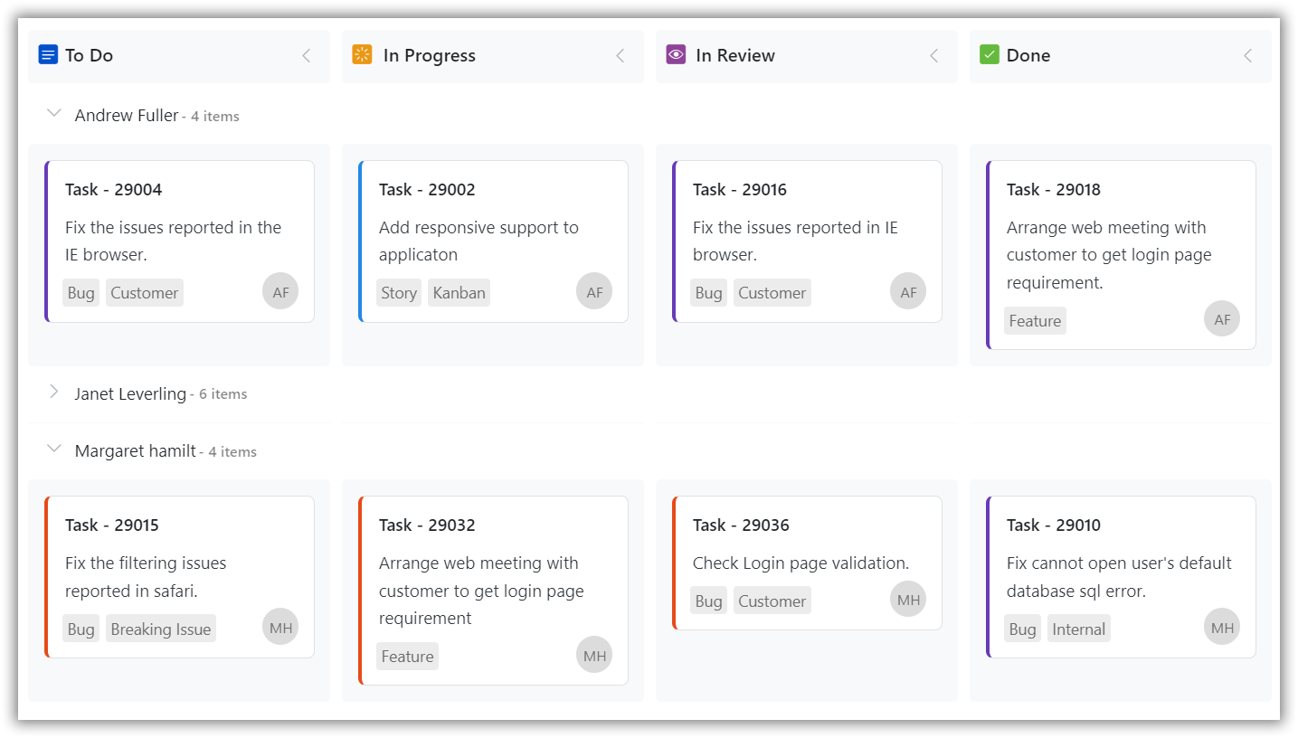
The Kanban board is an efficient way to visualize the workflow at each stage along its path to completion. The most important features available are Swim lane, filtering, and editing. for React
The React Kanban component is a popular tool for visualizing and managing work in a variety of contexts, including software development, project management, and personal productivity. The control supports necessary features to design task scheduling applications. The key features are swimlanes, customizable cards, binding from local and remote data sources, columns mapping, stacked headers, WIP validation, templating, responsiveness, filtering, and editing.
Getting started . Online demos . Learn more

Trusted by the world's leading companies

You can use create-react-app to setup applications. To create React app use the following command.
npx create-react-app my-app --template typescript
cd my-app
npm start
To install Kanban and its dependent packages, use the following command.
npm install @syncfusion/ej2-react-kanban --save
Add CSS references needed for Kanban in src/App.css from ../node_modules/@syncfusion package folder.
    @import "../node_modules/@syncfusion/ej2-base/styles/bootstrap5.css";
    @import '../node_modules/@syncfusion/ej2-buttons/styles/bootstrap5.css';
    @import "../node_modules/@syncfusion/ej2-layouts/styles/bootstrap5.css";
    @import '../node_modules/@syncfusion/ej2-dropdowns/styles/bootstrap5.css';
    @import '../node_modules/@syncfusion/ej2-inputs/styles/bootstrap5.css';
    @import "../node_modules/@syncfusion/ej2-navigations/styles/bootstrap5.css";
    @import "../node_modules/@syncfusion/ej2-popups/styles/bootstrap5.css";
    @import "../node_modules/@syncfusion/ej2-react-kanban/styles/bootstrap5.css";
In src/App.tsx file, use the following code snippet to render the Syncfusion React Kanban control and import App.css to apply styles to the kanban:
import { KanbanComponent, ColumnsDirective, ColumnDirective } from "@syncfusion/ej2-react-kanban";
import * as React from 'react';
import './App.css';

function App() {
    let data = [
        { Id: 1, Status: 'Open', Summary: 'Analyze the new requirements gathered from the customer.', Type: 'Story', Priority: 'Low', Tags: 'Analyze,Customer', Estimate: 3.5, Assignee: 'Nancy Davloio', RankId: 1 },
        { Id: 2, Status: 'InProgress', Summary: 'Fix the issues reported in the IE browser.', Type: 'Bug', Priority: 'Release Breaker', Tags: 'IE', Estimate: 2.5, Assignee: 'Janet Leverling', RankId: 2  },
        { Id: 3, Status: 'Testing', Summary: 'Fix the issues reported by the customer.', Type: 'Bug', Priority: 'Low', Tags: 'Customer', Estimate: '3.5', Assignee: 'Steven walker', RankId: 1 },
        { Id: 4, Status: 'Close', Summary: 'Arrange a web meeting with the customer to get the login page requirements.', Type: 'Others', Priority: 'Low', Tags: 'Meeting', Estimate: 2, Assignee: 'Michael Suyama', RankId: 1 },
        { Id: 5, Status: 'Validate', Summary: 'Validate new requirements', Type: 'Improvement', Priority: 'Low', Tags: 'Validation', Estimate: 1.5, Assignee: 'Robert King', RankId: 1 }
    ];
    return (
            <div className="App">
                <KanbanComponent id="kanban" keyField="Status" dataSource={data} cardSettings={{ contentField: "Summary", headerField: "Id" }}>
                    <ColumnsDirective>
                    <ColumnDirective headerText="To Do" keyField="Open"/>
                    <ColumnDirective headerText="In Progress" keyField="InProgress"/>
                    <ColumnDirective headerText="Testing" keyField="Testing"/>
                    <ColumnDirective headerText="Done" keyField="Close"/>
                    </ColumnsDirective>
                </KanbanComponent>
            </div>
          );
};
export default App;
Kanban component is also offered in the following list of frameworks.
 JavaScript |  Angular |  Vue |  ASP.NET Core |  ASP.NET MVC |
|---|
Product support is available through the following mediums.
Check the changelog here. Get minor improvements and bug fixes every week to stay up to date with frequent updates.
This is a commercial product and requires a paid license for possession or use. Syncfusion’s licensed software, including this component, is subject to the terms and conditions of Syncfusion's EULA. To acquire a license for 80+ React UI components, you can purchase or start a free 30-day trial.
A free community license is also available for companies and individuals whose organizations have less than $1 million USD in annual gross revenue and five or fewer developers.
See LICENSE FILE for more info.
© Copyright 2024 Syncfusion, Inc. All Rights Reserved. The Syncfusion Essential Studio license and copyright applies to this distribution.
FAQs
The Kanban board is an efficient way to visualize the workflow at each stage along its path to completion. The most important features available are Swim lane, filtering, and editing. for React
The npm package @syncfusion/ej2-react-kanban receives a total of 3,792 weekly downloads. As such, @syncfusion/ej2-react-kanban popularity was classified as popular.
We found that @syncfusion/ej2-react-kanban demonstrated a healthy version release cadence and project activity because the last version was released less than a year ago. It has 3 open source maintainers collaborating on the project.
Did you know?

Socket for GitHub automatically highlights issues in each pull request and monitors the health of all your open source dependencies. Discover the contents of your packages and block harmful activity before you install or update your dependencies.

Security News
Deno 2.2 enhances Node.js compatibility, improves dependency management, adds OpenTelemetry support, and expands linting and task automation for developers.

Security News
React's CRA deprecation announcement sparked community criticism over framework recommendations, leading to quick updates acknowledging build tools like Vite as valid alternatives.

Security News
Ransomware payment rates hit an all-time low in 2024 as law enforcement crackdowns, stronger defenses, and shifting policies make attacks riskier and less profitable.