
Research
Security News
Malicious npm Packages Inject SSH Backdoors via Typosquatted Libraries
Socket’s threat research team has detected six malicious npm packages typosquatting popular libraries to insert SSH backdoors.
@syncfusion/ej2-vue-buttons
Advanced tools
A package of feature-rich Essential JS 2 components such as Button, CheckBox, RadioButton and Switch. for Vue
The Vue Buttons package includes the following list of components.
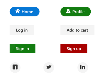
The Vue Button component is a custom HTML5 button component. It has several built-in features such as support for icons, predefined styles, different button types, different button sizes, and UI customization.
Getting Started . Online demos . Learn more
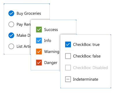
The Vue CheckBox component is a custom checkbox-type HTML5 input component for selecting one or more options from a list of predefined choices. It supports an indeterminate state, different sizes, custom labels and positions, and UI customization.
Getting Started . Online demos . Learn more
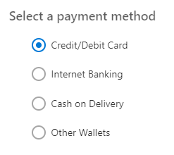
The Vue RadioButton component is a custom radio-type HTML5 input component for selecting one option from a list of predefined choices. It supports different states, sizes, labels, label positions, and UI customizations.
Getting Started . Online demos . Learn more
The Vue Switch component is a custom HTML5 input-type component control that allows you to perform a toggle (on/off) action between checked and unchecked states. It supports different sizes, labels, label positions, and UI customization.
Getting Started . Online demos . Learn more

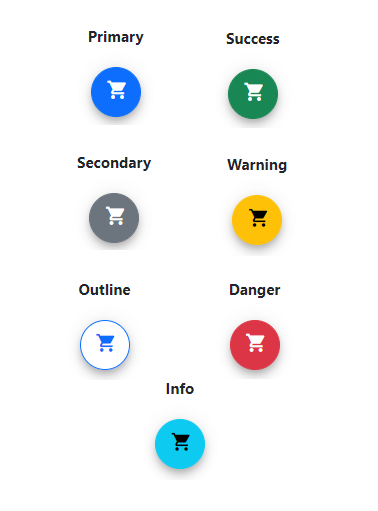
The Vue Floating Action Button component performs the primary action that appears in front of all screen contents. It has several built-in features such as support for icons, predefined styles, positions, and UI customization.
Getting Started . Online demos . Learn more
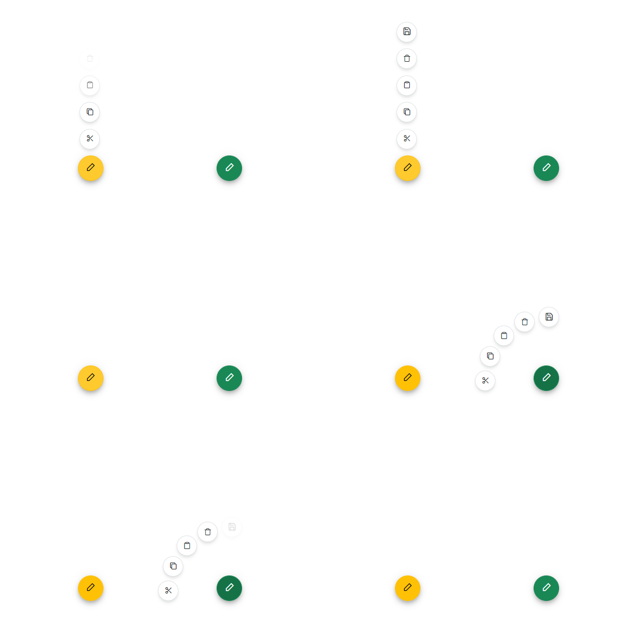
The Vue Speed Dial component is an extension of the floating action button that displays a list of action buttons when clicked. It has several built-in features such as support for items, predefined styles, positions, and UI customization.
Getting Started . Online demos . Learn more
Trusted by the world's leading companies

To install buttons and its dependent packages, use the following command,
npm install @syncfusion/ej2-vue-buttons
Buttons components are also offered in following list of frameworks.
 JavaScript |  React |  Angular |  ASP.NET Core |  ASP.NET MVC |
|---|
Product support is available for through following mediums.
Check the changelog here. Get minor improvements and bug fixes every week to stay up to date with frequent updates.
This is a commercial product and requires a paid license for possession or use. Syncfusion’s licensed software, including this component, is subject to the terms and conditions of Syncfusion's EULA. To acquire a license for 80+ Vue UI components, you can purchase or start a free 30-day trial.
A free community license is also available for companies and individuals whose organizations have less than $1 million USD in annual gross revenue and five or fewer developers.
See LICENSE FILE for more info.
© Copyright 2024 Syncfusion, Inc. All Rights Reserved. The Syncfusion Essential Studio license and copyright applies to this distribution.
FAQs
A package of feature-rich Essential JS 2 components such as Button, CheckBox, RadioButton and Switch. for Vue
The npm package @syncfusion/ej2-vue-buttons receives a total of 2,535 weekly downloads. As such, @syncfusion/ej2-vue-buttons popularity was classified as popular.
We found that @syncfusion/ej2-vue-buttons demonstrated a healthy version release cadence and project activity because the last version was released less than a year ago. It has 0 open source maintainers collaborating on the project.
Did you know?

Socket for GitHub automatically highlights issues in each pull request and monitors the health of all your open source dependencies. Discover the contents of your packages and block harmful activity before you install or update your dependencies.

Research
Security News
Socket’s threat research team has detected six malicious npm packages typosquatting popular libraries to insert SSH backdoors.

Security News
MITRE's 2024 CWE Top 25 highlights critical software vulnerabilities like XSS, SQL Injection, and CSRF, reflecting shifts due to a refined ranking methodology.

Security News
In this segment of the Risky Business podcast, Feross Aboukhadijeh and Patrick Gray discuss the challenges of tracking malware discovered in open source softare.