Security News
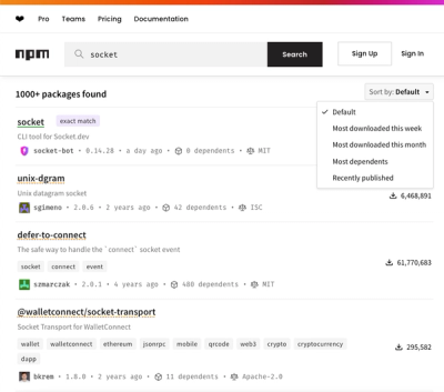
npm Updates Search Experience with New Objective Sorting Options
npm has a revamped search experience with new, more transparent sorting options—Relevance, Downloads, Dependents, and Publish Date.
@vcl/flex-layout
Advanced tools
Flexbox based layout system.
A declarative layout system built on top of CSS Flexbox. Features in CSS Flexbox are exposed as classes that can be put on any element.
Based on that, a twelve-column grid is provided.
Flexbox based layout primitives that can solve almost all layout challenges.
The flex layout also features a layout grid which works just like a classical
float based grid. A grid row is built from a vclLayoutGridRow containing
an arbitrary number of vclLayoutGridCells. The cells can be sized using
the column classed vclLayout1 .. vclLayout11 or the sizing spans from
the layout-spans module.
The grid also supports nesting of rows.
Note that a vclLayoutGridRow must be enclosed in a block container.
A special feature is a grid row which allows to wrap grid cells based on
their width maintaining the gutters. The total width of all cells can be
greater than 100%, they wrap at multiples of 100%.
The vclLayoutWrappingRow modifier is used to enable this.
vclLayoutHorizontalvclLayoutVerticalvclLayoutInlinevclLayoutReversevclLayoutWrapvclLayoutWrapReversevclLayoutFlexvclLayoutAutovclLayoutNonevclLayout1vclLayout2vclLayout3vclLayout4vclLayout5vclLayout6vclLayout7vclLayout8vclLayout9vclLayout10vclLayout11vclLayout12vclLayoutCentervclLayoutCenterCentervclLayoutStartJustifiedvclLayoutCenterJustifiedvclLayoutEndJustifiedvclLayoutJustifiedvclLayoutAroundJustifiedvclLayoutSelfStartvclLayoutSelfCentervclLayoutSelfEndvclLayoutSelfStretchvclLayoutGridRowvclLayoutGridCellvclLayoutWrapContainervclLayoutFixedTopvclLayoutFixedRightvclLayoutFixedBottomvclLayoutFixedLeftvclLayoutFullBleedvclLayoutInvisiblevclLayoutHiddenvclLayoutRelativevclLayoutFitvclLayoutGridRowvclLayoutWrappingRow: Make the row a non-nestable one that can
accommodate cells of more than 100% width in total and wrap those accordingly.layouthorizontalverticalinlinereversewrapwrap-reverseflexautononeonetwothreefourfivesixseveneightnineteneleventwelvestart-justifiedcenter-justifiedend-justifiedjustifiedaround-justifiedself-startself-centerself-endself-stretch--flex-layout-half-gutter-width: The half width of the gutter between
grid cells.example.html on GH-pages.
FAQs
Flexbox based layout system
The npm package @vcl/flex-layout receives a total of 1 weekly downloads. As such, @vcl/flex-layout popularity was classified as not popular.
We found that @vcl/flex-layout demonstrated a not healthy version release cadence and project activity because the last version was released a year ago. It has 4 open source maintainers collaborating on the project.
Did you know?

Socket for GitHub automatically highlights issues in each pull request and monitors the health of all your open source dependencies. Discover the contents of your packages and block harmful activity before you install or update your dependencies.

Security News
npm has a revamped search experience with new, more transparent sorting options—Relevance, Downloads, Dependents, and Publish Date.

Security News
A supply chain attack has been detected in versions 1.95.6 and 1.95.7 of the popular @solana/web3.js library.

Research
Security News
A malicious npm package targets Solana developers, rerouting funds in 2% of transactions to a hardcoded address.