
Research
Security News
Malicious npm Packages Inject SSH Backdoors via Typosquatted Libraries
Socket’s threat research team has detected six malicious npm packages typosquatting popular libraries to insert SSH backdoors.
@wannaby/wanna-ui
Advanced tools
WANNA 3D Viewer for handbags was specifically crafted to answer the industry's pain point — the high number of returns due to the wrong size of the bag. It provides users with a novel experience to understand the size and capacity of a bag and enables brands to showcase the product with the utmost realism. The WANNA 3D experience is designed to help clients make an informed shopping decision by exploring the product's size, dimensions, texture, and key attributes before purchase.
The WANNA 3D Viewer is delivered as a React component to be used together with the WANNA SDK for Web, which provides the core experiences. The 3D Viewer has a customizable UI that is easy to integrate into a webpage.
This document guides you through installing and using 3D Viewer.
Supported environments:
To work with WANNA SDK you need a license key. Contact our sales representative at account@wanna.fashion to get one.
To install the WANNA 3D Viewer, add both @wannaby/wanna-ui and @wannaby/wanna-sdk to your project dependencies:
yarn add @wannaby/wanna-ui @wannaby/wanna-sdk
wanna-ui.wanna-sdk library.license — Your license key received from the WANNA team.mode — This parameter is reserved for future use. In this version, only wannaSdk.MODE_TYPE_3D works.modelsType — This parameter is reserved for future use. In this version, only wannaSdk.MODEL_TYPE_BAG works.models — The models list. The current version of the component only displays one model. If you specify several identifiers in the list, only the first one will be used.import wannaSDK from '@wannaby/wanna-sdk';
import WannaUI, { VIEW_MODE_MOBILE } from '@wannaby/wanna-ui';
import '@wannaby/wanna-ui/styles.css';
<WannaUI
wannaSdk={wannaSDK}
models={[
{
id: 'model_id',
brand: 'Brand Name',
name: 'Model Name',
price: '$ 1,200',
pois: [
'',
'Text that will be displayed for the 2nd POI',
'Text that will be displayed for the 3rd POI',
],
},
]}
license="your_license_key"
mode={wannaSDK.MODE_TYPE_3D}
modelsType={wannaSDK.MODEL_TYPE_BAG}
/>
By default, wanna-ui uses an iframe hosted by WANNA, but you can override it by including an iframe in your build and host it yourself.
Add the following rules into your Webpack configuration:
rules: [
  ...
  {
    test: /@wannaby\/wanna-sdk\/.*iframe.html$/,
    loader: 'file-loader',
  },
  {
    test: /@wannaby\/wanna-sdk\/.*core.js$/,
    loader: 'file-loader',
    options: {
      name: 'core.js',
    },
   },
]
If instead of Webpack you use Rollup JS or another module bundler, add similar rules to the configuration. Add core.js and iframe.html files to your public folder. Import iframe.html and core.js to your application and pass the iframeSrc prop to the Wanna UI component:
import wannaSDK from '@wannaby/wanna-sdk';
import WannaUI from '@wannaby/wanna-ui';
import wannaSdkIframe from '@wannaby/wanna-sdk/iframe.html';
import '@wannaby/wanna-sdk/core';
import '@wannaby/wanna-ui/styles.css';

<WannaUI
  wannaSdk={wannaSDK}
  iframeSrc={wannaSdkIframe}
  models={[
    {
      id: 'model_id',
      brand: 'Brand Name',
      name: 'Model Name',
      price: '$ 1,200',
      pois: [
        '',
        'Text that will be displayed for the 2nd POI',
        'Text that will be displayed for the 3nd POI',
      ],
    },
  ]}
  license="your_license_key"
  mode={wannaSDK.MODE_TYPE_3D}
  modelsType={wannaSDK.MODEL_TYPE_BAG}
/>
When integrating the WANNA UI component, you always have to provide the following settings for it:
wannaSdk proplicense prop; contact WANNA sales representative to get onemodels propThat is enough for 3D Viewer to function. But you may also want to manage the component appearance and change the behavior on button clicks.
Set the theme prop to handle the light and dark themes for the component. The theme will handle the color for the loading indicator and other elements, but you can also override it by setting the mainColor prop.
In addition, you can display your logo on the loading screen (logoURL prop).
The header and footer of the 3D Viewer and the loading screen are split off into separate components. If you prefer to replace the default header, footer, or loading screen, use the headerComponent, footerLeftComponent, footerRightComponent, or loadingComponent props. Here's how the components fit into the 3D Viewer:
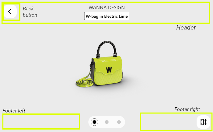
If the 3D model provides points of interest that highlight the special details about the bag, you can choose up to three of these points to display and set the descriptions for each. However, you cannot choose which points of interest to display or reorder them. To display the first 1, 2, or 3 points of interest, pass 1, 2, or 3 string values to the pois field of the models prop. If you don't want to set a description for any of the points, pass an empty string "" instead. Here is how the description for the point of interest will look:
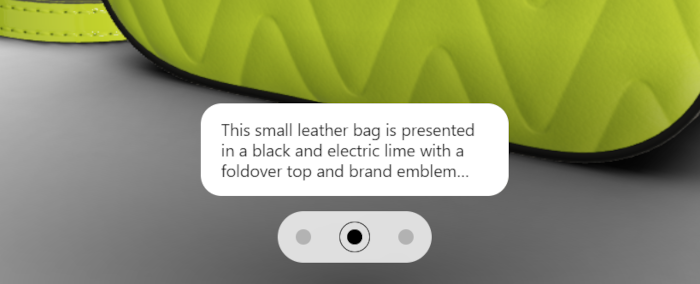
If you pass fewer points of interest, fewer dots will be displayed in the lower part of the screen. If you don't use any points of interest, the 3D model will be displayed from the default camera angle configured within the model.
WANNA UI component can inform you of the user's actions and SDK events happening in the 3D Viewer window. These events will be handled by WANNA UI (except onHeaderBackClick). However, you can use the callback functions described below to implement your own logic in addition to what WANNA SDK already does.
Implement the callback functions WANNA UI will call in different situations, and pass them to the corresponding props.
onHeaderBackClick — the user clicks the "back" button.onModel3dPoiChanged — the user switches to a different point of interest view.onModel3dShowReferences — the user requests the dimension rulers to be displayed.onModelLoadingSuccess — the model is loaded successfully.onModelLoading — the model loading is in progress.onError — general errors.onModelLoadingFail — model loading failure.WANNA UI component supports the following props:
| Prop Name | Type | Description |
|---|---|---|
| wannaSdk | Object, required | The SDK instance you imported from @wannaby/wanna-sdk. |
| license | String, required | License key. Get it from the WANNA sales representative. |
| models | Array, required | Model to be displayed in the 3D viewer. This prop accepts an array, but only the first model in the list will be used. Set the model identifier and optionally tune its display settings in this prop. See more in Models Prop. |
| theme | wannaSDK.THEME_LIGHT | wannaSDK.THEME_DARK | UI theme (default: wannaSDK.THEME_LIGHT).Note: There is a known issue with Samsung browser on Android devices and the way it handles dark mode. To prevent the colors mix-ups and ensure the UI looks as intended, it's best to always set the dark theme by default in Samsung browser on Android devices. |
| mainColor | String | Custom color for the loading indicator, specified by a hex code (example: #deff00). The default color is determined by the UI theme. |
| logoURL | String | Custom logo image URL; if specified, this image will be displayed on the loading screen. |
| modelsType | wannaSDK.MODEL_TYPE_BAG, required | Always pass wannaSDK.MODEL_TYPE_BAG to work with handbags. No other values are supported. |
| mode | wannaSDK.MODE_TYPE_3D, required | Always pass wannaSDK.MODE_TYPE_3D to work with the 3D Viewer. No other values are supported. |
| iframeSrc | String | Path to the iframe.html if you choose to host it on your own server. |
| headerComponent | React.Component | Custom component for the page header. See Header component. If you don't set one, the page will have a header with the model name and price displayed in text. |
| footerLeftComponent | React.Component | Custom component for the left half of the footer. If you don't set one, the lower left corner of the page will show plus / minus buttons on desktop and nothing on mobile. |
| footerRightComponent | React.Component | Custom component for the right half of the footer. If you don't set one, the lower right corner of the page will show a "show dimensions" button. |
| loadingComponent | React.Component | Custom loading component. If you don't set one, a simple progress indicator will be shown by default. |
| font | Object | Custom font for the interface, expressed as { file: string, family: string }; by default, Roboto Google font is used. |
| viewMode | VIEW_MODE_DESKTOP | VIEW_MODE_MOBILE | View mode for the component. Constants exported from @wannaby/wanna-ui (default: VIEW_MODE_MOBILE). |
| dimensionsUnit | wannaSDK.MODE_3D_DIMENSIONS_CM | wannaSDK.MODE_3D_DIMENSIONS_INCH | Length measurement unit for the size rulers: centimeters or inches. By default, wannaSDK.MODE_3D_DIMENSIONS_CM, centimeters are used. |
| showOnboarding | Boolean | Set to true to display a short tutorial on using 3D Viewer after the page is loaded. Default value: false. |
| labels | Object | Localization object. If you would like to change the UI language, set the props of this object to strings in the target language. See Labels. |
| onError | (error) => void | Called when an error occurs. |
| onModelLoadingFail | (modelId) => void | Called when the model loading fails. |
| onModelLoadingSuccess | (modelId) => void | Called when the model is successfully downloaded, though not necessarily already rendered in the view. |
| onModelLoading | (modelId) => void | Called when model loading starts. |
| onHeaderBackClick | () => void | Called when the user clicks the "back" button in the header. If you don't set this callback, no "back" button will be displayed in 3D Viewer UI. |
| onModel3dPoiChanged | ({ poi, modelId }) => void | Called when the user clicks on a point of interest and the view changes to it. |
| onModel3dShowReferences | ({ modelId }) => void | Called when the user clicks on the dimensions button and the rulers are displayed around the model to let the user see its size. |
Here's how the configurable components fit into the 3D Viewer:

The model list (models prop) supports the following fields for each entry:
| Field Name | Type | Description |
|---|---|---|
| id | String, required | Model identifier. |
| image | String | URL to image that will be displayed in the default loading screen. |
| name | String | Name that will be displayed in the default header. |
| price | String | Price that will be displayed in the default header. |
| pois | [String | Null, ...] | The descriptions of 3D model points of interest. Accepts up to three descriptions; if you add more to the list, they will be ignored. If you wish to add a point of interest without any description, pass an empty string to the corresponding array element. Note that this setting doesn't allow you to reorder or choose which points of interest to display: only the first three configured in the 3D model can be shown. |
WANNA provides full flexibility to customize the provided UI. Use your own header component by passing it as a render-prop in the headerComponent prop. This component is used in the Wanna UI component and the error screen.
headerComponent will receive the following props:
| Prop Name | Type | Description |
|---|---|---|
| appWasInit | Boolean | Indicates that the app is ready. When the app is in the error or rotate screens, this prop is false. It will only be set to true in the Wanna UI component after the app is successfully initialized. |
| name | String | Model name. |
| modelID | String | Model identifier. |
| style | Object | Styles object that should be applied to header root element. |
| mode | wannaSDK.MODE_TYPE_3D | Mode of SDK use. Currently can be only wannaSDK.MODE_TYPE_3D. |
| viewMode | VIEW_MODE_DESKTOP | VIEW_MODE_MOBILE | Current view mode: desktop or mobile. Constants exported from @wannaby/wanna-ui. |
To match your website better, you can use your own custom loading component by passing it as render prop in the loadingComponent property. This component will be used in the main component during initialization and model loading.
loadingComponent will receive the following props:
| Prop Name | Type | Description |
|---|---|---|
| children | React.Node | Text for the loading screen. |
| progress | Number | Number from 0 to 100 that shows the model loading progress. |
| image | URL | Image to be shown with the loading indicator. |
| loadingColor | String | Color of loading indicator, specified by a hex code (example: #deff00). |
| theme | wannaSDK.THEME_LIGHT | wannaSDK.THEME_DARK | UI theme. |
| modelsType | wannaSDK.MODEL_TYPE_BAG | Model type to work with; currently can be only wannaSDK.MODEL_TYPE_BAG. |
| mode | wannaSDK.MODE_TYPE_3D | Mode of SDK initialization; currently can be only wannaSDK.MODE_TYPE_3D. |
| type | LOADING_TYPE_INIT | LOADING_TYPE_MODEL | LOADING_TYPE_MODE_CHANGE | Tells the component at what loading stage the 3D Viewer is: initializing the library or loading the model. Use this setting to distinguish between loading screens for SDK initialization and model loading. Constants exported from @wannaby/wanna-ui. |
You can fully customize the footer by using your own custom footer components and passing them as render props in the footerRightComponent and footerLeftComponent properties. These components are used in the main component footer when the component is initializing or a model is loading.
footerRightComponent and footerLeftComponent support the following props:
| Prop Name | Type | Description |
|---|---|---|
| viewMode | VIEW_MODE_DESKTOP | VIEW_MODE_MOBILE | Current view mode: desktop or mobile. Constants exported from @wannaby/wanna-ui. |
| screenInteraction | Boolean | Indicates that the user has touched the screen at the current moment. |
| on3dZoomOut | () => void | Zoom out (minus button) handler for desktop mode. |
| on3dZoomIn | () => void | Zoom in (plus button) handler for desktop mode. |
| onToggleReferences | () => void | Dimensions button handler. |
| model | Object | Current selected model object from the models list. Contains not only the model identifier, but all the other info passed for it in the models prop. |
| activeShowReference | Boolean | Indicates whether the dimension rulers are displayed at the moment. |
| onboardingIsRunning | Boolean | Indicates whether the tutorial is currently shown. |
All the texts visible in the 3D Viewer UI are available as labels. You can pass your own values for these labels to edit them or change the interface language.
The default values are listed in the table:
| Label name | Default value | Description |
|---|---|---|
starting3dViewer | Starting 3D Viewer | The header of the initialization screen. |
useWiFi | Use a Wi-Fi network to start faster | The message on the initialization screen, shown only in mobile mode but doesn't check if the user is already connected to Wi-Fi. |
rotateThePhoneFor3d | Rotate the phone to view in 3D | Tells the user to rotate their smartphone for correct screen orientation. 3D Viewer only works in portrait orientation. |
loadingModel | Loading model | Shown during model download. |
doubleClickToFocus | Double click to select focus point | Displayed as a part of tutorial in desktop viewing mode. |
doubleTapToFocus | Double tap to select focus point | Displayed as a part of tutorial in mobile viewing mode. |
pinchToZoom | Pinch to zoom | Displayed as a part of tutorial in mobile viewing mode. |
canHold | Fits inside | The header message for the inlet that shows which objects would fit into the bag. |
somethingWentWrong | Something went wrong. But we're working on it | Generic error message. |
pleaseComeBackLater | Please come back later | Generic error description. |
cantDownloadModel | Can't download the model. | Error: failed to download the 3D model. |
cantToggleDimensions | Can't toggle model dimensions. | Error: failed to show dimension rulers. |
cantZoomInTheModel | Can't zoom in the model. | Error: failed to zoom in. |
cantZoomOutTheModel | Can't zoom iout the model. | Error: failed to zoom out. |
cantResetTheModel | Can't reset the model. | Error: failed to change the model shown in 3D Viewer. |
cantChangeTheModelViewpoint | Can't change the model viewpoint. | Error: failed to rotate the model around the selected focus point. |
noImage | No image | This text is shown in place of any image that 3D Viewer is unable to load. |
See the screens where the messages are displayed:
| App screen or situation | Label name |
|---|---|
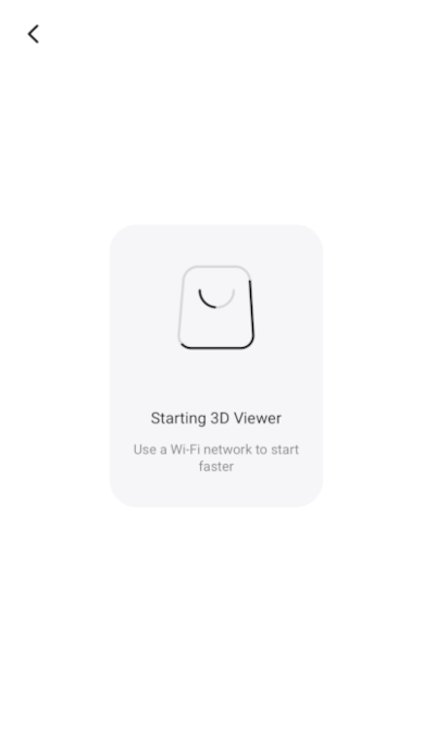 | starting3dVieweruseWiFi |
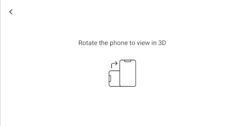 | rotateThePhoneFor3d |
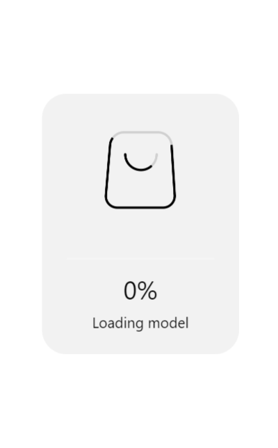 | loadingModel |
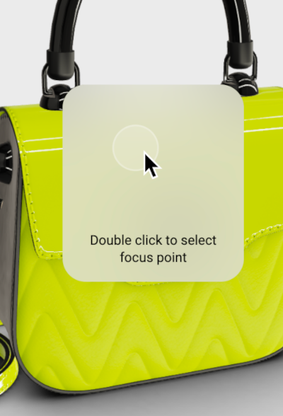 | doubleClickToFocus |
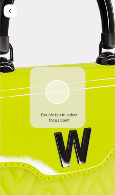 | doubleTapToFocus |
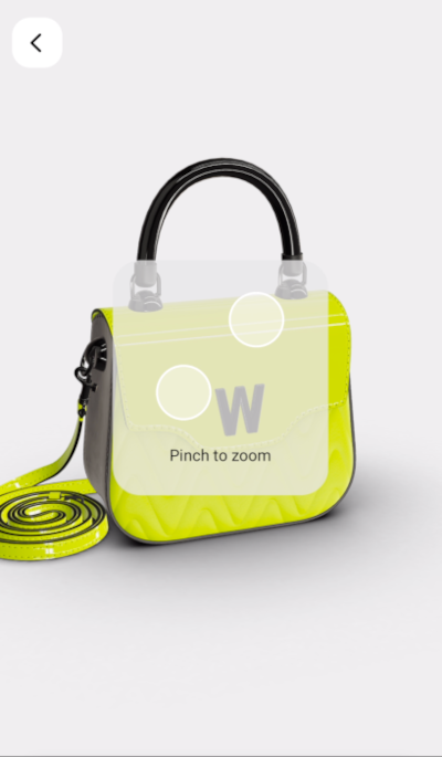 | pinchToZoom |
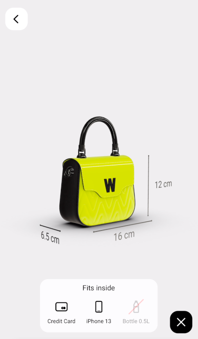 | canHold |
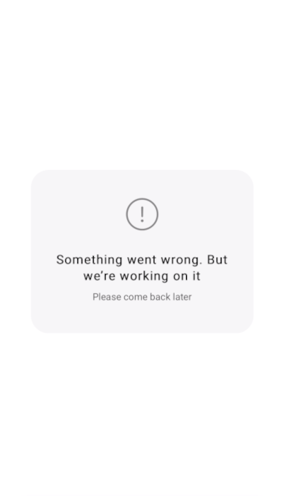 | somethingWentWrongpleaseComeBackLater |
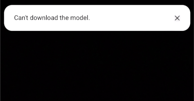 | cantDownloadModelcantToggleDimensionscantZoomInTheModelcantZoomOutTheModelcantResetTheModelcantChangeTheModelViewpoint |
"wannaby/wanna-sdk": <version>,
"wannaby/wanna-ui": <version>
import wannaSDK from '@wannaby/wanna-sdk';
import WannaUI, { VIEW_MODE_DESKTOP } from '@wannaby/wanna-ui';
import '@wannaby/wanna-ui/styles.css';

const models = [
  {
    id: 'model_id',
    brand: 'Brand Name',
    name: 'Model Name',
    price: '$ 1,200',
    pois: [
      '',
      'Text that will be displayed for the 2nd POI',
      'Text that will be displayed for the 3rd POI',
    ],
  },
];

const license = 'license_string';

function App() {
  return (
    <div>
      <PreviewModels
        wannaSdk={wannaSDK}
        models={models}
        license={license}
        mode={wannaSDK.MODE_TYPE_3D}
        viewMode={VIEW_MODE_DESKTOP}
        modelsType={wannaSDK.MODEL_TYPE_BAG}
        theme={wannaSDK.THEME_LIGHT}
      />
    </div>
  );
}

export default App;
FAQs
Wanna WEB-AR Preview component
The npm package @wannaby/wanna-ui receives a total of 64 weekly downloads. As such, @wannaby/wanna-ui popularity was classified as not popular.
We found that @wannaby/wanna-ui demonstrated a healthy version release cadence and project activity because the last version was released less than a year ago. It has 0 open source maintainers collaborating on the project.
Did you know?

Socket for GitHub automatically highlights issues in each pull request and monitors the health of all your open source dependencies. Discover the contents of your packages and block harmful activity before you install or update your dependencies.

Research
Security News
Socket’s threat research team has detected six malicious npm packages typosquatting popular libraries to insert SSH backdoors.

Security News
MITRE's 2024 CWE Top 25 highlights critical software vulnerabilities like XSS, SQL Injection, and CSRF, reflecting shifts due to a refined ranking methodology.

Security News
In this segment of the Risky Business podcast, Feross Aboukhadijeh and Patrick Gray discuss the challenges of tracking malware discovered in open source softare.