Security News
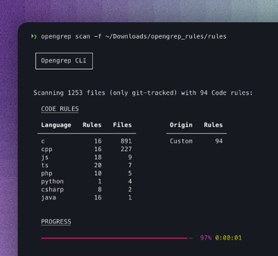
Opengrep Emerges as Open Source Alternative Amid Semgrep Licensing Controversy
Opengrep forks Semgrep to preserve open source SAST in response to controversial licensing changes.
@webdev-tools/css-flex-layout
Advanced tools
A tiny framework based on css flex box to manage grids without flood your html
A tiny framework based on css flex box to manage grids without flood your html
It is only necessary to add 1 class to the columns container. Keep your code slim and clean.
Divide all available space between columns. If a column don't fit on the line, it will break to the next line.
<section class="fl-cols-container">
<div>1</div>
<div>2</div>
<div>3</div>
</section>
Define the number of columns you want per line and available space will be divided to fit the columns on the line and the other columns will break to the next line.
| Columns | Class |
|---|---|
| 2 | .fl-2-cols-container |
| 3 | .fl-3-cols-container |
| 4 | .fl-4-cols-container |
| 6 | .fl-6-cols-container |
<section class="fl-3-cols-container">
  <aside>001</aside>
  <aside>002</aside>
  <aside>003</aside><!-- break to next line -->
  <aside>004</aside>
  <aside>005</aside>
  <aside>006</aside><!-- break to next line -->
  <aside>007</aside><!-- alone on the last line -->
</section>
Gutters add padding to the columns, without change its size.
| Padding | class |
|---|---|
| 5px | .fl-gutter-5 or .fl-gutter-tb-5 or .fl-gutter-rl-5 |
| 10px | .fl-gutter-10 or .fl-gutter-tb-10 or .fl-gutter-rl-10 |
| 15px | .fl-gutter-15 or .fl-gutter-tb-15 or .fl-gutter-rl-15 |
| 20px | .fl-gutter-20 or .fl-gutter-tb-20 or .fl-gutter-rl-20 |
tb = Top and Bottom rl = Right and Left
<section class="fl-cols-container fl-gutter-5">
  <div>1</div>
  <div>2</div>
  <div>3</div>
</section>
Spacers add margin bottom to all columns, pushing the cells that fell to the next line.
| Padding | class |
|---|---|
| 5px | .fl-spacer-5 |
| 10px | .fl-spacer-10 |
| 15px | .fl-spacer-15 |
| 20px | .fl-spacer-20 |
<section class="fl-2-cols-container fl-spacer-20">
  <aside>001</aside>
  <aside>002</aside><!-- break to next line -->
  <!-- 20px spacer between  -->
  <aside>003</aside>
  <aside>004</aside>
</section>
<small>0.1.1 (2018-05-27)</small>
<a name="0.1.0"></a>
FAQs
A tiny framework based on css flex box to manage grids without flood your html
The npm package @webdev-tools/css-flex-layout receives a total of 12 weekly downloads. As such, @webdev-tools/css-flex-layout popularity was classified as not popular.
We found that @webdev-tools/css-flex-layout demonstrated a not healthy version release cadence and project activity because the last version was released a year ago. It has 1 open source maintainer collaborating on the project.
Did you know?

Socket for GitHub automatically highlights issues in each pull request and monitors the health of all your open source dependencies. Discover the contents of your packages and block harmful activity before you install or update your dependencies.

Security News
Opengrep forks Semgrep to preserve open source SAST in response to controversial licensing changes.

Security News
Critics call the Node.js EOL CVE a misuse of the system, sparking debate over CVE standards and the growing noise in vulnerability databases.

Security News
cURL and Go security teams are publicly rejecting CVSS as flawed for assessing vulnerabilities and are calling for more accurate, context-aware approaches.