Security News
Deno 2.2 Improves Dependency Management and Expands Node.js Compatibility
Deno 2.2 enhances Node.js compatibility, improves dependency management, adds OpenTelemetry support, and expands linting and task automation for developers.
@xsolla/login-sdk
Advanced tools
The library allows you to use the login widget or Login SDK API methods separately. Currently, SDK supports the following types of authorization:
This page contains:
See Login documentation to find more.
Connect Xsolla Login Widget SDK using one of the following methods:
npm, launch the console and runnpm i @xsolla/login-sdk
<head> tag of the HTML-page where the widget will be placed:<script src="https://login-sdk.xsolla.com/latest/">
</script>
Before you integrate the Xsolla Login widget, you can see it in the preview mode. The preview uses default settings, style, and language. To see it, use the following URL with your own values for query parameters:
https://login-widget.xsolla.com/latest/?projectId={LOGIN_PROJECT_ID}&login_url={CALLBACK_URL}
You can also add the locale query parameter to the URL. Possible values are available in the preferredLocale parameter.
This library allows you to quickly integrate Xsolla Login widget with your website in following steps:
Add the widget initialization code to the <body> tag.
<script>
const xl = new XsollaLogin.Widget({
  projectId: '[Login ID]',
  preferredLocale: 'en_US'
});
</script>
Version for npm:
import { Widget } from '@xsolla/login-sdk';
const xl = new Widget({
  projectId: '[Login ID]',
  preferredLocale: 'en_US'
});
string
Login project ID from Publisher Account. Required.
string
URL to redirect the user to after registration/authentication/password reset. Must be identical to one of the Callback URL specified in Publisher Account in Login settings. Required if there are several Callback URLs.
You can pass several URLs of the local server to make the widget available to the local build. For example https://localhost:9000.
string
Your custom data. The value of the parameter will be returned in the user JWT > payload claim.
string
Language of the widget interface and region in the <language code>_<country code> format where:
string
Widget background color in the fullscreen mode. The value can be in any of the CSS color formats. Default is RGBA(50, 150, 150, 0.1).
string
The stack order of the widget in the fullscreen mode. Default is 9000.
Choose the widget placing on the website start page:
Add the button with the on-click event and the xl.show() function to the site.
<div id="xl_auth" style="display: none"></div>
<button onclick="xl.open()">Fullscreen widget</button>
Add the code for inserting the widget into the block.
<script type="text/javascript">
  xl.mount('xl_auth');
</script>
The fullscreen mode is closed by clicking outside the widget area.
Add the block with the widget to the <body> tag and set the block ID.
<div id="xl_auth" style="height: 700px"></div>
Add the code for inserting the widget into the block.
<script type="text/javascript">
  xl.mount('xl_auth');
</script>
If you have already integrated Login, you can also try additional features of Xsolla Login Widget:
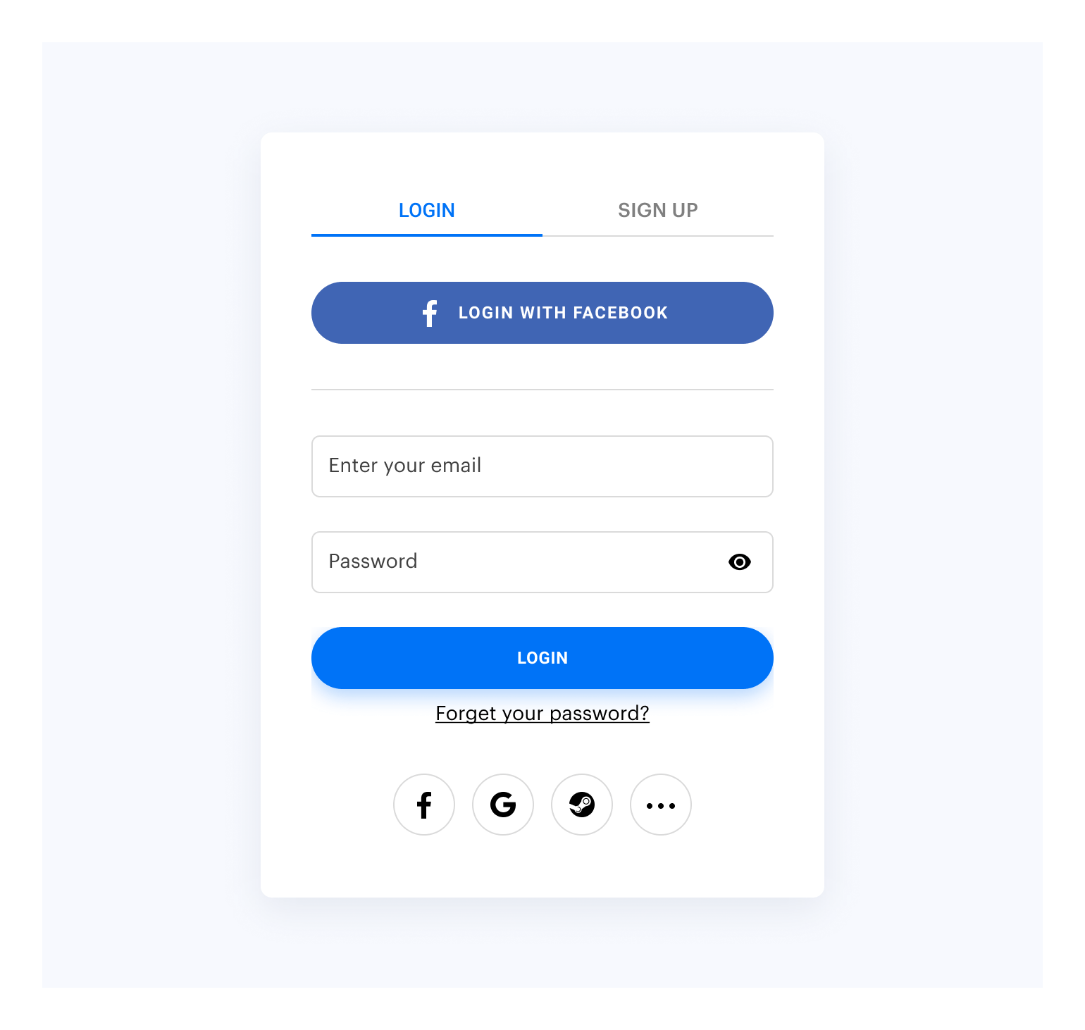
By default, the widget looks like this:

Customize the widget style by changing the following parameters in Publisher Account:
To customize:
Go to the Customization page in Publisher Account.
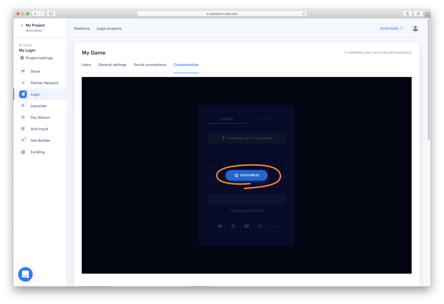
Move your mouse cursor to the editing area and click Customize. It will open the widget builder.

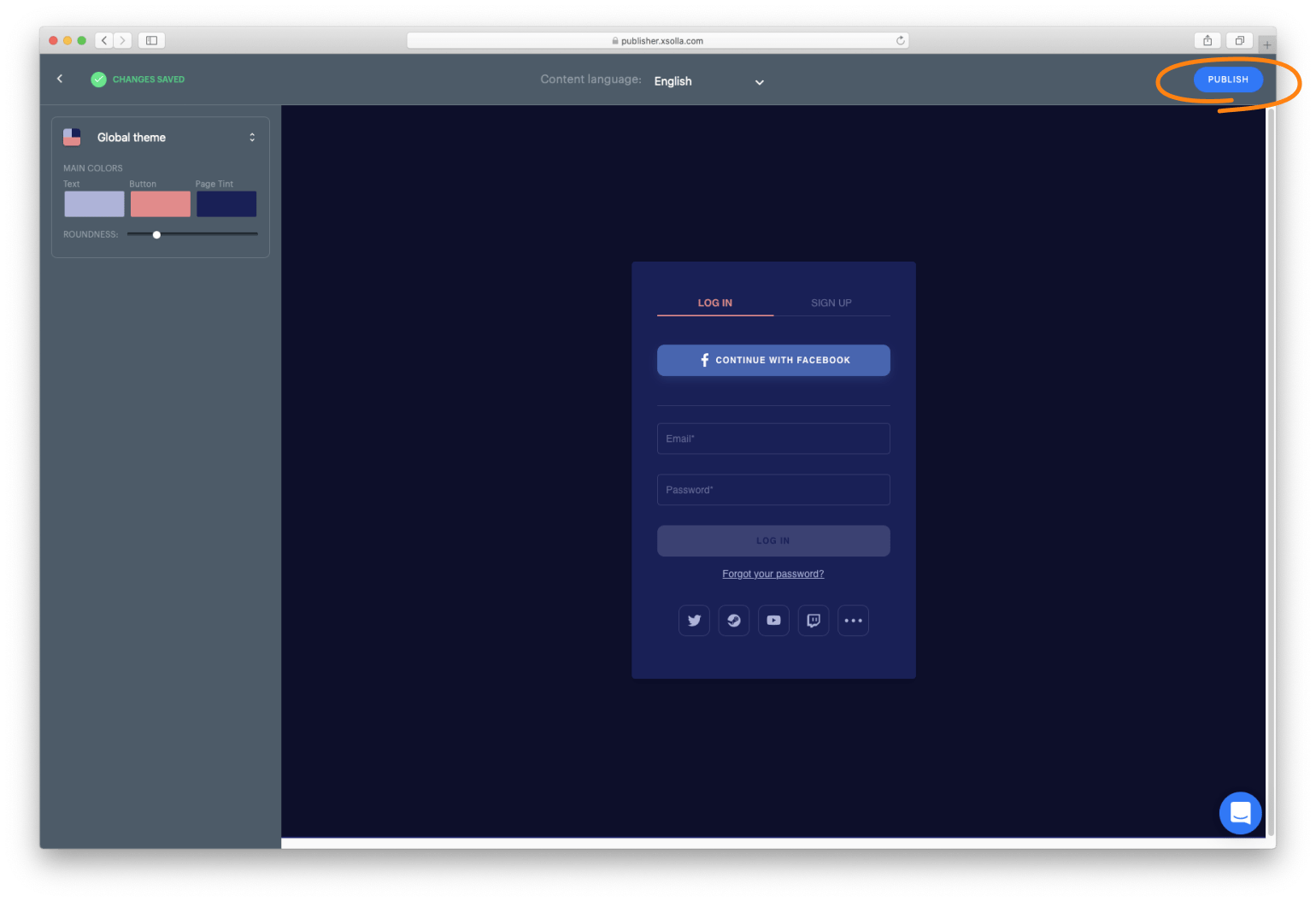
Set up the widget style and click Publish.

NOTE
After publication, the widget will be changed for all the projects it was connected to.
You can collect widget statistics on the following events:
To start tracking the event, initialize and process the action as described below.
xl.on(xl.events.Open, function () {
    console.log('user has opened the widget');
});
xl.on(xl.events.Close, function () {
    console.log('user has closed the widget');
});
Xsolla Login widget supports the OAuth 2.0 protocol-based user authentication. Follow the Connecting OAuth 2.0 instruction to set it up.
You can open Xsolla Login widget on other pages, in addition to the authentication (Login) page. The following pages available to you include:
To open the page, initialize and process the action as described below.
const pages = XsollaLogin.WidgetPages;
const page = pages.SignUpPage;
xl.setPage(page);
const pages = XsollaLogin.WidgetPages;
const page = pages.SocialsPage;
xl.setPage(page);
const pages = XsollaLogin.WidgetPages;
const page = pages.ResetPasswordPage;
xl.setPage(page);
You can work with the Login Widget SDK API calls separately from the Login widget if you want to:
Detailed information is provided in the instruction.
The widget settings are contained in the following JSON files:
settingsJSON — main settingssocialsJSON — social login settingsthemeJSON — theme settingsYou can reuse the settings in the files and display the same widget on different settings. The settings URL is specified in the widget initialization code. To connect JSON with widget settings, follow the instruction.
FAQs
Xsolla Login Javascript SDK
The npm package @xsolla/login-sdk receives a total of 313 weekly downloads. As such, @xsolla/login-sdk popularity was classified as not popular.
We found that @xsolla/login-sdk demonstrated a healthy version release cadence and project activity because the last version was released less than a year ago. It has 0 open source maintainers collaborating on the project.
Did you know?

Socket for GitHub automatically highlights issues in each pull request and monitors the health of all your open source dependencies. Discover the contents of your packages and block harmful activity before you install or update your dependencies.

Security News
Deno 2.2 enhances Node.js compatibility, improves dependency management, adds OpenTelemetry support, and expands linting and task automation for developers.

Security News
React's CRA deprecation announcement sparked community criticism over framework recommendations, leading to quick updates acknowledging build tools like Vite as valid alternatives.

Security News
Ransomware payment rates hit an all-time low in 2024 as law enforcement crackdowns, stronger defenses, and shifting policies make attacks riskier and less profitable.