
Security News
The Risks of Misguided Research in Supply Chain Security
Snyk's use of malicious npm packages for research raises ethical concerns, highlighting risks in public deployment, data exfiltration, and unauthorized testing.
@yoonit/style
Advanced tools


A SASS lib to provide:
npm i -s @yoonit/style
To access all the features of yoonit/style, import the SASS theme that you want in your project globally.
@import '@yoonit/style'
If you want to import somenthing especific of this project, for example, the button style, you can import that directy.
@import '@yoonit/style/atoms/YooButton'
These are all the themes available for now.
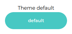
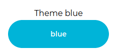
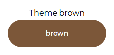
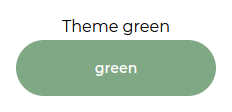
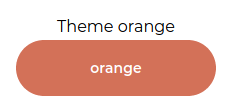
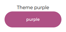
Yoonit Style has global root variables, with a default theme. In addition to the default theme, we have 5 more themes available, as shown above in the images.
The default theme has the following variables:
  --fontFamily-primary: 'Montserrat', 'sans-serif'
  --fontFamily-second: 'Arial', 'sans-serif'

  --fontWeight-regular: 400
  --fontWeight-medium: 500
  --fontWeight-semibold: 600
  --fontWeight-bold: 700
  --fontWeight-black: 800

  --primaryDarkest: #008080
  --primaryDark: #1DBABA
  --primaryBase: #47C8C3
  --primaryLight: #B0E7E5
  --primaryLightest: #C3ECEb
  --dangerDarkest: #CB0A22
  --dangerDark: #E83C4B
  --dangerBase: #F4596C
  --dangerLight: #FF7888
  --dangerLightest: #FF99A5
  --greyDarkest: #212325
  --greyDark: #5A5F67
  --greyBase: #8F959F
  --greyLight: #D6DBE2
  --greyLightest: #F5F6F7
  --color-white: #FFFFFF
  --color-black: #111111
  --color-transparent: rgba(255, 255, 255, 0)

  --font-tn: 8px
  --font-xs: 10px
  --font-sm: 12px
  --font-md: 14px
  --font-lg: 16px
  --font-xl: 20px
  --font-hg: 32px

  --spacing-tn: 2px
  --spacing-xs: 4px
  --spacing-sm: 8px
  --spacing-md: 16px
  --spacing-lg: 24px
  --spacing-xl: 32px
  --spacing-hg: 64px
To use the variable in your sass file, just use var(VariableName), for example:
.myClass
  color: var(--greyBase)
To create a custom theme, in your project create a sass file and overwrite the root variables, involved in a "data-composition", let's see an example:
MyTheme.sass
@import '@yoonit/style'

/*==== Import Quarks ====*/

[data-composition="myTheme"]
  --primaryDarkest: #49260a
  --primaryDark: #623b1c
  --primaryBase: #7c5739
  --primaryLight: #caad8c
  --primaryLightest: #f6eddd

  --font-tn: 8px
  --font-xs: 10px
  --font-sm: 12px
  --font-md: 14px
  --font-lg: 16px
  --font-xl: 20px
  --font-hg: 32px

  --spacing-tn: 2px
  --spacing-xs: 4px
  --spacing-sm: 8px
  --spacing-md: 16px
  --spacing-lg: 24px
  --spacing-xl: 32px
  --spacing-hg: 64px
Now, in your template, add a div wrapped in the elements you want to change the theme to, and add in this div the data-composition="myTheme" attribute
Template.vue
<div data-composition="myTheme">MyContainer</div>
So the root variables will be overridden with the theme you made for this added condition.
| Name | Input/Format | Usage (sass) | Description |
|---|---|---|---|
| flex | flex-direction, flex-wrap, justify-content, align-content/align-items | +flex($flex-direction, $flex-wrap, $justify-content, $align-content/align-items | Helps in the spacial organization on the interface |
| durationAnimation | 'slow' or 'normal' or 'fast' or 'very-fast' | +durationAnimation($modifier) | Sets the duration of the animation |
| stateAnimation | 'paused' or 'played' | +stateAnimation($state) | Sets the state of the animation |
| delayAnimation | 'slow' or 'normal' or 'fast' | +delayAnimation($delay) | Sets the animation delay |
| animation | animation-name, animation-iteration-count, animation-direction, animation-timing-function, 'slow' or 'normal' or 'fast' or 'very-fast', 'paused' or 'played', 'slow' or 'normal' or 'fast' | +animation($animation-name, $animation-iteration-count, $animation-direction, $animation-timing-function, $animation-duration, $animation-play-state, $animation-delay | Mixin to build an animation with all properties |
| border-radius | 'sm' or 'md' or 'lg' or 'pill' or 'circular' or 'none' | +border-radius($modifier) | Defines a rounding for the bordered element |
| border | 'xs' or 'sm' or 'md' or 'lg' or 'none', border-color, border-style, 'sm' or 'md' or 'lg' or 'pill' or 'circular' or 'none' | +border($border-width, $border-color, $border-style, $border-radius) | Mixin to build a border with all properties |
| text-color | $primary or $danger or $grey, $colorVariation | +text-color($variation, $color) | Sets the color of the text with its respective variation, according to the colors of the theme. |
| background-color | $primary or $danger or $grey, $colorVariation | +background-color($variation, $color) | Sets the background color with its respective variation, according to the colors of the theme. |
| border-color | $primary or $danger or $grey, $colorVariation | +border-color($variation, $color) | Sets the color of a border with its respective variation, according to the colors of the theme. |
| box-shadow | 'soft' or 'low' or 'mid' or 'high' or 'veryHigh' or 'none', color | +box-shadow($level, color) | Sets a shadow for the desired element. You can choose the intensity and color of the shadow |
| text-shadow | 'soft' or 'low' or 'mid' or 'high' or 'veryHigh' or 'none', color | +text-shadow($level, color) | Sets a shadow for text. You can choose the intensity and color of the shadow |
| font-size | 'tn' or 'tn' or 'sm' or 'md' or 'lg' or 'xl' or 'hg' | +font-size($font-size) | Set font size |
| font-family | 'font-primary' or 'font-second' or font-family | +font-family($font-family) | Set the family to font |
| font-weight | 'bold' or 'semi-bold' or 'medium' or 'regular' | +font-weight($font-weight) | Set a font weight |
| font | font-color, 'tn' or 'tn' or 'sm' or 'md' or 'lg' or 'xl' or 'hg', 'font-primary' or 'font-second' or font-family, 'bold' or 'semi-bold' or 'medium' or 'regular' | +font($font-color, $font-size, $font-family, $font-weight) | Mixin to assist in the construction of the font css with all the properties |
We have tons of classes in Yoonit Style, but let's talk about the two main ones, that can be used to set margin and padding.
The margin class .m and the padding class .p have elements and modifiers.
The elements are the position of the margin or padding (left, top, bottom or right) and the modifiers are the size of the margin or padding (extra small, small, medium, large, extra large or none).
| Param | Input/Format | Description |
|---|---|---|
| element | 'l' or 't' or 'b' or 'r' | Position of the margin or padding |
| modifier | 'xs' or 's' or 'm' or 'l' or 'xl' or 'none' | Size of the margin or padding |
To use them, in your html code, set the .m or .p, then do __element, then --modifier.
Example:
.m__b--l //meaning: margin__bottom--large

.m__l--s //meaning: margin__left--small

.p__t--m //meaning: padding__top--medium

.p__r--xl //meaning: padding__right--extra-large
Clone the repo, change what you want and send PR.
Contributions are always welcome!
Code with ❤ by the Cyberlabs AI Front-End Team
FAQs
The SASS Atomic Design System that powers Web & Native Yoonit Components
The npm package @yoonit/style receives a total of 22 weekly downloads. As such, @yoonit/style popularity was classified as not popular.
We found that @yoonit/style demonstrated a not healthy version release cadence and project activity because the last version was released a year ago. It has 11 open source maintainers collaborating on the project.
Did you know?

Socket for GitHub automatically highlights issues in each pull request and monitors the health of all your open source dependencies. Discover the contents of your packages and block harmful activity before you install or update your dependencies.

Security News
Snyk's use of malicious npm packages for research raises ethical concerns, highlighting risks in public deployment, data exfiltration, and unauthorized testing.

Research
Security News
Socket researchers found several malicious npm packages typosquatting Chalk and Chokidar, targeting Node.js developers with kill switches and data theft.

Security News
pnpm 10 blocks lifecycle scripts by default to improve security, addressing supply chain attack risks but sparking debate over compatibility and workflow changes.